
Table of Contents
The Optimize Viewport for Mobile insight is one of the performance audits found in Google’s speed testing tools. It checks if a website’s viewport meta tag has been configured correctly to allow swift responses to user input on mobile. A misconfigured viewport tag can delay interactions by up to 300 milliseconds.
In this article, we’ll explain why that’s the case, the pass/fail criteria of Google’s Optimize Viewport for Mobile insight, and how to check your site for viewport issues. After that, we’ll discuss how to correct the tag on your site by hand and how to address other issues related to mobile performance with a WordPress plugin. We’ll end with a case study to show you the effect of these changes.
| TL;DR No time to spare? The most important takeaways are: ✅ Google’s Optimize Viewport for Mobile insight flags viewport meta tags that are missing or misconfigured. When that’s the case, it prompts browsers to listen for the double-tap zoom command, which can delay mobile interactions by up to 300ms. ✅ To pass the audit, your viewport tag must include the width attribute and an initial-scale of at least 1. The standard mobile-optimized configuration is <meta name=”viewport” content=”width=device-width, initial-scale=1″ />. ✅ WordPress users can resolve viewport issues by correcting tags hardcoded in theme files. To further boost mobile performance, WP Rocket offers features like mobile caching, lazy rendering, and delaying JavaScript execution to improve Interaction to Next Paint (INP). |
What is the Optimize Viewport for Mobile Insight?
First, let’s cover some background information.
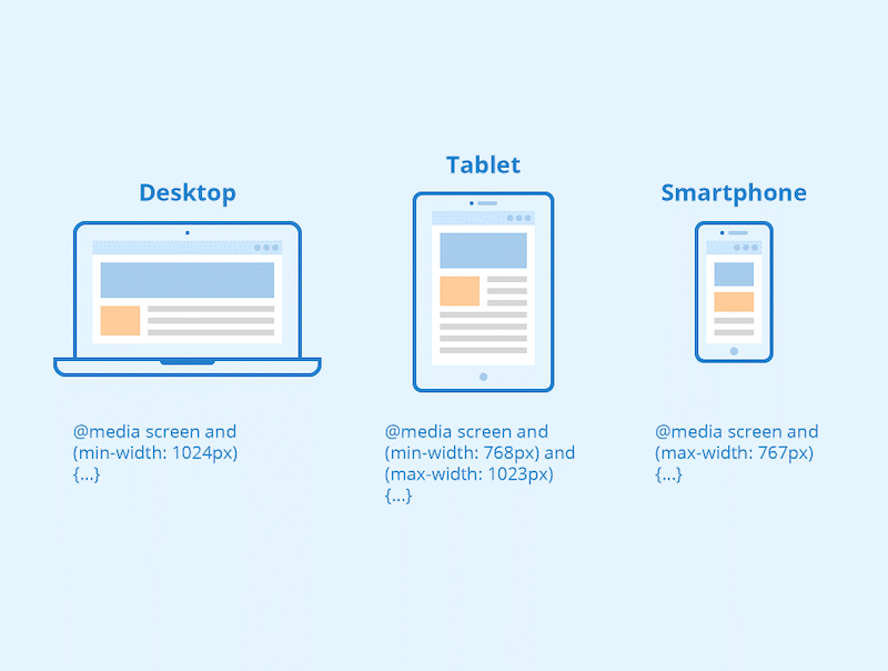
The Viewport Explained
“Viewport” is the name for the area of a website you see in your web browser. It varies in size, depending on the device screen or the size of the browser window.
At the same time, there is also a meta tag called “viewport,” which appears in the <head> section of a web page. It usually looks something like this:
<meta name="viewport" content="width=500, initial-scale=1" />The viewport tag instructs the browser how to control a page’s dimensions and scaling. For example, it typically defines the web page’s initial width and zoom level.
How Does the viewport Meta Tag Affect Performance?
The performance impact of the viewport tag is rooted in user interactions on mobile. In the past, browsers had a delay built in before responding to a tap on screen. They would wait around 300 milliseconds to see if it would turn into a double tap to zoom in.
Unfortunately, this also reduced the responsiveness of mobile web pages. You can see the difference in the video below:
To address this issue, browsers largely removed double-tap zoom for websites with a mobile-optimized viewport, relying instead on pinch zoom gestures. However, since pinch zoom can be difficult to use for people with motor impairments, double-tap zooming, including the 300ms delay, is still available as an accessibility feature on non-mobile-optimized pages.
That means, if your viewport tag is misconfigured, you add a serious delay to how fast the mobile version of your website responds to user interactions. This can hurt your user experience and affect Interaction to Next Paint (INP), an important Core Web Vitals metric. This, in turn, impairs your search rankings.
What Google’s Optimize Viewport for Mobile Insight Tracks
Google’s viewport performance insight checks the following conditions:
- The viewport tag is present
- It contains a width attribute
- The initial-scale attribute has been defined and has a value of at least 1
If your meta tag does not meet these conditions, it will trigger the Optimize Viewport for Mobile insight.
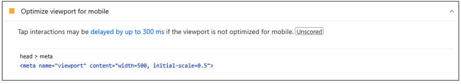
The insight does not only point out the problem but also shows the viewport tag currently present on your web page, so you know what you are looking for.
| 💡 Optimize Viewport for Mobile replaces an older audit with the name “Does not have a <meta name=”viewport”> tag with width or initial-scale.” I think we can all agree the new name is much catchier. |
How to Check for Viewport Problems on Your Site
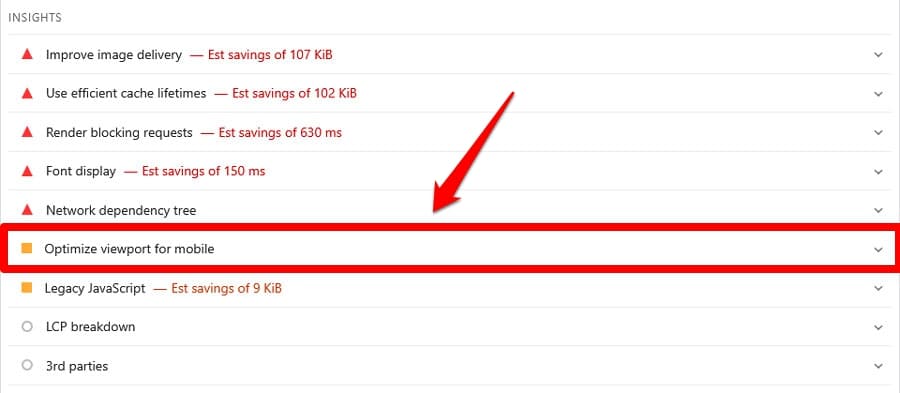
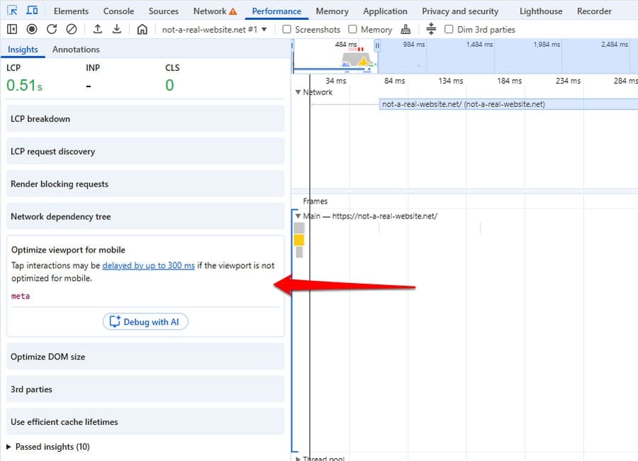
One of the easiest ways to check if your site has a problem with the viewport tag is to run its URL through PageSpeed Insights. If the insight gets triggered, it will appear in the Insights section.
Another option is to run a performance trace in Chrome Developer Tools. You can do that in the Performance tab, for example, via Record and reload.
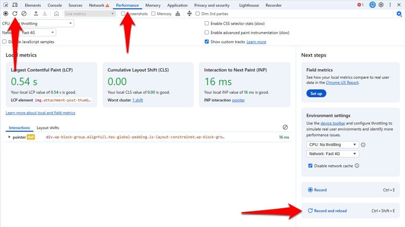
The Optimize Viewport for Mobile insight will appear in the left sidebar.
Note that there can be cases where the audit appears in PageSpeed Insights but not in Chrome Developer Tools. That’s because one is a static and the other a dynamic test.
PageSpeed Insights simply checks the presence and configuration of the viewport tag, while the developer tools analyze page performance in context. If the page performs well otherwise, the tools may not point out the viewport issue. That’s why it’s important to test in more than one way.
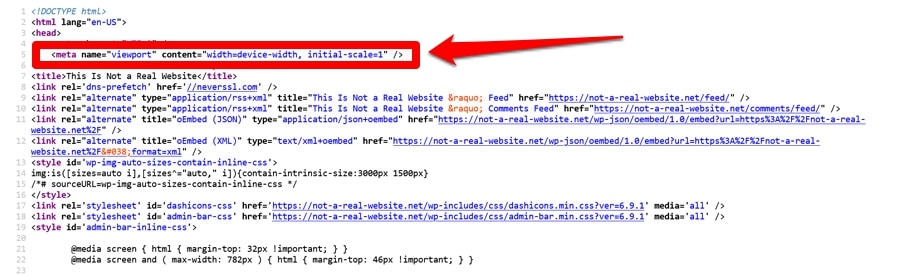
Finally, you can also check your site’s viewport tag manually in the browser. Either look at the page HTML via browser developer tools or right-click and choose View Page Source.
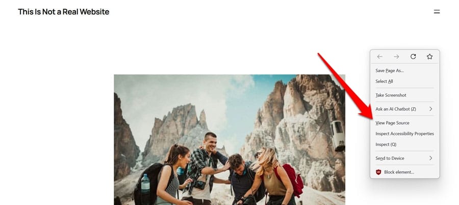
The viewport meta tag should appear at the top of the page.
Here’s a recap of the different methods:
| Method | How to use it | Type | Notes |
| PageSpeed Insights | Run your URL through the tool | Static | Flags missing or misconfigured viewport tags in the Insights section |
| Chrome Developer Tools | Run a trace in the Performance tab | Dynamic | May not flag the issue if the page otherwise performs well |
| Manual check | View page source or inspect HTML via browser developer tools | Manual | The viewport tag should appear at the top of the section |
How to Optimize the viewport Tag in WordPress
The only thing that will improve the Optimize Viewport for Mobile insight is to have a mobile-friendly viewport tag on your website. To do so, you need to a) understand the meta tag, b) know how to correct it on your WordPress site if necessary, and c) ensure the rest of your site’s mobile optimization is on point.
Understanding the viewport Tag
On the most basic level, the viewport meta tag looks like this:
<meta name="viewport" content=" " />The content part contains the directives that tell browsers how to render a web page. It takes several attributes, the most important of which are:
- width: Sets the minimum width of the viewport in pixels. It also takes the value device-width, which adjusts the viewport to the pixel size of the screen it appears on.
- height: Like width but for viewport height. It also takes device-height as a value though it’s rarely used.
- initial-scale: Sets the zoom level (between 0.0 and 10.0) of the web page when it first loads.
- user-scalable: This should never be set to “no,” as it disables the ability to zoom on your website, which is an important accessibility tool for people with low vision.
The most common viewport configuration is this:
<meta name="viewport" content="width=device-width, initial-scale=1" /> The above tag:
- Matches the viewport width to the device’s screen width. It also preserves this behavior when switching between portrait and landscape view.
- Sets the initial zoom level to 100% (1:1). This is to prevent browsers from applying their own default scaling, so the page loads without zooming.
| 💡For detailed information on the viewport tag and it’s attributes, check the documentation on MDN. |
Correcting a Faulty Tag on Your WordPress Website
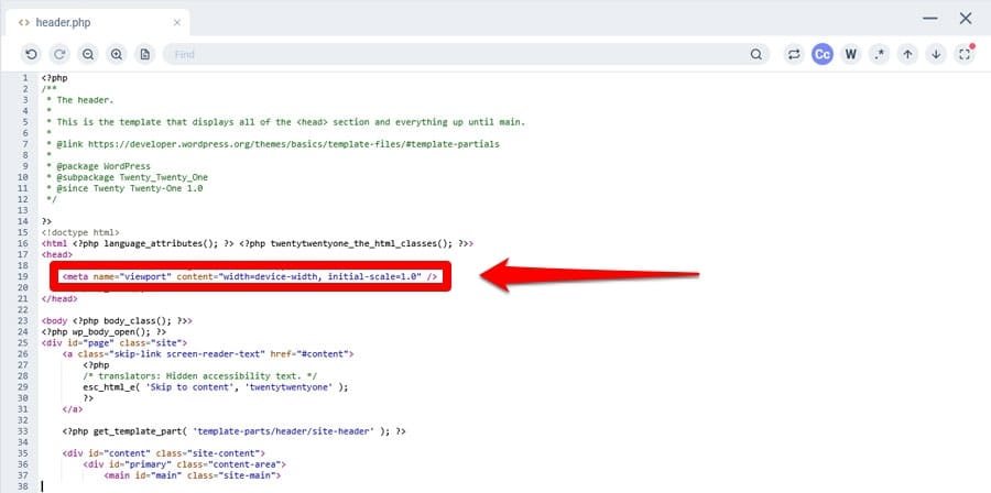
In WordPress, a misconfigured viewport meta tag usually has a limited number of causes. When using a modern block theme, WordPress core automatically adds a mobile-optimized tag using the _block_template_viewport_meta_tag() function, so the problem shouldn’t come from there.
Typically, if your site throws the Optimize Viewport for Mobile insight, it’s because the viewport tag is:
- Hardcoded manually in header.php or a similar template file (common in classic themes)
- Added via a code snippet in functions.php
You have two options to fix it:
- Reach out to the maker of your theme and ask them to update their work so it displays a mobile-friendly viewport meta tag.
- Correct the problem locally yourself.
When you update a template file or your theme’s functions.php, make sure you do it in a child theme. Otherwise, you can lose all changes to a theme update.
Ensure Your Website Design is Responsive
When a mobile-friendly viewport tag is in place, browsers assume your site is mobile friendly, and visitors don’t need to zoom and pan to consume your content. Your job is to ensure that’s in fact true.
The modern default method to do so is responsive web design. It means your website automatically adjusts to any screen size it’s being viewed on, both in terms of zoom level, layout, usability, readability, and performance. This ensures visitors have the best possible experience, no matter what device they’re on.
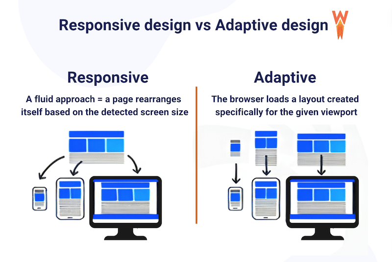
Responsive web design comes down to a few key principles:
- Avoid using a fixed viewport width (we’ve already covered this)
- Define the sizes of page elements with relative values like %, em, or vw instead of absolute units such as px, pt, or cm
- Use modern layout techniques (e.g. flexbox, grid, and multi-column), which are responsive by design
- Employ CSS media queries to define design changes for smaller screens
- Provide responsive images (including width and height declarations to prevent layout shifts)
| 💡To learn more about this, web.dev has a detailed tutorial on responsive design basics, including advice on how to choose break points. |
Optimizing Mobile Performance with a WordPress Plugin
The viewport meta tag is only one factor in mobile website performance. To ensure your visitors have a good experience on your site, you can use a performance plugin like WP Rocket. It includes many features to make the mobile version of your WordPress site load as quickly as possible.
For one, when you switch on WP Rocket, it automatically implements:
- Caching (page and browser caching), with a separate mobile cache
- Automatic lazy rendering to speed up initial page loading
- GZIP compression and minification, which reduce website file size, so they transmit faster
- Critical image optimization, makes the most important images load quickly and early
- Preconnecting to external page assets to speed up their download
In addition to that, you can enable optional performance improvements to further speed up your site:
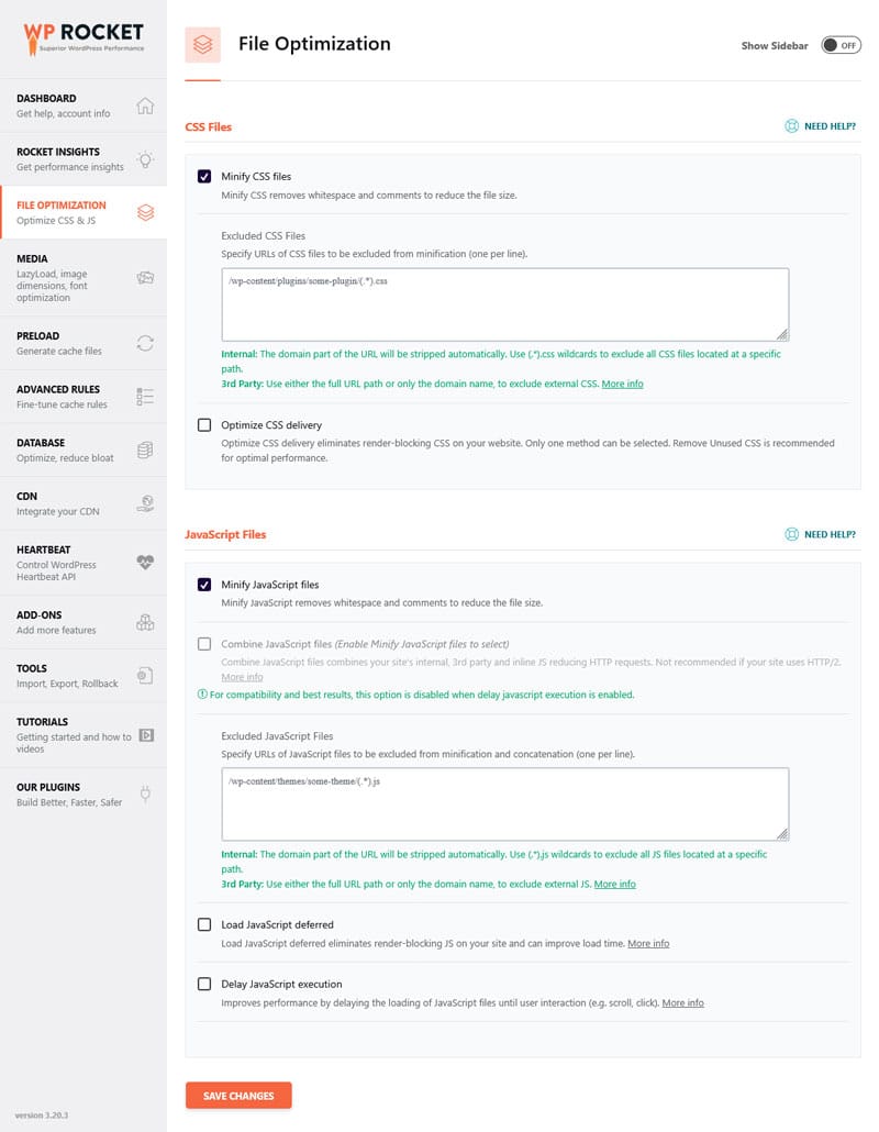
- Remove unused CSS so it doesn’t slow down page rendering
- Combine and defer JavaScript to remove render-blocking requests
- Lazy loading for images, embedded videos, and other visuals
- Self-hosting Google Fonts (cut down on HTTP requests)
- Add missing image dimensions to help prevent layout shifts
- Preload above-the-fold fonts for enhanced layout stability
What’s more, switching these options on is as easy as checking a few boxes.
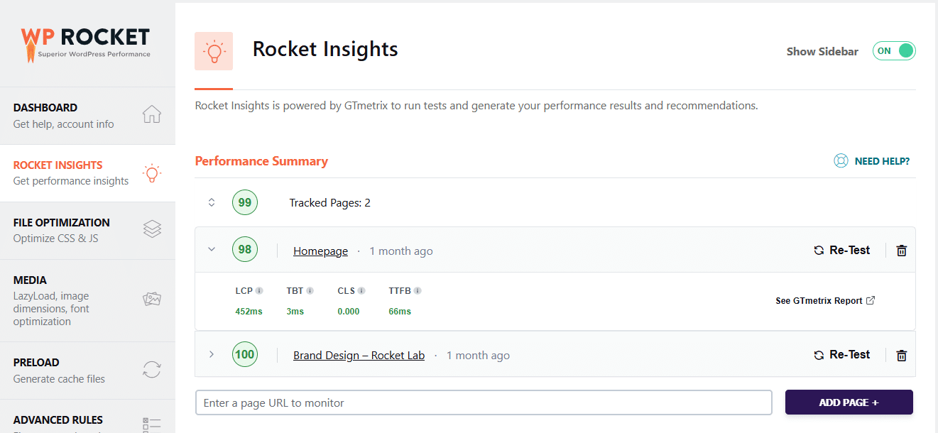
Finally, the built-in, free Rocket Insights, powered by GTmetrix, helps you monitor your top pages’ performance directly in your WordPress dashboard, check your performance score and advanced indicators at both global and page level, understand your results, get clear recommendations tied to WP Rocket features, and re-test anytime.
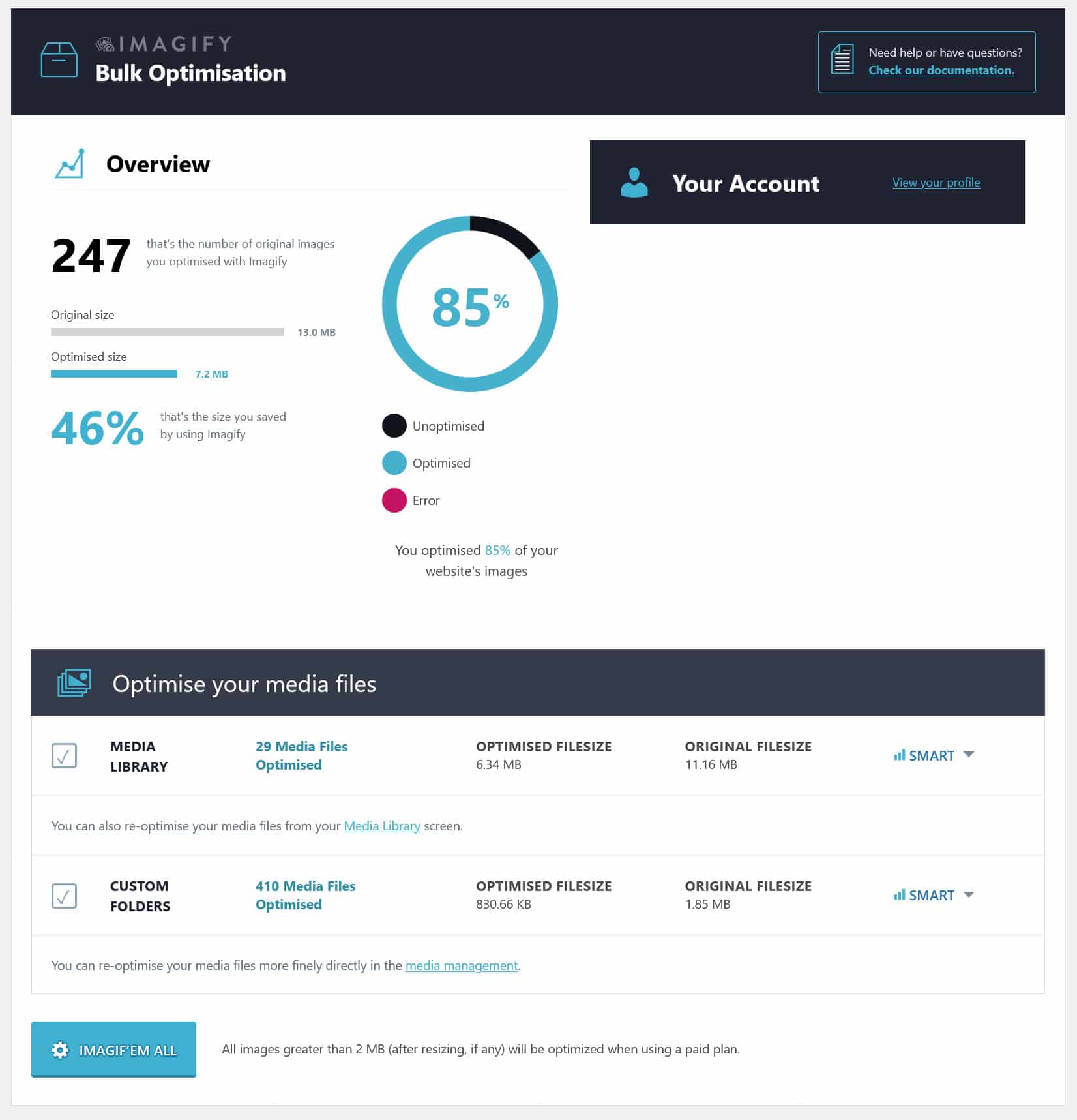
If you want to optimize your images for speed as well, the perfect companion plugin to WP Rocket is Imagify, an image optimization plugin for WordPress.
It lets you convert images to the WebP and AVIF formats as well as compress and resize them without loss of quality. This happens automatically for images you upload to your site, and you can do it for existing images as well, both individually and in bulk.
Overview: WP Rocket Features
| WP Rocket Feature | What It Does | Setup | Performance Impact |
| Page and Browser Caching (incl. mobile cache) | Stores pre-generated HTML and static assets to reduce server work | Automatic | Faster load times, improved TTFB |
| Critical Image Optimization | Ecludesabove-the-fold images from lazy-loading, preloads the FCP image and adds fetchpriority=”high” | Automatic | Faster FCP and perceived load speed |
| Automatic Lazy Rendering | Delays non-visible elements and content from rendering | Automatic | Improved LCP, INP, TBT (and sometimes FCP) |
| GZIP Compression | Compresses files before sending them to the browser | Automatic | Smaller file sizes, faster downloads |
| Preconnect | Automatically adds preconnect hints for external domains | Automatic | Faster third-party resource loading |
| CSS and JavaScript Minification | Removes unnecessary characters from CSS/JS files | Default | Faster downloads, reduced render-blocking |
| Cache Preloading | Generates cache files from sitemap URLs | Default | Faster first visits |
| Remove Unused CSS | Removes CSS not used on the page | One-click | Reduces render-blocking, faster FCP/LCP |
| Combine and Defer JavaScript | Combines files and defers execution | One-click | Fewer render-blocking scripts, faster page load |
| Delay non-critical JavaScript | Delays JS execution until user interaction | One-click | Improved INP and responsiveness |
| Lazy Loading (Images, CSS backgrounds, videos, iframes) | Defers offscreen media loading | One-click | Faster initial load, improved LCP |
| Add Missing Image Dimensions | Adds width/height attributes to images | One-click | Prevents layout shifts, improves CLS |
| Preload Fonts | Preloads critical above-the-fold fonts | One-click | Faster text rendering, improved LCP |
| Self-host Google Fonts | Serves fonts locally instead of from Google | One-click | Fewer external requests, better privacy and speed |
Case Study: Improve Mobile Responsiveness and Loading Speed
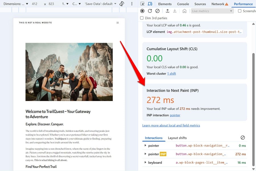
To test the impact of a misconfigured viewport meta tag on website responsiveness, we set up a trial website with a standard theme, some plugins, and some dummy content. We also replaced the default viewport meta tag with this:
<meta name="viewport" content="width=500, initial-scale=0.5" /> The live performance metrics in Chrome Developer Tools showed an INP value of 272ms, which is in the “needs improvement” territory.
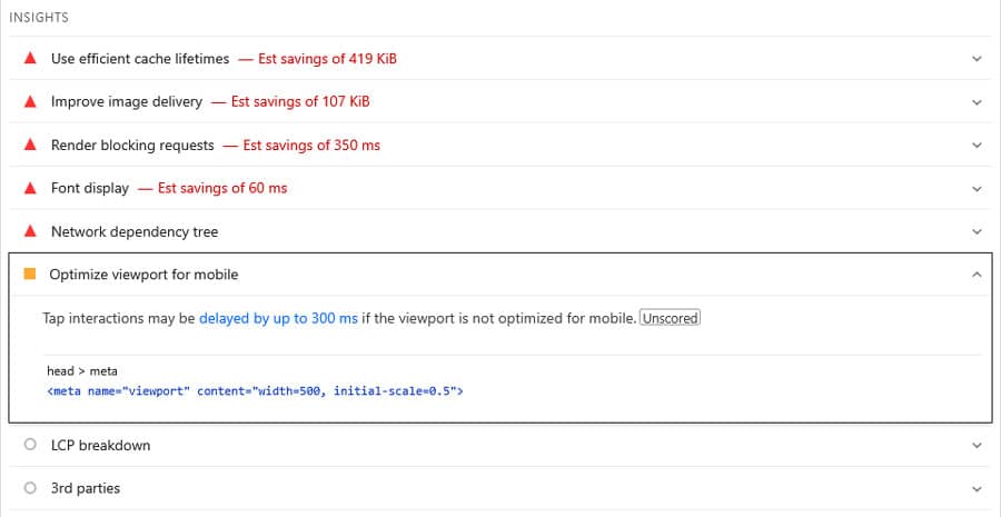
Running the site through PageSpeed Insights also showed less-than-stellar results.
In addition, the Optimize Viewport for Mobile insight was visible in the Insights section.
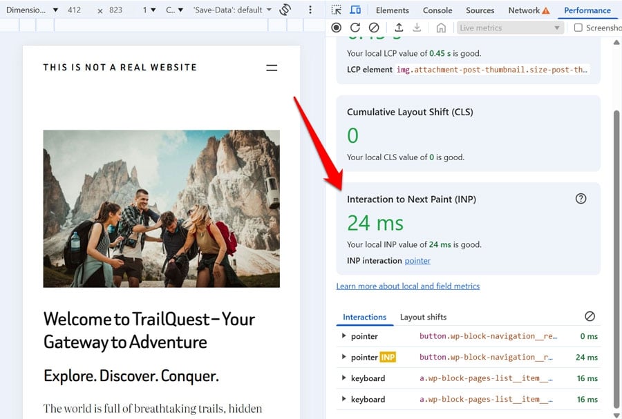
As a first step, we removed the faulty viewport tag and returned the site to a standard tag. This immediately improved the INP value. In fact, it was more than ten times faster.
In addition to that, we installed and activated WP Rocket on the website along with these features:
- Remove unused CSS
- Defer and delay JavaScript
- Lazy load images and embedded videos
- Preload fonts
This resulted in much better results in PageSpeed Insights and the Optimize Viewport for Mobile insight was no longer visible either.
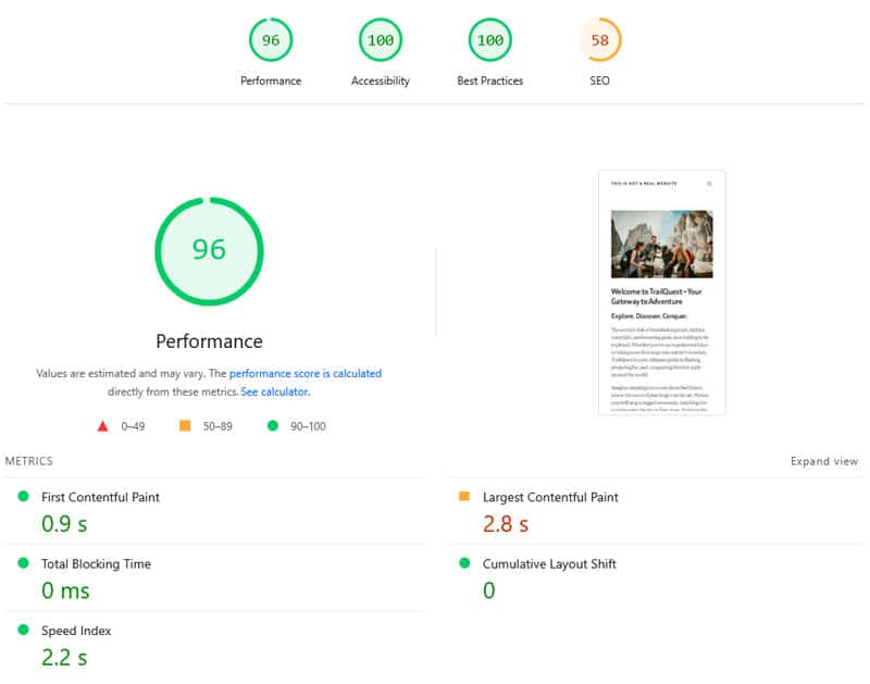
What’s awesome is that it only took a few minutes to implement. Here’s the before-and-after comparison in detail:
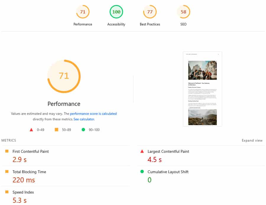
| Value | Before | After |
| Interaction to Next Paint | 272ms | 24ms |
| Mobile Performance score | 71 | 96 |
| First Contentful Paint | 2.9s | 0.9s |
| Largest Contentful Paint | 4.5s | 2.8s |
| Speed Index | 5.3s | 2.2s |
FAQs — Optimize Viewport for Mobile Insight
Finally, let’s go over some common questions related to viewport issues.
Why is my viewport not optimized for mobile?
A viewport is considered unoptimized if it fails to meet three specific conditions: the meta tag is missing, the width attribute is not set, or the initial-scale attribute is missing or set to a value less than 1.
Where should the viewport meta tag be placed?
The viewport meta tag should appear in the <head> section of your web page. For the best results, place it at the very top of the page HTML.
How does the “Optimize Viewport for Mobile” insight affect my Core Web Vitals and search rankings?
A misconfigured viewport adds a significant delay to how fast your site responds to mobile user interactions. This directly increases your Interaction to Next Paint (INP) score, a key Core Web Vitals metric and ranking factor.
Why does PageSpeed Insights flag a viewport issue but Chrome DevTools doesn’t?
This happens because PageSpeed Insights performs a static test, simply checking for the presence and configuration of the tag. Chrome Developer Tools performs a dynamic test, analyzing actual page performance in context. If the page performs well otherwise, the tool might not trigger the insight even if the tag is technically imperfect.
How do I fix a misconfigured viewport tag in WordPress?
First, identify the source: it is often hardcoded in header.php or added via a function in functions.php. Use a child theme to correct the code so updates don’t overwrite your changes.
What are other ways to improve Interaction to Next Paint besides optimizing the viewport for mobile?
You can improve INP by reducing and optimizing JavaScript on your pages, delaying non-critical scripts, shrinking the DOM size, and using lazy loading. A plugin like WP Rocket can help you implement these steps more easily.
Set Up Your Viewport for Mobile Success
The viewport meta tag may seem like a small line of code, but its impact on mobile user experience shouldn’t be underestimated. Failing to optimize it can significantly slow down page responsiveness, hurting your user experience and SEO in the process.
At the same time, the viewport tag just one step toward a high-performance mobile website. Get WP Rocket today to boost your mobile speed in minutes.