
Table of Contents
Last update on
Are you wondering how to make your website responsive? Great! Responsive design is no longer a trend; it has become a necessity.
We’ve all experienced the frustration of using a website that could be optimized for mobile, with tiny text, misplaced images, and unreachable buttons.
What do you do when you stumble upon such a site?
Leave, stop browsing, and find the information or the product you want on another site.
You don’t want this to happen to your business, and that’s precisely why your next website should have a mobile-first approach. And don’t worry if your site is already built; it’s never too late to make it responsive. We have some practical tips that can help you. Watch the video or keep reading!
What’s Responsive Web Design?
Responsive design means that the website’s content perfectly adapts to the screen regardless of the device used (smartphone, tablet, desktop, or TV). It means adjusting websites to all resolutions. It uses flexible layouts, adaptable images, and media queries to adjust the site’s design based on the screen size.
In plain English, responsive web design ensures websites look good and function well on any device.
| 💡Hints – Responsive design ensures the content smoothly transitions from desktop to mobile, maintaining usability and functionality. – The layout and content should automatically resize based on the available space on the user’s screen. |
Why a Responsive Website Matters
A responsive website is essential to ensure your site looks and functions well on any device. But it goes beyond user experience; there are a few more reasons why a responsive website matters; let’s go over the most important ones:
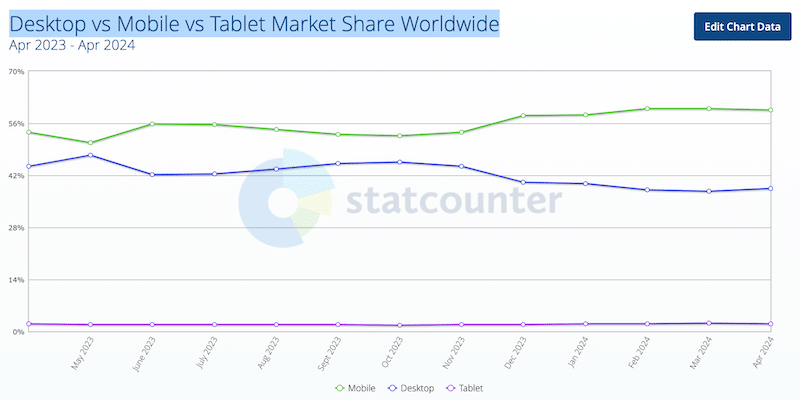
1. Mobile Users Dominate Search Engine Traffic
Mobile users dominate the market, so creating a responsive site should be your strategy’s heart. Every design should be “mobile first.” This approach starts with designing for the smallest screen size and then progressively adapts the design for larger screens.
According to Statcounter, in 2024, mobile phones will dominate, with a market share of 58%, against 40% for desktops.
2. Improved User Experience
Responsive design ensures that users have an enjoyable experience on mobile and tablets. It can lead to higher engagement, longer site visits, and increased conversion rates on mobile. As you can see in the UXcam statistics research, mobile users have high expectations in terms of design and page speed:
- 83% of consumers believe a seamless user experience across all devices is crucial.
- 85% of consumers think a company’s mobile website should be as good (or better) as its desktop website.
Google also says that:
- 75% of smartphone users expect to get immediate information while using their smartphone. That’s why you need a fast mobile site.
3. Improved Speed and SEO
Search engines like Google favor mobile-friendly websites. A responsive design can improve your site’s search engine ranking, making it easier for potential customers to find you online.
Furthermore, responsive design often leads to faster page load times on mobile devices, as it optimizes content delivery. Page speed is a ranking factor for search engines, so faster-loading pages are more likely to rank higher.
4. Optimized Social Media Advertising
If you advertise on social media, most of your traffic will likely come from mobile users. Your landing page should be responsive and display well on mobile; otherwise, the user will leave, and you’ll have invested all this effort in marketing for nothing.
How to Check if Your Website is Responsive (6 Easy Tips)
Would you like to know if your site is responsive? To make sure your website is responsive, you need to check how your site looks on different devices. Here are six easy tips you can follow:
- Resize browser window: Manually adjust the size of your browser window to see if the layout adapts to different screen sizes.
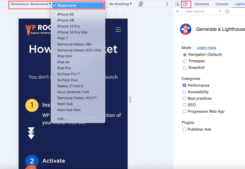
- Use browser developer tools: Most browsers have built-in tools (like Chrome’s DevTools) to simulate various device screens.
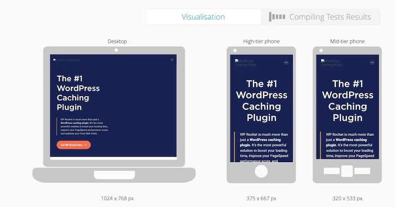
- Use online responsive testing tools: To check responsiveness, use tools like Responsinator or mobiReady. Simply add the URL of your site, and then you can visualize how the content looks on different screens:
- Test on real devices: Load your website on smartphones, tablets, and desktops and try to perform several scenarios.
- Go over the “touch” elements: Make sure links, buttons, and other interactive elements are easily tappable on touch screens.
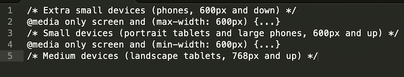
- Look for breakpoints: Confirm that your CSS media queries are correctly applied at different screen sizes. For example, look into your code, and you should see several rows for each device:
So, how is your website doing? Have you tested it? If you feel that the content and layout were not smooth when you changed the resolution, you may need to make a few adjustments. That takes us to the next part: how to make your website more responsive.
How to Make Your Website Responsive
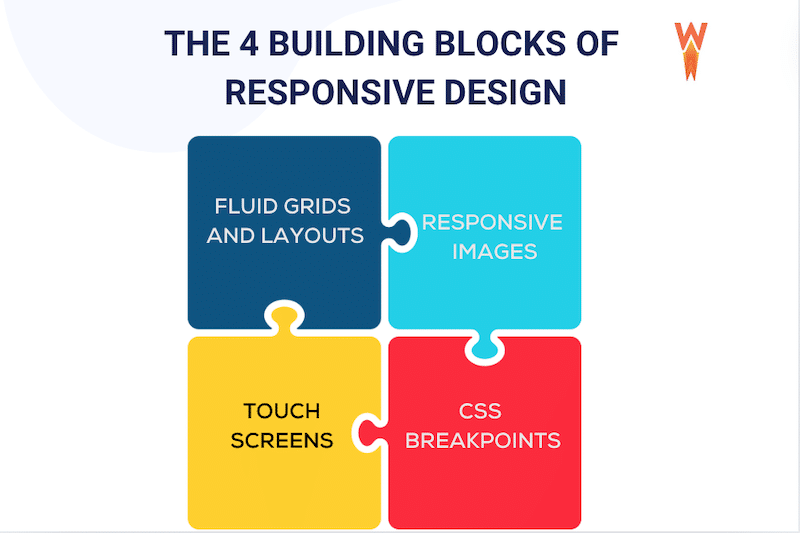
To make an already-created website responsive, you must implement the four key building blocks of responsive design. This section explains what a website needs to become responsive.
The 4 Key Components of Responsive Design
Responsive design might initially seem challenging, but we’ll go through each component so you can understand the basics. Here’s a quick overview before we dive into the details:
- Serve responsive images: Learn how to adapt images to different screen sizes with the “srcset” attribute.
- Consider touchscreens: What works on a desktop may not work on a mobile.
- Create fluid grids and layouts: Your layouts should display properly on any device.
- CSS breakpoints (or Media query breakpoints): Discover how to apply styles for different screen widths.
Let’s break each component down!
1. Responsive Images
The main idea is to use images that scale perfectly for different screen sizes and resolutions. To do so, you need to use the “srcset” attribute, which specifies the list of images to use in different browser situations.
So, to make an image responsive, you can write something like this:
<img
  srcset="black-cat-480w.jpg 480w, black-cat-800w.jpg 800w"
  sizes="(max-width: 600px) 480px,
         800px"
  src="black-cat-800w.jpg"
  alt="a cute black cat" />
Here’s the code breakdown:
- An image filename (black-cat-480w.jpg)
- The Scret attribute, which tells the list of images available
- The Size attribute defines a set of media conditions (e.g., screen widths) and indicates what image size should be chosen when certain media conditions are true.
- A media condition (max-width:600px) describes a potential screen size and means “when the viewport width is 600 pixels or less displays this specific picture size”.
2. Consider Touchscreens
When making a website responsive, consider touchscreens. Almost all mobile devices use touch input to perform actions.
For example, imagine that you have a call to action button in the hero header. On the desktop, the button is prominent and easily clickable. Now, how will it look on mobile? On mobile screens, you should make smaller elements like buttons easy to detect and select.
3. CSS breakpoints (or Media Query Breakpoints)
A breakpoint in responsive design is the point at which a website’s content and design adapt to provide the best possible user experience. Breakpoints are pixel values defined in CSS, and when a responsive website “reaches” these values, transformations occur to ensure the website remains visually appealing across different devices.
For example, Breakpoints can show or hide some elements, change the font size, or modify the global site’s layout.
| 💡Hint: Breakpoints prevent content or images from being distorted, cut off, or obscured. |
However, it would be almost impossible to have breakpoints for every screen and resolution, so here are the most common breakpoints used in device resolutions on desktop, mobile, and tablet:
- 1920×1080 (8.89%)
- 1366×768 (8.44%)
- 360×640 (7.28%)
- 414×896 (4.58%)
- 1536×864 (3.88%)
- 375×667 (3.75%)
Best Practices for Adding Responsive Breakpoints
- Mobile-First approach: Start designing for smaller screens and then scale up for larger ones. This simplifies the process and prioritizes the core functionalities. Expanding a mobile design for desktops is also easier than the reverse.
- Use media queries with min-width or max-width to tailor your code to specific screen sizes.
- Reduce friction: Implement fluid layouts and remove unnecessary elements to reduce clutter and improve user experience.
- Prioritize key menu options.
- Simplify forms.
- Highlight primary calls-to-action (CTAs).
- Improve search and filter functions on mobile.
- Content-Driven breakpoints: Base breakpoints on content needs rather than specific device sizes. Adjust layout when content requires it for the best display and usability.
- Use your data: If you want to check the breakpoints based on the most popular devices that access your website, you can do this on Google Analytics from Audience > Technology > Browser & OS > Screen Resolution.
4. Create Fluid Grids and Layouts
A fluid grid layout allows you to create different layouts for various devices, such as desktops, tablets, and mobile phones. Fluid grids are divided into columns with scalable heights and widths, ensuring text and elements adjust based on the screen size. This approach keeps the site visually consistent across devices.
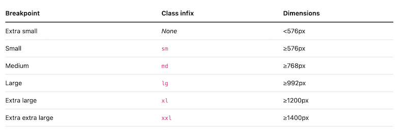
For example, you can use CSS Grid or frameworks like Bootstrap to create designs that stretch or shrink without breaking the structure. For reference, Bootstrap includes six default breakpoints:
So, to create a responsive site, you’ll need to create a fluid grid with Bootstrap, for example. Here is an example below:
// X-Small devices (portrait phones, less than 576px)
// No media query for `xs` since this is the default in Bootstrap


// Small devices (landscape phones, 576px and up)
@media (min-width: 576px) { ... }


// Medium devices (tablets, 768px and up)
@media (min-width: 768px) { ... }


// Large devices (desktops, 992px and up)
@media (min-width: 992px) { ... }


// X-Large devices (large desktops, 1200px and up)
@media (min-width: 1200px) { ... }
The 5 Responsive Design Challenges (+ Solutions)
Responsive design requires specific techniques and good coding skills. We’ve listed the five most common challenges in building a website that looks great on mobile, along with their solutions.
1. Navigation Issues
Problem: Navigation menus must scale to different screen sizes without altering their structure. Inconsistent navigation can confuse users and disrupt the brand experience.
Solution: Focus on the information architecture to ensure accessibility on all devices. Use data to design effective navigation and conduct responsive testing on multiple devices to increase accessibility before launch.
2. Visual Rendering on Different Devices
Problem: Elements like padding and margins may look good on desktops but appear poorly on mobile devices (e.g., too much white space on Desktop and none on mobile)
Solution: To maintain uniformity across devices, use percentages instead of fixed pixel values for height and width. We also recommend testing how your site looks on different browsers and devices.
3. Scalable Images May Lose Details and Quality
Problem: Scaled images lose quality and clarity, leading to a poor user experience.
Solution: Crop images and use percentages for width and height instead of fixed pixel values. It ensures that images adjust appropriately according to the device. Use a powerful image optimization plugin like Imagify, which does not impact image quality but significantly reduces file size.
4. You Need to Have Coding Skills
Problem: Responsive design requires some coding knowledge. For instance, understanding CSS and Bootstrap is essential for creating a fluid grid or adding the “srcset” attribute to images.
Solution: Use the WordPress Editor or choose a theme or page builder to build a responsive site directly without extensive coding.
| 📖 Check our 12 best responsive themes for WordPress. |
5. Impact on Performance
Problem: Responsiveness can sometimes slow down your web pages because they contain more content and experience increased traffic from both desktop and mobile devices.
Solution: Eliminate bandwidth-heavy elements like large images, videos, and GIFs. Optimize your images and code and implement caching. (The next section will tell you everything you need to know about performance.)
Don’t Forget to Make your Website Blazing-Fast
Responsive design involves more code and assets to accommodate various devices. However, when executed properly and combined with a few speed optimization techniques, responsive design can improve loading speeds.
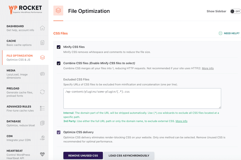
If you are looking for a code-free way to boost the performance of your responsive site, you can use a WordPress performance plugin like WP Rocket. Upon activation, it applies 80% of the performance best practices and does all the heavy lifting for you. All you need to do is check a few boxes from the intuitive interface in the WordPress admin.
For example, here’s how WP Rocket can help you improve the performance of your responsive site:
1. Implement Caching Automatically
WP Rocket stores frequently accessed website data closer to users, making pages load faster because they don’t have to fetch everything from scratch every time.
2. Optimize Your Responsive Code
Code optimization is essential for a responsive site, as it has even more code. This technique involves cleaning up the website’s code to improve performance and efficiency. It can be done through four main methods:
- CSS and JS minification: Minifying code involves removing unnecessary stuff, like extra spaces and comments, from HTML, CSS, and JavaScript files. It makes the files smaller and quicker to download, so your website loads faster for visitors.
- Reduce unused CSS: This process removes all unneeded CSS and stylesheets while keeping only the used CSS for each page.
- Defer JavaScript: This is like telling your browser to prioritize the content that needs to be loaded right away before running specific JavaScript code. As a result, essential elements like images and text appear first.
- Delay JavaScript: By delaying, you hold off on loading specific JavaScript until it’s needed. It prevents non-essential scripts from slowing down the initial page load.
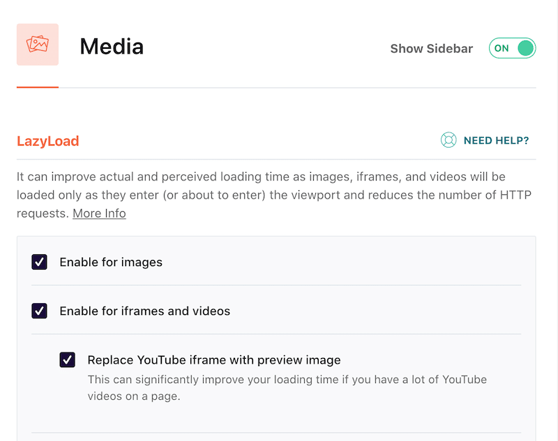
3. Add Lazy Loading on Images
Instead of loading all the images and videos on your page simultaneously, lazy loading waits until you scroll down to them. This technique saves time and data because the browser only loads the media you need at that moment, making the page load faster.
Wrapping Up
In conclusion, responsive design ensures that websites adapt seamlessly to various devices, providing users with an optimal browsing experience. We’ve discussed the importance of responsive design and provided tips on building fast, responsive sites using caching, minifying code, and lazy loading.
By incorporating these speed optimization techniques into responsive design, you can maintain fast loading times across different devices, improving user satisfaction and engagement. With plugins like WP Rocket, these optimizations become accessible to everyone, regardless of coding skills.
WP Rocket also offers a 14-day money-back guarantee, ensuring you can try out the plugin risk-free!