
Table of Contents
Last update on
You’re probably reading this blog post on your phone.
Optimizing your WordPress website for mobile is key to connecting with your audience, and that’s why you should care about WordPress mobile optimization. But what if your website is slow when accessed from mobile devices? What are the ways to speed up your site from mobile?
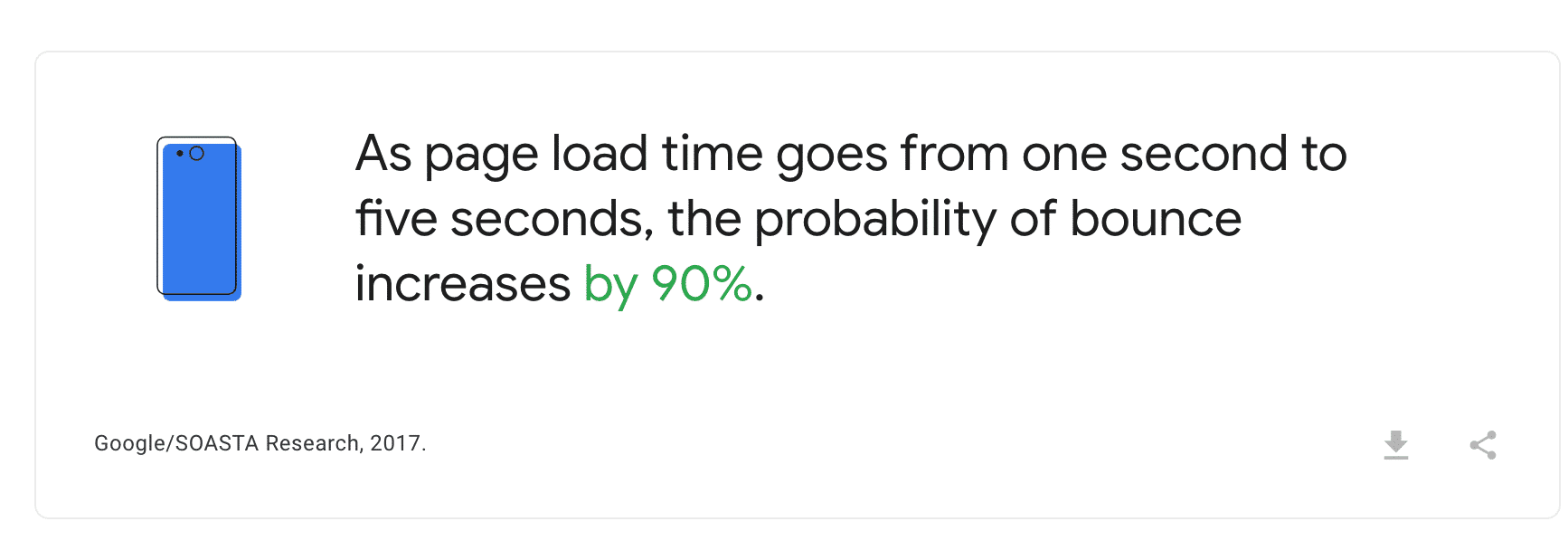
Google says that if your website takes more than five seconds to load, 90% of your mobile users may leave your site immediately. And if you have invested a lot of effort to drive traffic to your website, it’s a shame that visitors won’t even take the time to interact with your content. That’s money down the drain!
In this article, we’ll give you some performance tips for speeding up your WordPress mobile site, including the best way to optimize your content for a mobile device. We’ll show you how to make browsing easier for everyone regardless of the device your visitors are using. This will ensure a first-class mobile user experience and a smart optimization of your mobile site on WordPress, even with a plugin. Making your mobile website faster is a great way to fix some common WordPress issues affecting your traffic, engagement, and conversion rates.
How to Test Mobile Page Speed
The first step before improving the speed of your mobile site is to measure its current performance, which is also a crucial step of a WordPress pre-launch checklist about speed. You need to assess the health of your website and the overall speed experienced by mobile users.
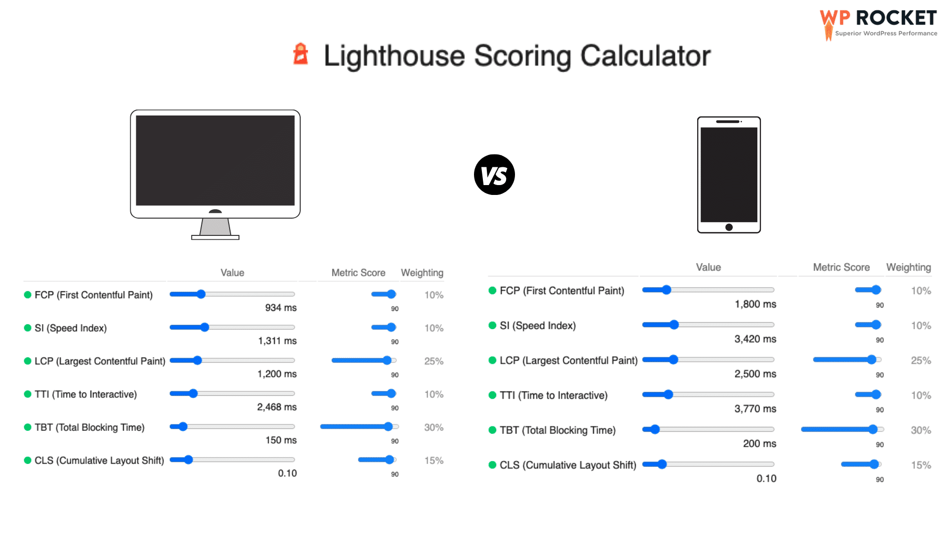
To conduct such an audit, we recommend you use the Lighthouse technology. Lighthouse provides easy insights into your site’s performance both for desktop and mobile. It’s worth mentioning that the metrics have different thresholds between mobile and desktop:
Let’s dig into the tools available on the market to measure performance on mobile pages.
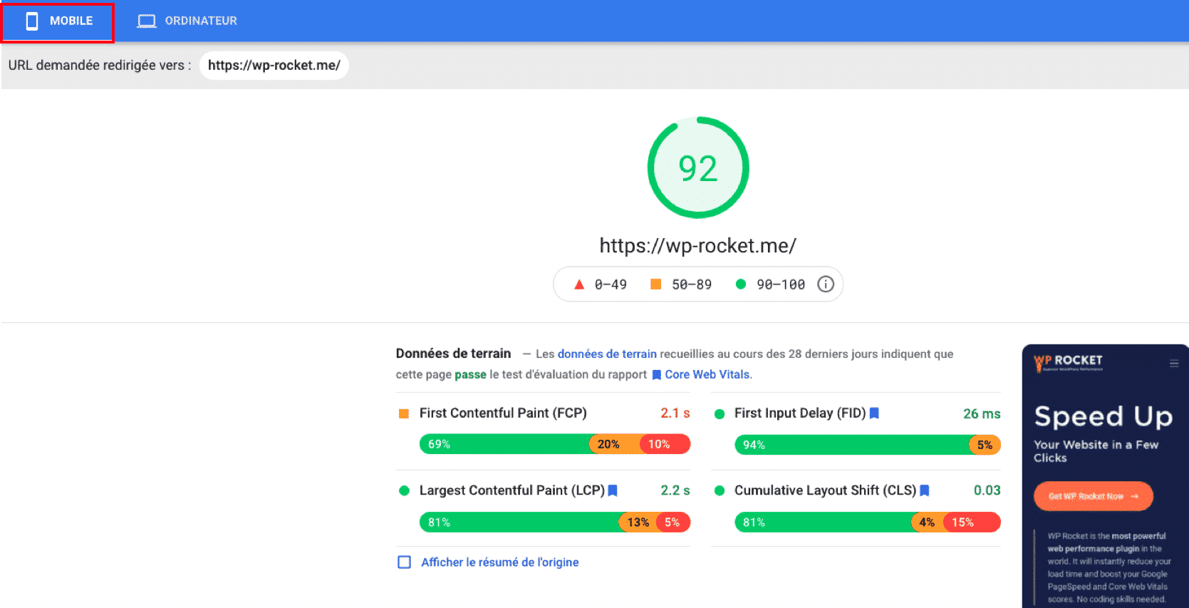
PageSpeed Insights is a Google SEO tool that can measure and analyze the loading time of any URL.
To get a good PageSpeed Score for mobile, make sure that your indicators are in the following thresholds:
| Metrics – Weight | Good (green) | Average (orange) | Bad (red) |
| First Contentful Paint – 10% | 0- 1.8 s | 1.8 s – 3 s | > 3s |
| Speed Index – 10% | 0 -3.3 s | 3.3 – 5.8 s | > 5.8 s |
| Largest Contentful Paint – 25% | 0 – 2.5 s | 2.5 s – 4 s | > 4 s |
| Time to Interactive – 10% | 0 – 3.8 s | 3.8 s – 7.2 s | > 7.2 s |
| Total Blocking Time – 30% | 0 – 200 ms | 200 – 600 ms | > 600 ms |
| Cumulative Layout Shift – 15% | 0 – 0.10 | 0.10 – 0.25 | > 0.25 |
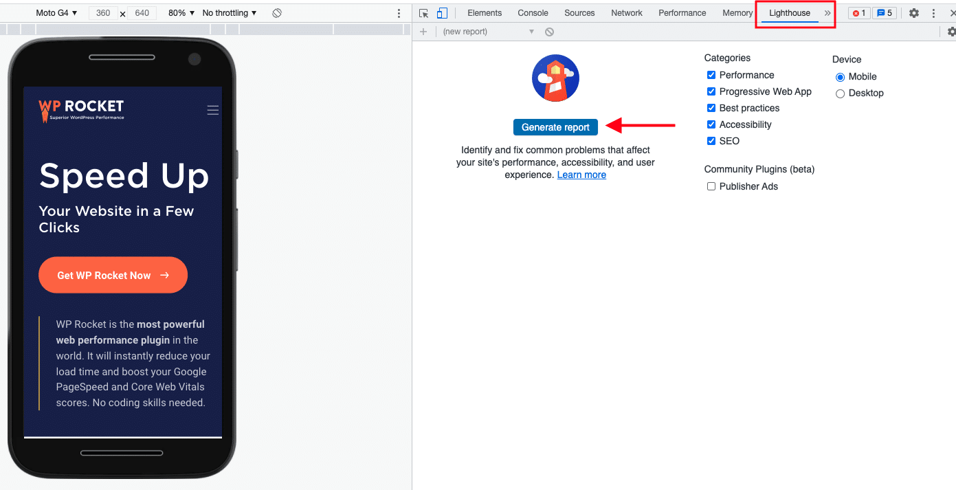
You can also generate your mobile performance report using the Chrome Dev Tool directly from the Chrome browser. Follow the steps below to launch the mobile report:
- Go to your website
- Open the “developer tools” from the top menu
- Select the “Lighthouse” tab
- Check the ”Mobile” box under the “Device” section
- Click on the “Generate Report” button.
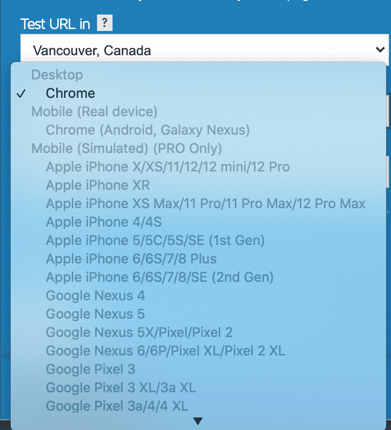
GTmetrix is a free tool to test your page’s performance on the desktop. However, you need a PRO account to check the performance on mobile. Powered by Lighthouse, it generates scores for your pages and offers actionable recommendations.
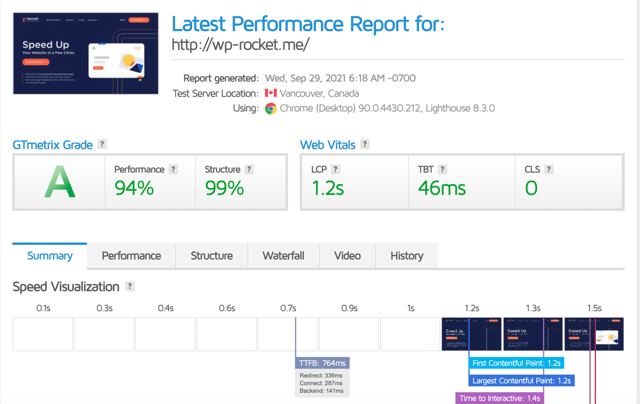
Many devices are available. It may be useful to go PRO to check your website on a few different mobile devices.
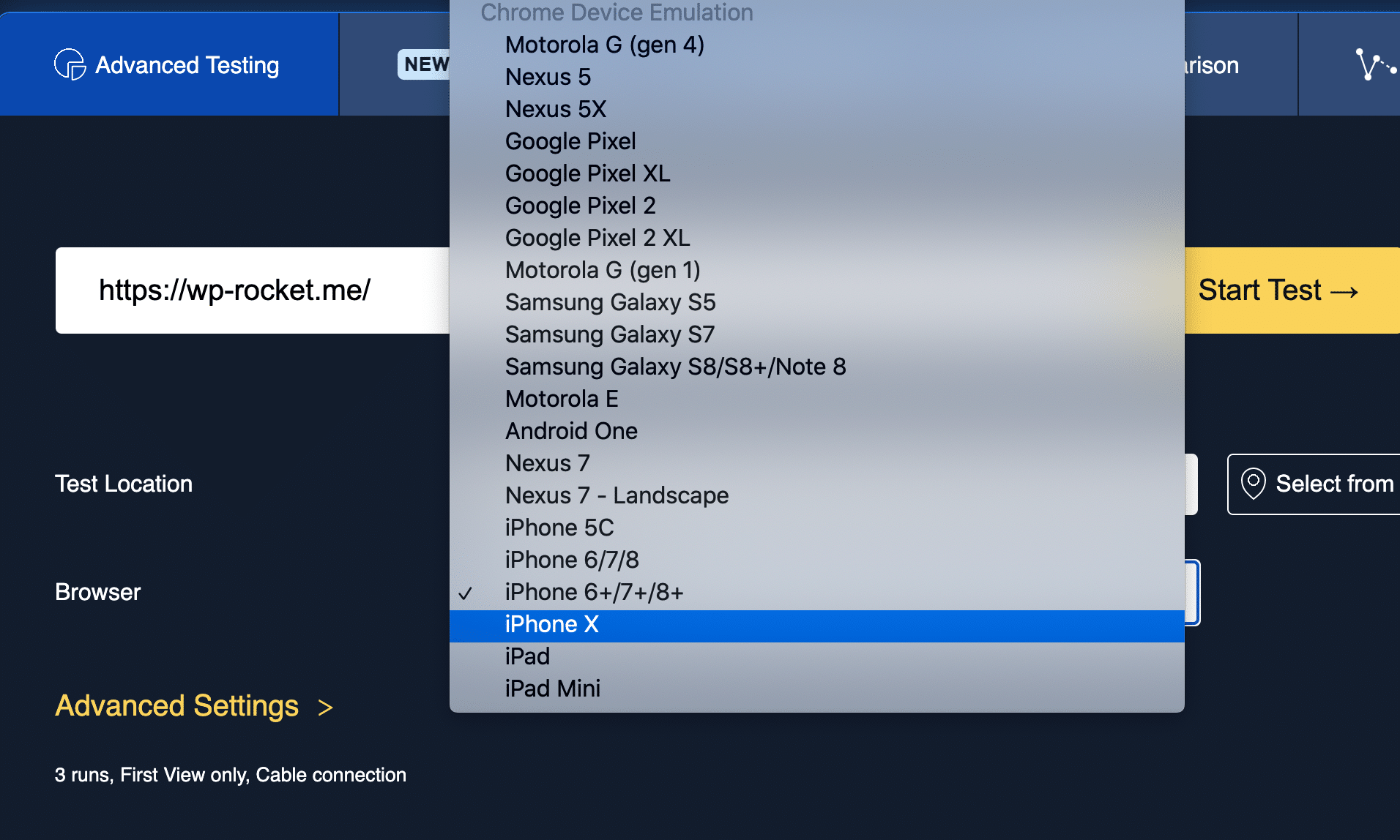
Webpagetest is a free tool that can help you identify slow-loading mobile pages on your WordPress site and fine-tune it to be as fast as possible.
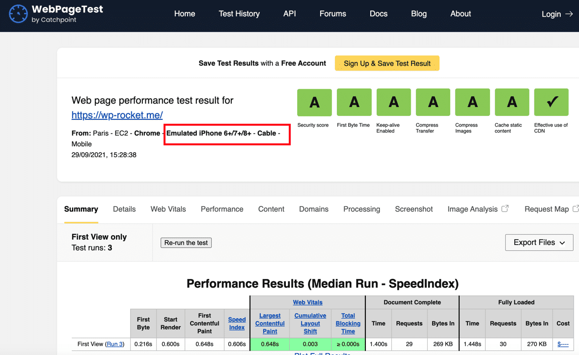
WebPageTest allows you to test your site from many mobile devices:
It’s a very user-friendly tool to test your WordPress site on mobile and in multiple locations. This is very important if you want to know how your mobile site is doing in the US and Australia!
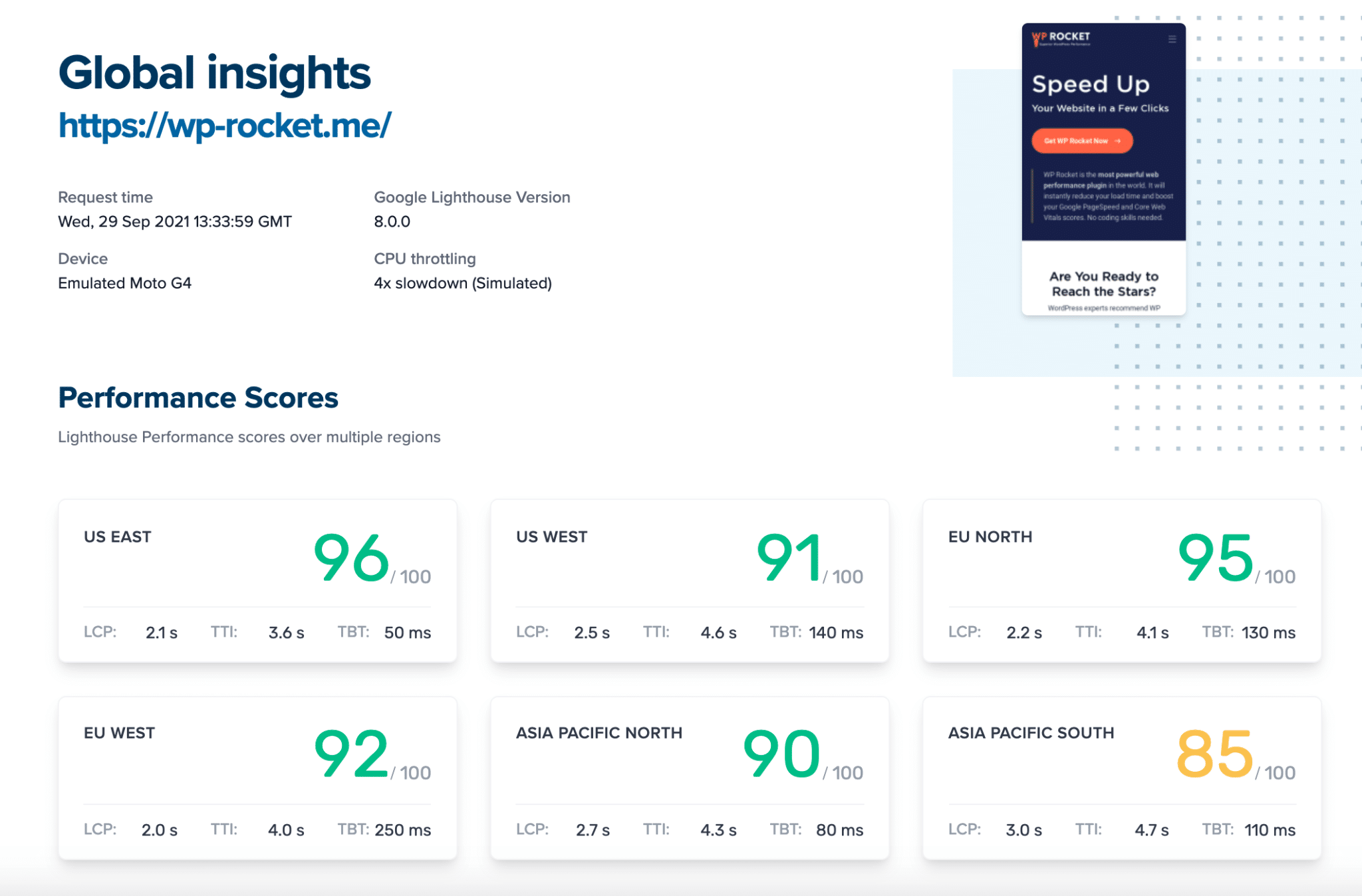
All you need to do is select a region and run the report accordingly.
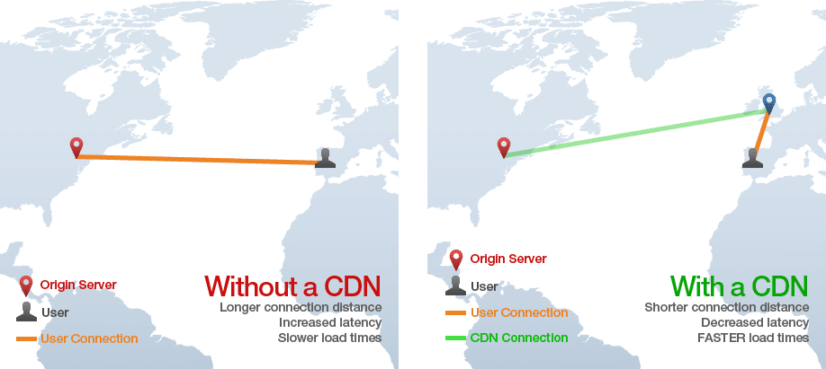
| 💡 If you notice that a region is slower than another, you may want to try our RocketCDN. A CDN improves loading times for people who are far away from your web servers. |
Why Is Your WordPress Site Slow on Mobile? (Common Reasons)
1. Mobile is different from desktop
Difference #1: Smartphone processor vs. Desktop processor
Mobile processors are generally designed for efficiency first, and performance comes in second. Mobiles have a weaker CPU architecture than desktops. Meaning they are less powerful in terms of speed processing.
Difference #2: The networks speed (network latency)
The bandwidth of a network refers to how quickly information can be transferred from a point to another. This speed is commonly measured in Megabits (Mbps).
A high Mbps number means that more traffic can flow through the connection without interruption. Network latency is the time it takes for the data to be sent to the network. Usually, mobile networks have a more important network latency than desktops.
2. You are not serving images optimized for mobile
Images are often the culprit for slowing down your WordPress site. They need to be optimized specifically for mobile devices. To make content readable on small screens, images need to be proportionally sized down.
3. You didn’t enable mobile caching
Websites are often full of data that need to be loaded with images and videos. And sometimes, this can take a while! Caching will automatically make these elements available, so you don’t have to wait when viewing the page again in the future—saving time for yourself on slower connections or mobile devices.
4. You use sliders, preloaders, or animations
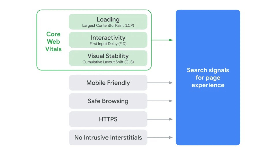
A layout or design instability can negatively affect mobile users, especially if they are not expecting it. Too many sliders and animations can slow down pages, impact SEO and conversion rates. Google will penalize your site with a bad CLS (Cumulative Layout Shift) score in case of a sudden layout shift. This Core Web Vital will impact your final user experience score and affect your SEO visibility and traffic.
5. You installed too many plugins
Installing new plugins can affect your mobile site’s speed, and too many of them can also lead to security breaches and low performance. Plugins may slow down your site by making additional HTTP requests and adding DB queries. Some plugins require custom styling or scripts, resulting in extra JS files being loaded onto the page and CSS files.
6. Other reasons why your mobile may be slow
Layouts are the key element of every website: the browser figures out the size and location of the elements on the page. Without them, you’ll have no way to organize your content or create appealing layouts for users. If you have a lot of elements to load and heavy JS, it will take a while for the browser to figure out the locations and dimensions.
Another low-performance culprit is your dependency on 3rd party scripts such as trackers, visitor sessions, external services – such as Instagram feed.
Do you recognize your mobile website as one of those issues? It’s OK! Stay with us, and let’s see how to optimize the speed of your website when accessed on a mobile.
How to Optimize Your WordPress Mobile Site For Speed
We have listed all the techniques for WordPress mobile optimization to improve your mobile score on Google PageSpeed Insights. Let’s dive into the speed optimization tips to boost your mobile WordPress site.
1. Use a Responsive WordPress Theme
A responsive WordPress theme will make your site look as good on a mobile phone or tablet, no matter what kind of device it’s being viewed through.
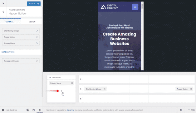
How to know if the theme or the page builder is responsive?
- Check the customizer or the options of your theme. For example, the Astra theme offers a mobile view when building a custom header:
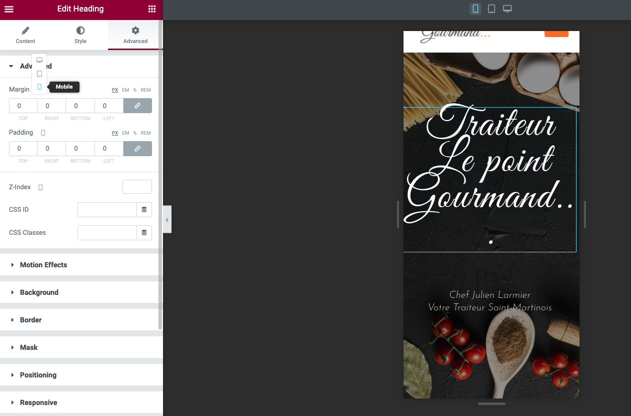
- Start building your page and see the options offered by your page builder. Divi or Elementor page builders have this type of responsive section.
| Build your design on mobile using the Divi Theme | Ability to change the size, padding, and margin for each device on Elementor |
 |  |
2. Enable Mobile Caching
Mobile caching is a common technique to reduce the load on an application and its servers. For these apps and games to run smoothly at high speeds, there needs to be some form of caching – aka “stored local data” – so that they don’t need constant download requests. The goal is to reduce bandwidth usage, network perceived lag, and even battery consumption.
✅ Looking for the best WordPress plugin for mobile optimization? The WP Rocket performance plugin implements a mobile cache by default when you activate the plugin.
✅ Have a look at our list, gathering all the best WordPress cache plugins.
3. Optimize Images for Mobile
Image optimization for mobile is the process of creating and delivering high-quality images in a format that will increase user engagement on their phone.
We recommend you follow the following techniques to make sure your images are well optimized on mobile:
- Resize images to save bandwidth: 640 by 320 pixels are usually a good standard to follow. You can also keep the “4:3 aspect ratio” as a rule of thumb for your images on mobile.
- Compress images to make your files smaller: find the right balance between the quality and size of the image. The quality is not compromised in our example below, but my file size went from 517 KB to 70.3 KB!

- Choose the correct file format: WebP is the best image format you can use on mobile (and on desktop). It provides superior lossless and lossy compression for images on the web. The graph below shows the file size after compression.
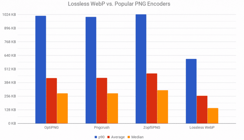
What we can conclude:
- WebP offers 25% smaller file sizes than PNG and JPG – with the same quality
- WebP loads faster (due to file size) than PNG or JPG images.
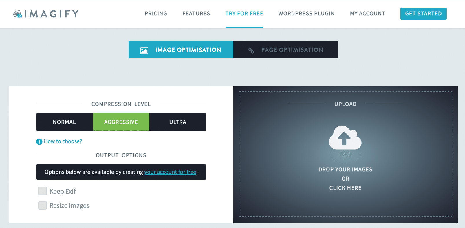
✅ When it comes to getting a crucial WordPress plugin for mobile optimization, Imagify comes in handy. The main features include all the image optimization best practices we just listed:
- Resize and compress mobile images in bulk or one-by-one without losing quality
- Convert all your files automatically to WebP
🧪 What about taking Imagify for a test drive? It’s free for around 200 images a month.
✅ We also have a full list of the best plugins you can use to optimize your images. Feel free to check it out.
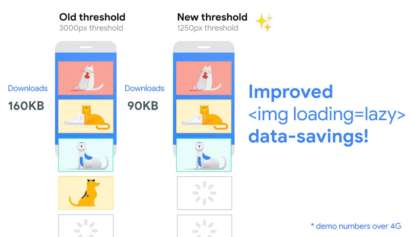
4. Implement Lazy Loading on Your Images and Videos
The last key of image optimization is to lazy load your images and videos on mobile. The lazy loading script delays the loading of an image that is not being viewed by the visitors yet.
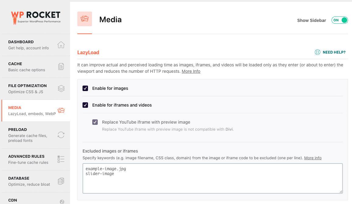
✅ Use the free Lazy Load by WP Rocket plugin to Implement lazy loading on your images and videos.
Important note: if you are already a WP Rocket user, you don’t need this plugin. The lazy load feature is already included:
✅ We also have a full list of the best plugins you can use to implement lazy loading.
5. Optimize Image Delivery With a CDN
Optimizing image delivery is a key step in improving mobile page speed. You may need multiple servers to increase the speed of your rendered data anywhere in the world. This is exactly what a CDN is doing.
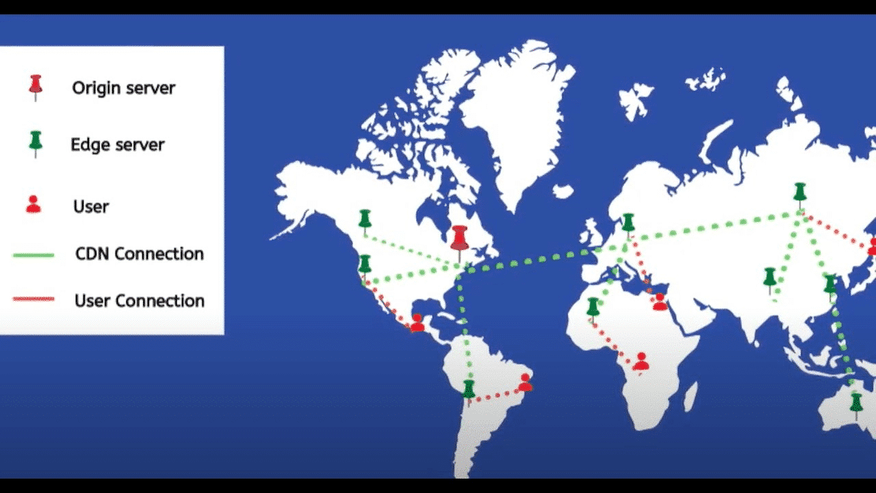
✅ Use RocketCDN to optimize the delivery of your images on mobile.
6. Improve Time To First Byte
The idea is to display something ASAP to the visitors on mobile, so they don’t perceive your website as slow. It’s all about making a first good impression.
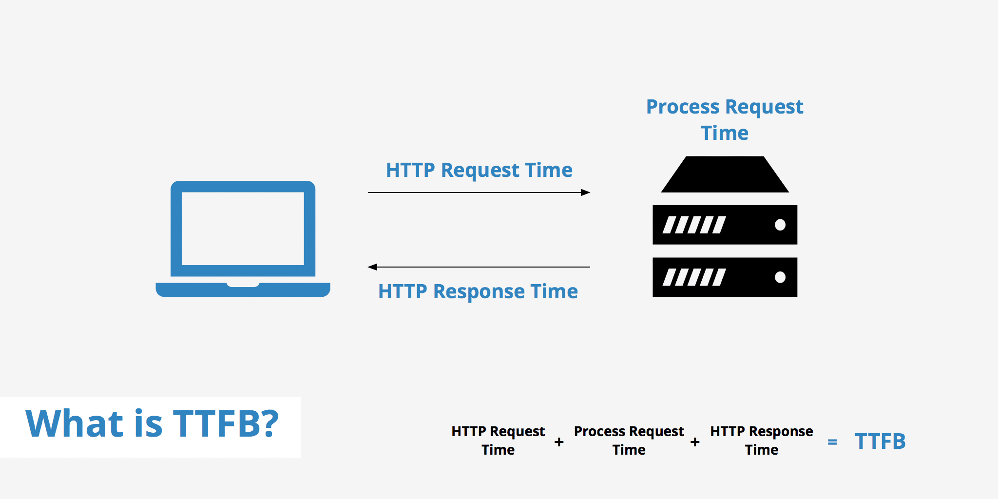
You need to have a fast hosting provider supporting Gzip compression if possible and a cache plugin to reduce the server processing time.
A plugin like WP Rocket can help you clean your database, activate Gzip compression, cache your pages, and much more.
✅ Use WP Rocket to reduce TTFB.
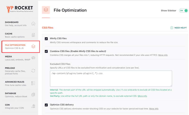
7. Eliminate Render-Blocking Resources (JS and CSS)
When PSI tells you to eliminate render-blocking resources, it means that you should avoid loading unnecessary resources at the top of your site’s code. If you have a lot of useless JS and CSS there, it will take longer for browsers to render the visible part of your mobile site.
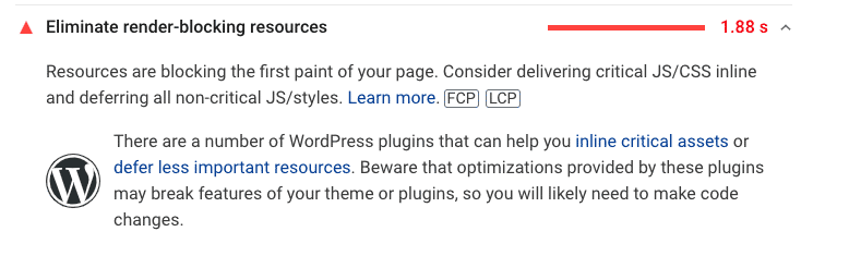
The solution is to deliver critical JS and CSS inline and defer all non-critical JS and styles. You can also remove the unused code to save some extra loading time. In other words, you need to prioritize what the browser will load first.
✅ WP Rocket can help you to load JS deferred and remove unused CSS:
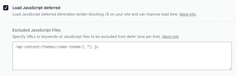
You can also delay JS execution, which is often one of the main culprits for a slow mobile site:
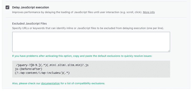
✅ If you don’t feel like using a WordPress plugin, you can use the defer and async attributes and apply the tags yourself.
8. Reduce Page Weight
A lighter page will be quicker to load on mobile. A heavy page will generally be caused by videos, images, scripts, styles, and fonts. The best way to reduce your page weight is to optimize your images, implement text compression (GZIP) and combine/minify the code.
✅ WP Rocket is the easiest way to implement GZIP, to minify and compress CSS and the JS files in a few clicks.
9. Get Rid of Whatever Might Challenge Mobiles (When Possible)
Avoid using any sliders, animation, preloaders, or pop-ups for your mobile visitors. If you want all those elements to load, then you’ll end up with an increased page size, load time, and a higher number of HTTP requests. Keep it simple and opt for static images instead by trying to cache data locally.
Even the Google Page Experience relies on Visual Stability, Mobile Friendliness, and Intrusive Interstitials. If you want your ranking to be good, don’t use unnecessary heavy elements like layouts, properties, and JS on mobile.
10. Have Your Full-page Cache Delivered Through CDN
On top of caching, you can use a Content Delivery Network service, just like Cloudflare APO’s service. As we explained earlier, a CDN means that a visitor is never too far from your servers, no matter where he is in the world. Imagine that your page takes 1 second to load in Paris, 2 seconds in New York, and 4 seconds in Sydney. If you use a CDN, the page should load equally no matter where the mobile user is.
11. Manage and Display your Ads Properly
Try to never display any ads above the fold and lazy-load them until they reach the viewport. In other words, it means serving ads a bit later and only when it’s necessary.
You should also build responsive ads to display them well on mobile with a responsive C-T-A, so users feel like interacting.
✅ Use a plugin like Advanced Ads Pro to control when and where to display your ads on mobile.
It’s time to apply all the techniques!
How to Optimize Your WordPress Site for Mobile with a Plugin
Let’s see how WP Rocket, one of the best caching plugins, allowed us to improve our mobile PSI score.
Before we start, we recommend you read our detailed guide about how to test WordPress site performance.
Performance Tools & mobile KPIs we are measuring:
- Google PageSpeed Insights (Core Web Vitals, Speed Index, Total Blocking Time, First Contentful Paint, and Time To Interactive)
- WebPageTest (Fully loaded time and the number of HTTP requests)
The test site:
An advanced test site built with Astra with many images, a YouTube video, and an Instagram feed.

The scenarios:
- Scenario #1 – My test site – no WP Rocket
- Scenario #2 – My test site – 🚀with WP Rocket
- Scenario #3 – My test site – 🚀with WP Rocket + Optimizing images for mobile (Bonus)
Scenario #1 – My Test Site – no WP Rocket
First of all, let’s see how my site is doing on mobile without conducting any optimizations. The first conclusions are not so great: my Core Web Vitals are red and orange, and my overall performance score is 35/100.
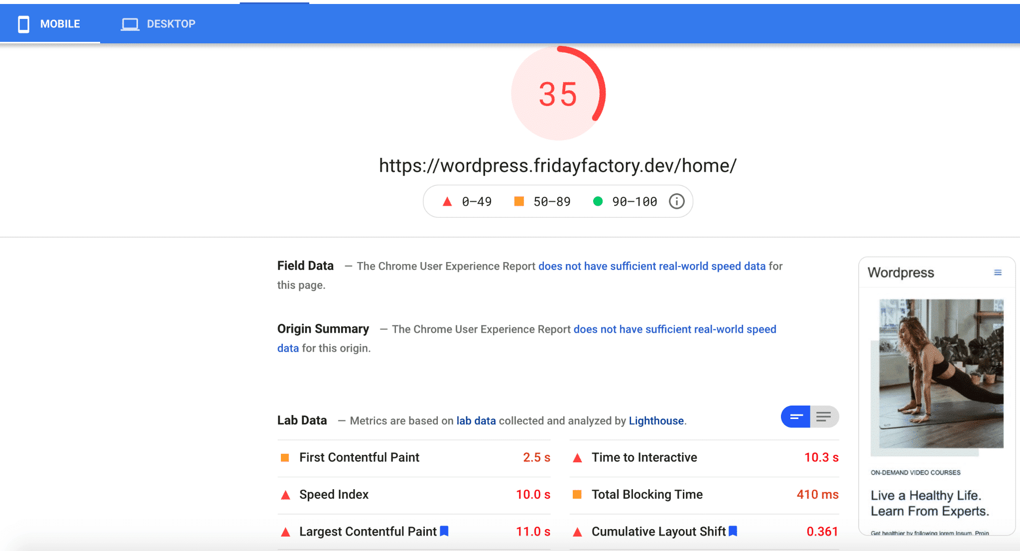
| KPIs (mobile performance) | Scores (no WP Rocket) |
| Overall grade | 35 |
| FCP | 2.5 s |
| SI | 10 s |
| LCP | 11 s |
| TTI | 10.3 s |
| TBT | 410 ms |
| CLS | 0.361 |
| Fully loaded time | 7.822s |
| HTTP requests | 62 |
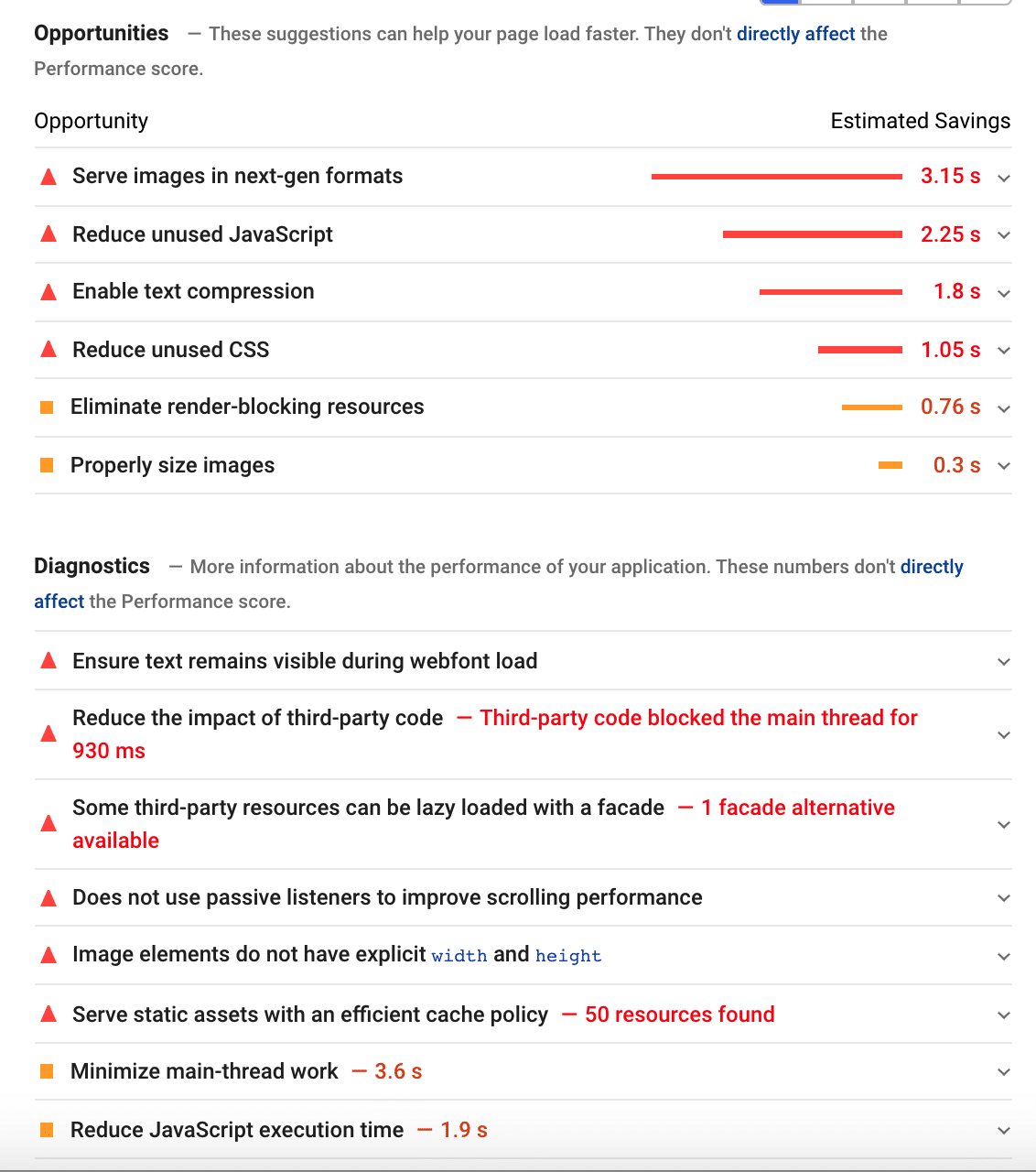
What’s more, I have a total of 12 issues flagged by Lighthouse. All of them are linked to mobile optimization:
- Wrong format and size for the images
- Too much-unused code
- Urgent need for a cache plugin
- Enabling Gzip compression.
- Last but not least, some issues with the third-party resources (YouTube) that need to be lazy-loaded.
That takes us to our second scenario.
Scenario #2 – My Test Site – 🚀with WP Rocket
My website is doing much better with WP Rocket. My score went from 35/100 to 87/100 on mobile! My Core Web Vitals are in the green except for my CLS, which needs a bit more work.
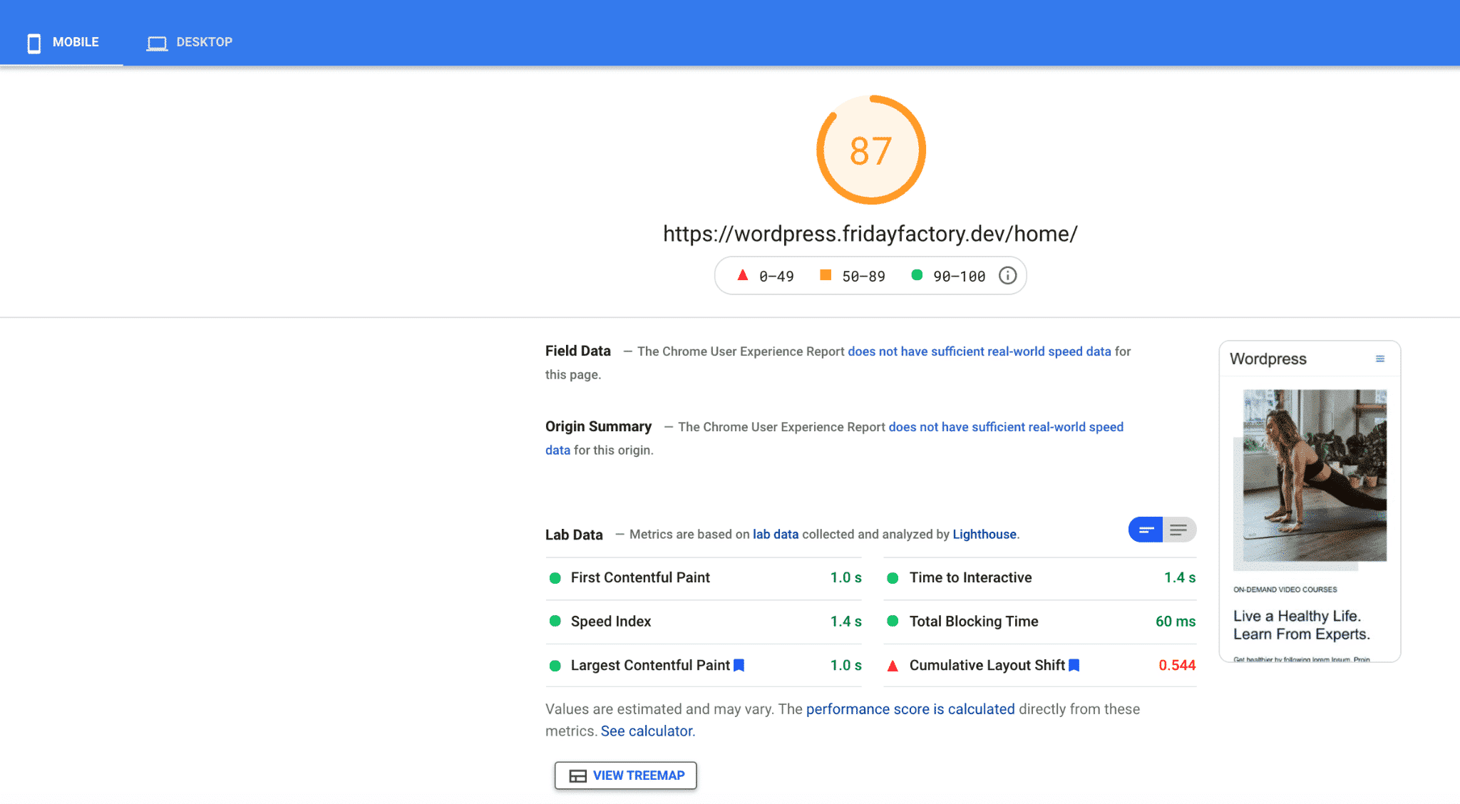
| KPIs (mobile performance) | Scores (no WP Rocket) | Scores (🚀WP Rocket) |
| Overall grade | 35/100 | 87/100 |
| FCP | 2.5 s | 1 s |
| SI | 10 s | 1.4 s |
| LCP | 11 s | 1.0 s |
| TTI | 10.3 s | 1.4 s |
| TBT | 410 ms | 60 ms |
| CLS | 0.361 | 0.544 |
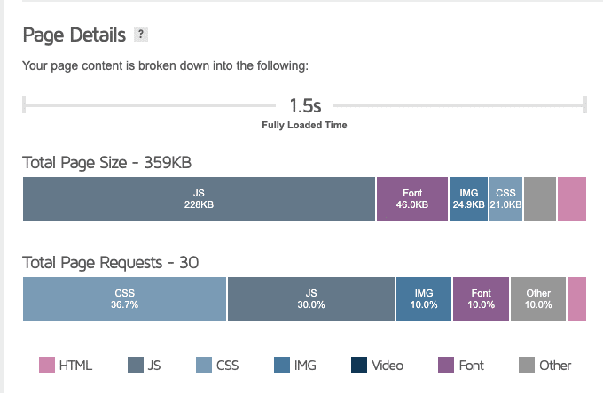
| Fully loaded time | 7.822s | 1.204 s |
| HTTP requests | 62 | 8 |
As for the issues previously flagged by Google, WP Rocket resolved most of them. All the JavaScript, CSS, Gzip compression, lazy loading, and cache problems are now fixed.
As you can see below, the only remaining issues are the ones leaning towards image optimization:
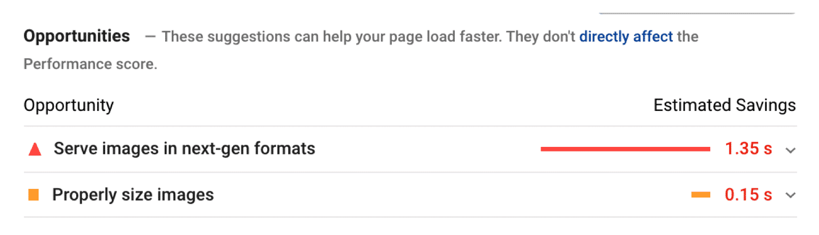
Scenario #3 – Optimizing Images for Mobile (Bonus)
The only issues left on my website are image-related. I’ve used the Imagify plugin to optimize my images on mobile.
I’ve done two main things:
- Properly sized images for mobile (resizing and compressing them)
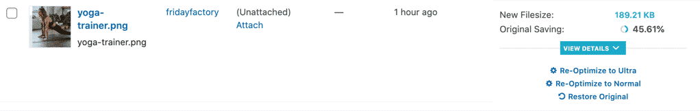
PageSpeed Insights told me that I had an issue with this image:
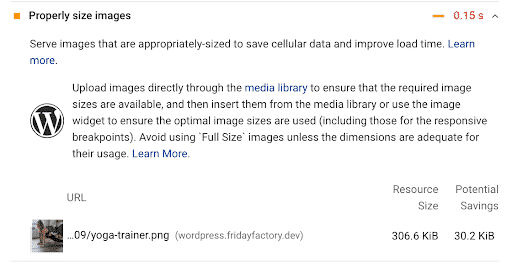
I went to the WordPress library and optimized it with Imagify. My file went from 306 KB to 189 KB:
- Converted my images to WebP (next-gen format)
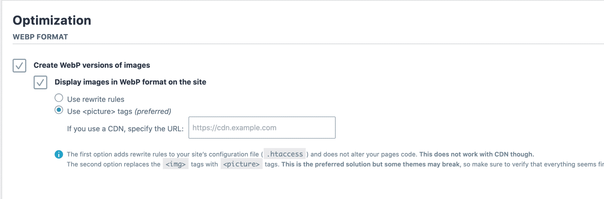
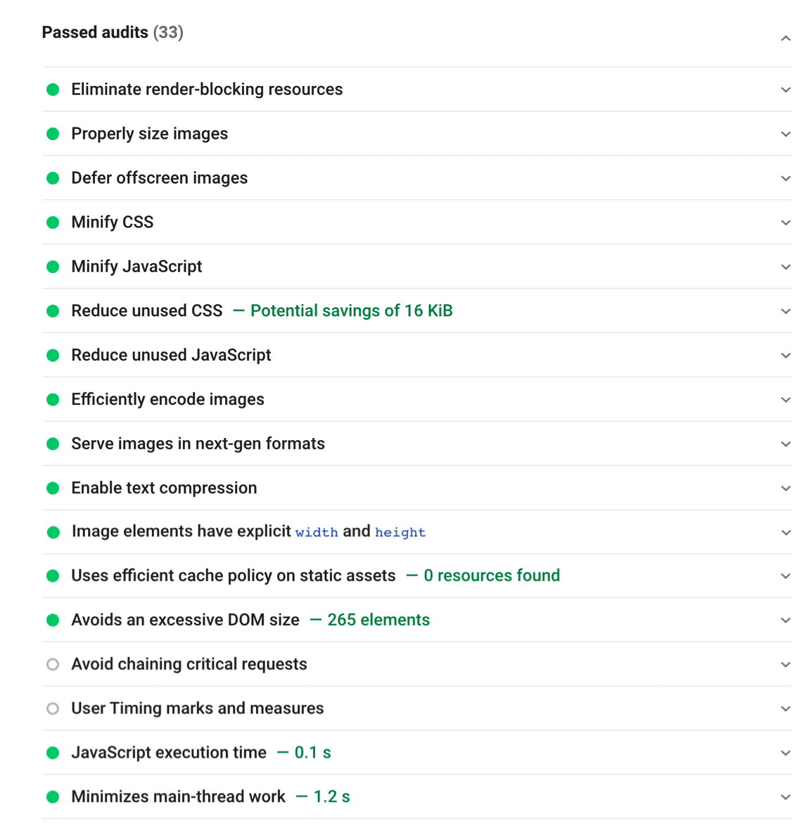
All the images-related issues previously flagged by PSI are gone thanks to Imagify:
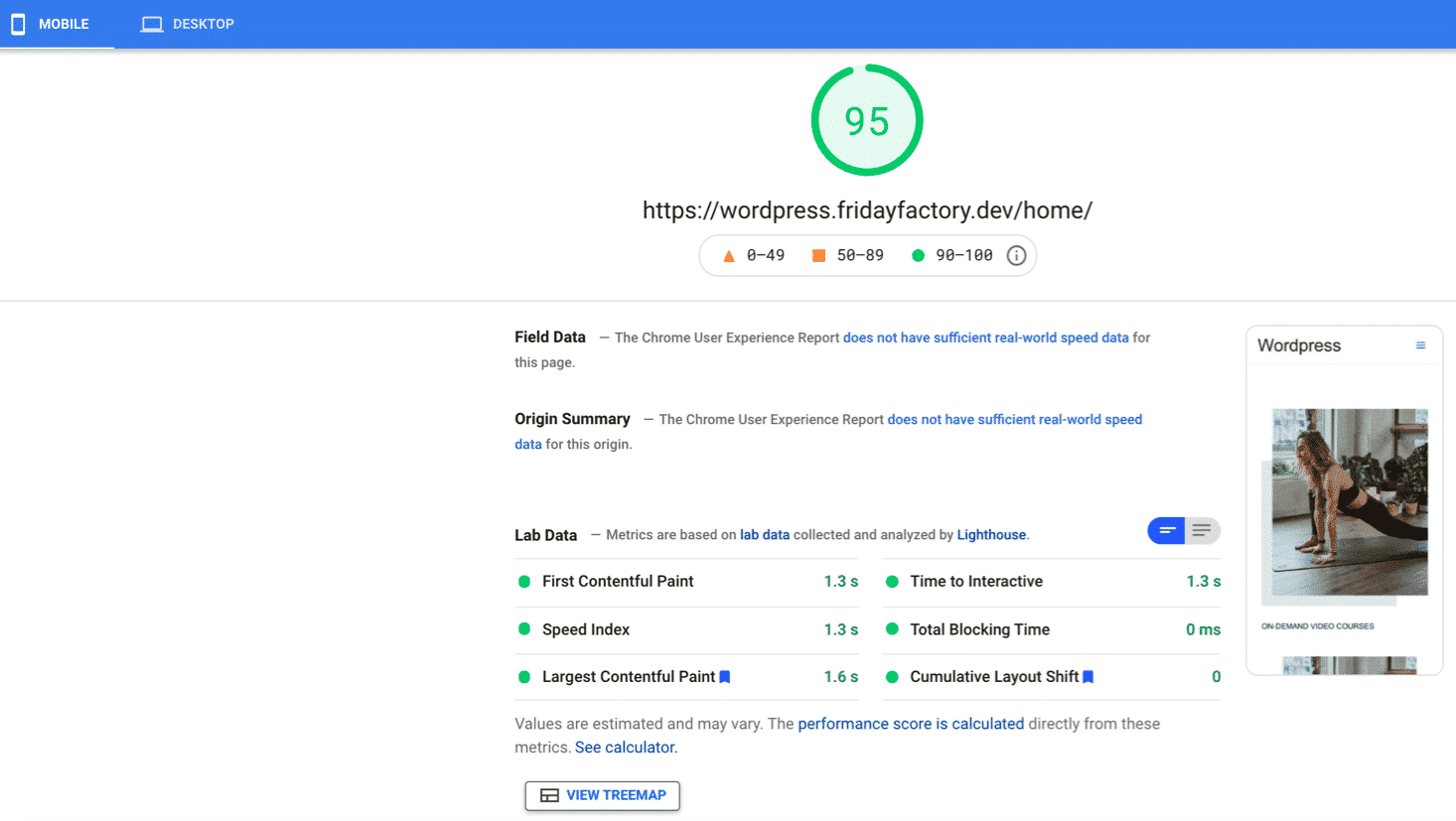
My final PSI grade is 95/100, and all my KPIs are green after using WP Rocket and Imagify.
Do you want to go from 35/100 to 95/100 on mobile as well? Here’s my toolbox:
✅ I used WP Rocket to cache my page, minify my code, defer JS, remove unused CSS and apply the lazy-loading script on images and video.
✅ I used the Imagify plugin to compress my images and convert them to WebP
✅ I resized my images for mobile use (3:4 ratio)
✅ I removed any sliders on mobile thanks to the options in the customizer
Wrapping up
Improving a mobile site’s speed requires prioritization. Start by working out what the most important and common tasks are for your customers on mobile. By building scenarios, you can see which content and pages are critical to optimizing first.
You can follow our techniques to prioritize the web performance optimizations you need to initiate first.
In any case, WP Rocket can help you to implement 80% of those best practices in a few clicks. Try it and see how your mobile score is changing on Google PageSpeed Insight. (If you don’t see any improvements, we have a 14-days money-back guarantee).