
Table of Contents
Layout shifts happen when visible elements move unexpectedly as a page loads. It disrupts the browsing experience and frustrates users as well as leads to worse Cumulative Layout Shift (CLS) scores.
With the Layout Shift Culprits Insight, Google gives a detailed resource for website owners to identify and take care of the causes of layout shifts, so they can provide a better user experience and SEO performance.
In this post, you will learn all you need to know about this performance metric — what it is, what it measures, how to apply this knowledge to your website. Finally, we’ll cover how to tackle issues with layout shifts, by hand, and also with a plugin.
| TL;DR No time for the entire post? No problem, here are the main points: ✅ The Layout Shift Culprits Insight in Google’s tools pinpoints which elements cause layout shifts and how much each one contributes to your CLS score. You can measure it in PageSpeed Insights or Chrome Developer Tools. ✅ To fix CLS manually, add explicit width and height to images and videos, reserve space for ads or embeds, connect layout shifts to user interactions, load fonts quickly and use them correctly, use transform or opacity for animations, and ensure compatibility with bfcache. ✅ WordPress users can simplify the process with WP Rocket, which automatically handles image dimensions, lazy loading, font preloading, and CSS optimization, along with other performance improvements. |
What Is the Layout Shift Culprits Insight?
First, let’s understand this performance metric better, as well as the Core Web Vital it is associated with.
What is Cumulative Layout Shift?
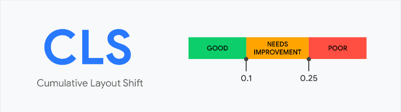
Cumulative Layout Shift (CLS) measures how much visible content on a web page unexpectedly moves while it’s loading and being used. It’s one of Google’s Core Web Vitals metrics, meaning it affects search ranking.
CLS is calculated by multiplying how much of the viewport (the part that appears in the user browser) shifts by how far elements move. A high score means users experience jarring page movements while reading or interacting, a low score means the opposite.
Google classifies CLS scores as good (≤ 0.1), needs improvement (0.1–0.25), or poor (> 0.25).
Understanding the Layout Shift Culprit Insight
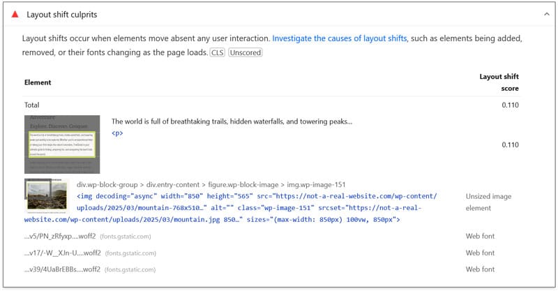
To reduce CLS on your site, the Layout Shift Culprit Insight helps you find the reasons for the movement. It reports both the elements that shift, how much they contribute to the CLS score, and sometimes a specific cause for the behavior.
You can use this information to address CLS issues on your site in a targeted manner.
| 💡 This isn’t entirely new. Google originally offered a metric called “Avoid large layout shifts,” which has been replaced by the new insight. |
How to Measure Layout Shift Issues on Your Website
You have several options to find out if this is something you should worry about. One of the easiest is to use PageSpeed Insights. Just run your page URL through it — Layout Shift Culprits appears under Insights or Passed Audits.

Your site receives a pass if you have a “good” CLS score (0.1 or lower). However, Layout Shift Culprits may still show elements that cause your site elements to move, even if it’s not enough to fail the test.
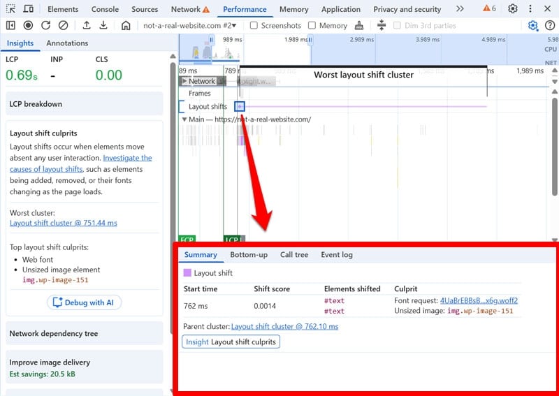
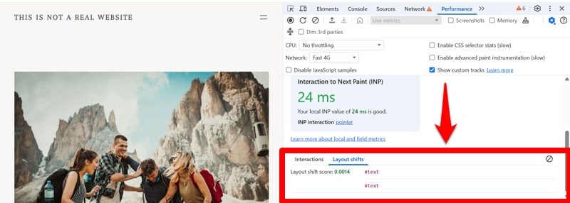
Another option is to open your website in the Chrome browser and use its Developer Tools. Here, go to the Performance tab and run a speed trace. The Layout Shift Culprits insight will appear in the sidebar on the left as well as in the performance timeline on the right. It’ll show when and where layout instabilities occur.

Rapid successive shifts are grouped into clusters that appear as purple lines. Individual shifts show up as diamonds, their size proportional to the movement that occurs. When you hover over them, the element on the page that causes the shift will be marked.
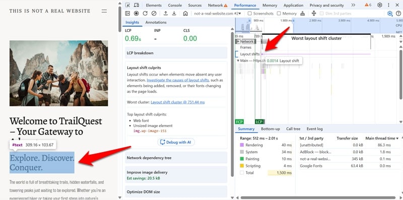
You can receive more information, such as start time, shift score, the CSS selector of elements, and the cause of the shift, when you click on them in the timeline.
It’s important to remember that layout shifts can also happen while people use your website. Use the live metrics inside Chrome Developer Tools to find those.
How to Solve CLS Problems Manually
Fixing layout shift issues by hand involves adjusting how page elements load, resize, and render. The goal is to create predictable space for each component before content appears.
1. Add Explicit Dimensions to Images
Images without specified dimensions are one of the most common reasons for layout instability. Without defined height and width, the browser doesn’t know how much space to reserve for them initially. When they end up smaller or larger than the area set aside from them, the content below moves the moment they appear.
To avoid that, always include HTML width and height attributes for images and video elements, including lazy-loaded images. It looks like this:
<img src="images/hero-banner.jpg" alt="Hero banner" width="1200" height="600" loading="lazy">

This markup is usually accompanied by a CSS rule to make images scale responsively:

img {

max-width: 100%;

height: auto;

display: block;

}

A newer solution is to use the aspect-ratio CSS property.

.responsive-image {

aspect-ratio: 16 / 9;

width: 100%;

height: auto;

object-fit: cover;

display: block;

}
In addition, it’s advisable that you use responsive images using srcset and sizes.
<img src="images/hero-1200.jpg" srcset="images/hero-480.jpg 480w, images/hero-800.jpg 800w, images/hero-1200.jpg 1200w, images/hero-1600.jpg 1600w" sizes="(max-width: 600px) 100vw, 1200px" width="1200" height="600" alt="Hero banner"> This way, the browser loads the right image size for each device and screen resolution. This improves performance and prevents layout shifts caused by resizing.
| 💡 If you are using an updated version of WordPress to power your website, you don’t have to do any of the above. The platform takes care of image dimensions and serves responsive images automatically. |
2. Reserve Space for Third-Party Content
The same principle as above applies to third-party embeds like ads, social widgets, and iframes. They often load asynchronously, causing layout shifts when they appear on the page late. In the case of ads, you additionally often don’t have control over their size, which leads to more problems.
The solution to address them is to reserve fixed-size containers for these elements. This is typically done by using the aforementioned aspect-ratio and a minimum height that matches the expected content dimensions.
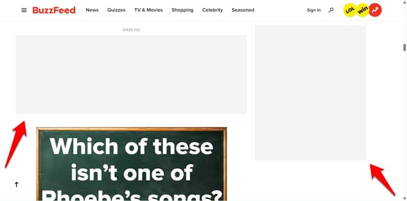
With this technique, even if the content exceeds the container, the shift won’t be as pronounced, which is good for your CLS score. For the same reason, another way to reduce the layout impact of third-party content is to place it lower on the page so it can push down less content.
3. Prevent Intended Layout Shifts from Hurting Your CLS Score
Not all layout shifts are bad. Some occur as a result of intentional user actions, for example, a menu that shows up when you click a button on the page. CLS will treat those as expected shifts and not negatively score them — as long as they happen within 500ms of an input.
There are other, similar ways you can prevent dynamic content from causing CLS problems:
- Remove it from the document flow by shifting it to another layer, such as a pop-up cookie notice.
- Replace old content with new content inside a fixed-size container. This is especially suitable for product pages.
- Load new content outside of the screen and notify users when it appears. Social media sites often use this technique.
4. Load and Use Fonts Correctly
Custom website fonts can also cause layout instability. To understand why, you first have to know how browsers handle them.
In CSS, page elements typically have a primary typeface and one or more fallback fonts. The latter are typically widely available fonts, like those included in operating systems, and look similar to the originally intended design.
body {

font-family: "Open Sans", Helvetica, Arial, sans-serif;

}
Should the primary font fail to load, the browser will use the fallbacks instead. However, this setup can also lead to issues, such as:
- FOUT (Flash of Unstyled Text): The fallback font appears briefly before the custom web font loads.
- FOIT (Flash of Invisible Text): The browser hides the text until the custom font finishes loading.
Both can cause layout shifts. Fortunately, there are several ways to prevent them.
First, choose fallback fonts that occupy roughly the same space as your primary typeface. Additionally, preload third-party font files to reduce load delays.
<link rel="preload" href="https://fonts.gstatic.com/s/opensans/v34/mem8YaGs126MiZpBA-UFUK0Zdc1UAw.woff2" as="font" type="font/woff2" crossorigin> Better yet, host fonts locally and declare them inline in your site’s head section. Further, limit the number of fonts you use, opt for WOFF2 compression, and avoid large font families or unnecessary variants.
Next, use font-display CSS property to control how text is rendered when the web font isn’t yet available. Two recommended values are:
- font-display: optional: Delays text rendering briefly (up to 100 ms) and uses the fallback if the main font doesn’t load in time.
- font-display: swap: Renders text immediately with the fallback font, then switches once the custom font is ready.
Finally, since fonts are typically loaded via CSS, remember that the browser only requests them once they’re referenced in the stylesheet. Optimizing your CSS—by removing unused rules and loading critical styles early—helps fonts load faster and minimizes layout shifts.
5. Optimize Animations on Your Site
Poorly implemented animations can trigger layout shifts by changing element positions or sizes. Common examples are box-shadow, top, left, width, or height.
To avoid that, use CSS properties that don’t trigger layout shifts, like transform animations or opacity. Furthermore, test animations in the Chrome Developer Tools Performance panel to ensure smooth, layout-safe rendering. It has a dedicated Animations panel for that.

You can also use will-change to tell the browser about elements that are likely to be altered. This removes them from the normal document flow and prevents layout shifts, though it should only be used as a last resort. For more detailed information on these topics, see the animations guide on web.dev.
6. Make Your Pages Compatible with bfcache
The back/forward cache (bfcache) is a feature of all modern browsers that allows pages to instantly restore when users navigate via the browser’s back or forward buttons.
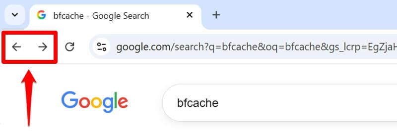
Making your pages compatible with bfcache improves user experience by reducing perceived load time. It also improves CLS scores in the field. However, it does not fix the root cause of layout shifts, so you will have to address those as well.
| 💡 Web.dev has an article on how to optimize your site for bfcache. |
Optimizing Layout Shift Culprits with a Plugin
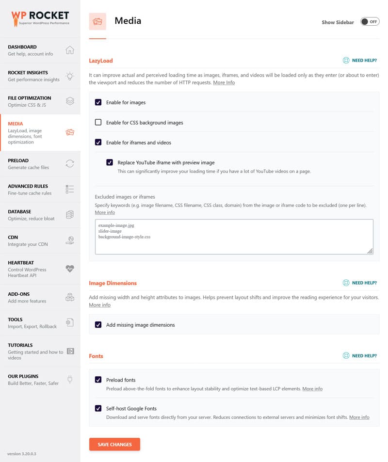
Feeling overwhelmed by the prospect of fixing your website’s layout issues by hand? If you are looking for a simpler solution, a performance plugin like WP Rocket can make the process much quicker and easier. It has both powerful features to improve website speed and design stability as well as making them simple to implement. Here’s what it can do for you:
- Automatically add missing image dimensions
- Preload fonts (and other third-party files) so they arrive faster
- Self-host Google Fonts with two clicks
- Lazy load images and media embeds to reduce layout shifts off-screen
- Combine, defer, or asynchronously loading JavaScript so your pages stay performant and user-prompted layout shifts happen quickly
- Optimize CSS to help fonts load fast
What’s more, you can do all of this by simply ticking boxes in the user interface.
In addition, the plugin comes with many automatic performance improvements:
- Caching (with a separate mobile cache)
- Automatic lazy rendering
- Critical image optimization (to ensure visible content loads immediately)
- GZIP compression
- Minification for CSS and JavaScript files
That means, your pages not only become more stable, but your site as a whole loads faster — from the moment you activate the plugin.
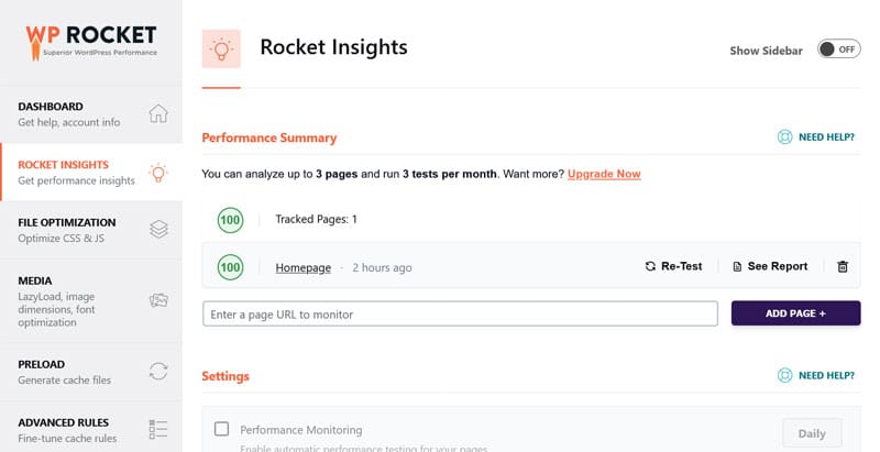
In addition, you can monitor how well your top pages are performing through Rocket Insights. It’s an integrated performance monitoring tool powered by GTmetrix. You can use it to track your top pages with in-depth insights. It makes WP Rocket’s impact instantly visible, helping you quickly spot and troubleshoot performance issues so you can optimize what slows your site down directly in the plugin dashboard.
Stabilize Your Site Layout Now
Layout shifts can seriously affect your site’s user experience and Core Web Vitals performance. To combat it, the Layout Shift Culprits Insight identifies which elements cause instability and explains why.
The tips in this tutorial help you address the most common issues. Do you want a less technical solution? Get WP Rocket today and test it risk-free for 15 days!