Table of Contents
Last update on
More people use smartphones to surf the web than desktop computers and Google ranks websites according to their mobile version. Consequently, if you hope to do well in search results and provide a good user experience to your audience, it’s absolutely imperative that you learn how to do a mobile SEO audit.
That’s why, in this article, we’ll cover what exactly a mobile SEO audit is, especially in comparison to a more general audit, what’s part of it, and why you should do it. After that, we’ll give you clear instructions on how to inspect your site’s mobile SEO. The goal is to help you spot issues that could impede your mobile rankings and user experience and take corrective action.
Mobile SEO Audit? What’s That?
Auditing your mobile SEO means undertaking a targeted review of your website’s performance, user experience, and search optimization specifically on mobile devices. Unlike a standard SEO audit, it hones in on factors that uniquely affect that part of your audience using mobile devices to access your site.
Here’s what’s part of it:
- Technical SEO – Evaluating mobile-specific technical aspects of your website.
- Mobile usability – Mobile users look at your site through smaller screens. Part of the audit is to ensure your site stays easy to navigate for them and that your content is pleasant to consume.
- Loading speed – Since Internet access is often slower on mobile devices, it’s especially important to provide great performance and a fast-loading website.
- User behavior – What are your mobile users doing on your site? What pages do they visit? Where do they drop off? Questions like this can help you understand how you could improve your website to make it more mobile-friendly.
- Traffic and keyword performance – People search differently on smartphones than on desktop computers. Part of this audit is to check on your keywords, rankings, and traffic differences as well as appearance in search results.
How to Perform a Mobile SEO Audit
Note that we already have an article on how to do a general SEO audit. If you haven’t checked your site’s SEO ever, it might be a good idea to start there. The following tips all specifically aim to improve your website’s mobile SEO, so if that’s what you are looking for, just keep reading.
1. Do a Site Crawl
A site crawl is the foundation of any SEO audit. For mobile, it requires specific attention to issues that affect user experience on smaller screens, such as:
- Viewport configuration – Ensure that the viewport tag is correctly configured so your content scales appropriately on mobile screens.
- Touch target sizes – Check that buttons and links have sufficient spacing and size to allow easy tapping.
- Content size – Find pages with content smaller or larger than the viewport width.
- Mobile meta tags – Evaluate your title tags and meta descriptions to ensure they fit within the character limits of mobile search results.
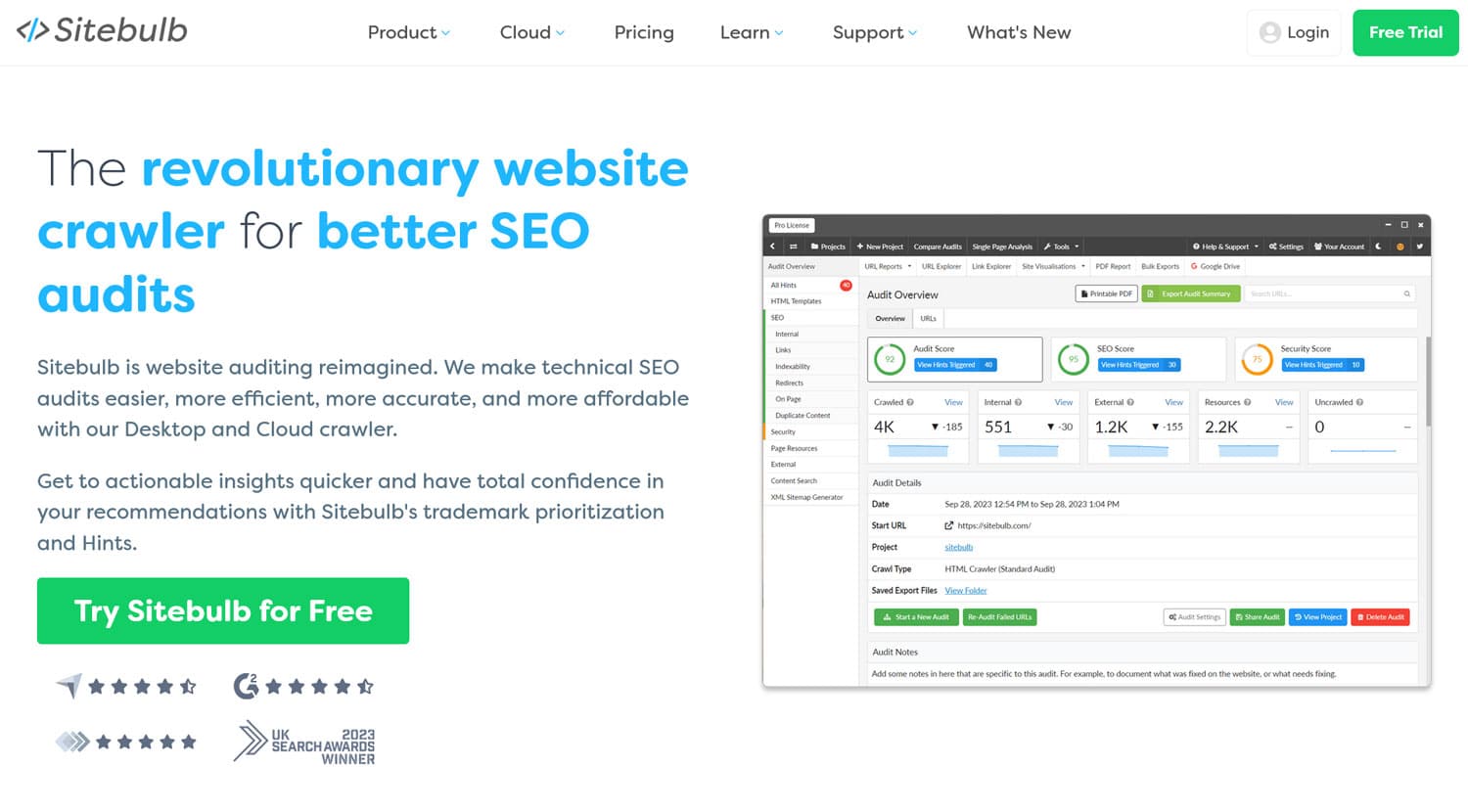
Screaming Frog and Sitebulb are both great tools to do this. They can both tell you about technical SEO issues affecting mobile users.
2. Check Your Mobile Design
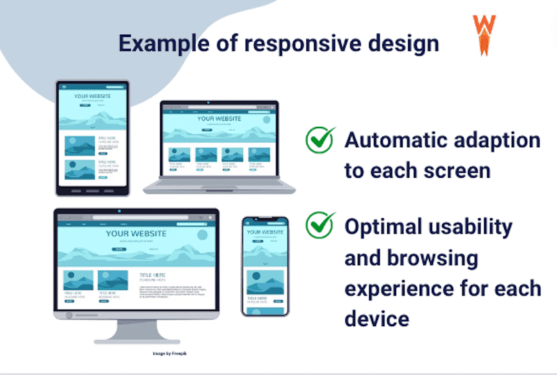
There are several ways of adjusting your design for mobile devices, which we discuss in detail in our mobile SEO checklist. The most common, and recommended, solution is to use responsive design. Here, every visitor encounters the same website and content automatically resizes to fit any screen.
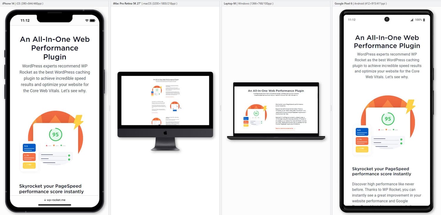
If you use any up-to-date WordPress theme, this part should already be taken care of. However, especially if you have customized your design, it still helps to audit your mobile design. Access it with different mobile devices and test your pages in different screen orientations. Alternatively, use a tool like Blisk to run tests on different setups simultaneously.
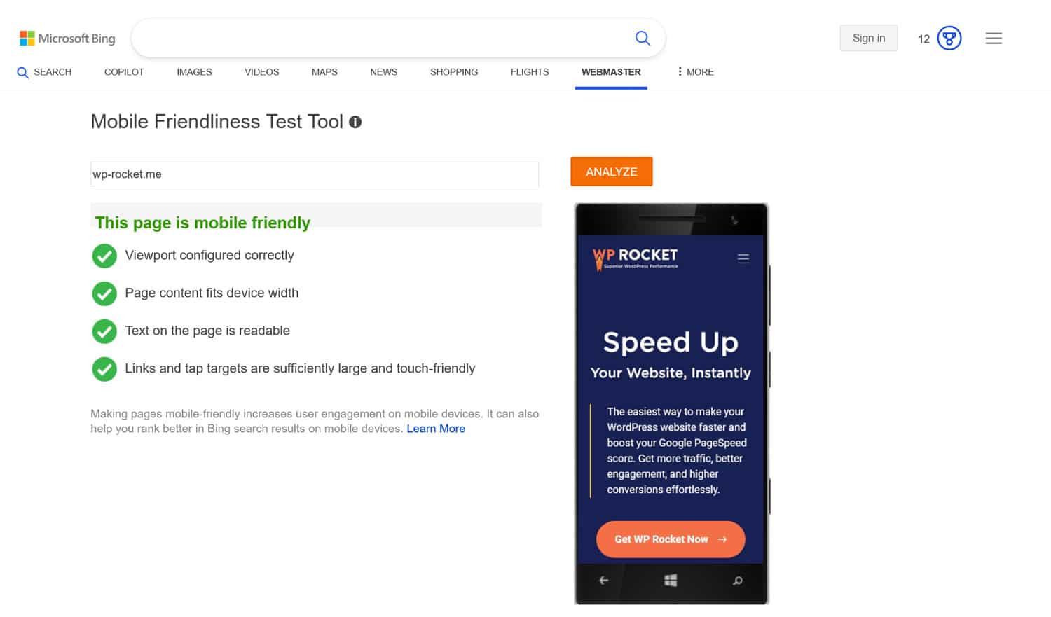
Focus on layout, button, and link size, that fonts are large enough to be readable, and that all pages are easy to reach and navigate. In short, put yourself in the shoes of mobile users to see if the site provides a good experience. Another useful tool is Bing’s mobile testing tool.
3. Analyze Your Website Performance
A fast-loading site is essential for good mobile SEO. Visitors expect websites to load quickly, including on mobile, where performance can be a bit slower. Also, speed is part of page experience, which is an important ranking factor.
Therefore, part of your audit is to speed test your website. A great tool for that is PageSpeed Insights because it measures desktop and mobile performance separately, including Core Web Vitals. You can find additional tools here.
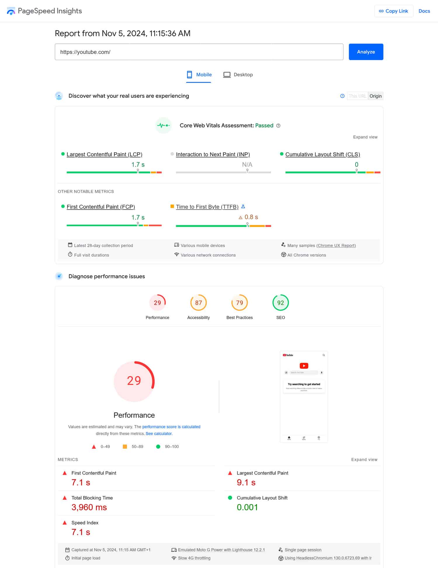
Once you run your site through it (be sure to test all of your most important pages), PageSpeed Insights gives you a detailed list of any performance problems on your site as well as solutions to them.
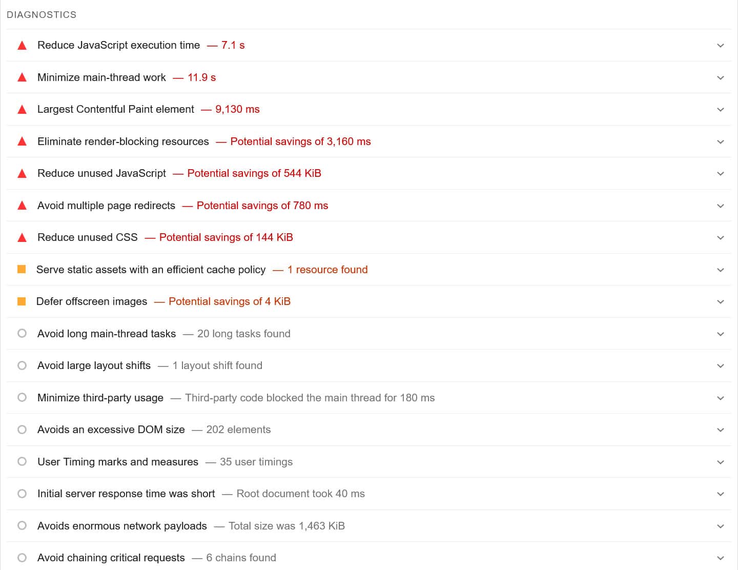
There are many ways to make your site faster, including caching, minifying CSS and JavaScript files, lazy loading your images and videos or using a Content Delivery Network (CDN).
Sounds intimidating?
If you feel out of your depth, consider a performance plugin like WP Rocket. It can do all of the above and more, and allows you to easily switch optimizations on and off in a user-friendly interface.
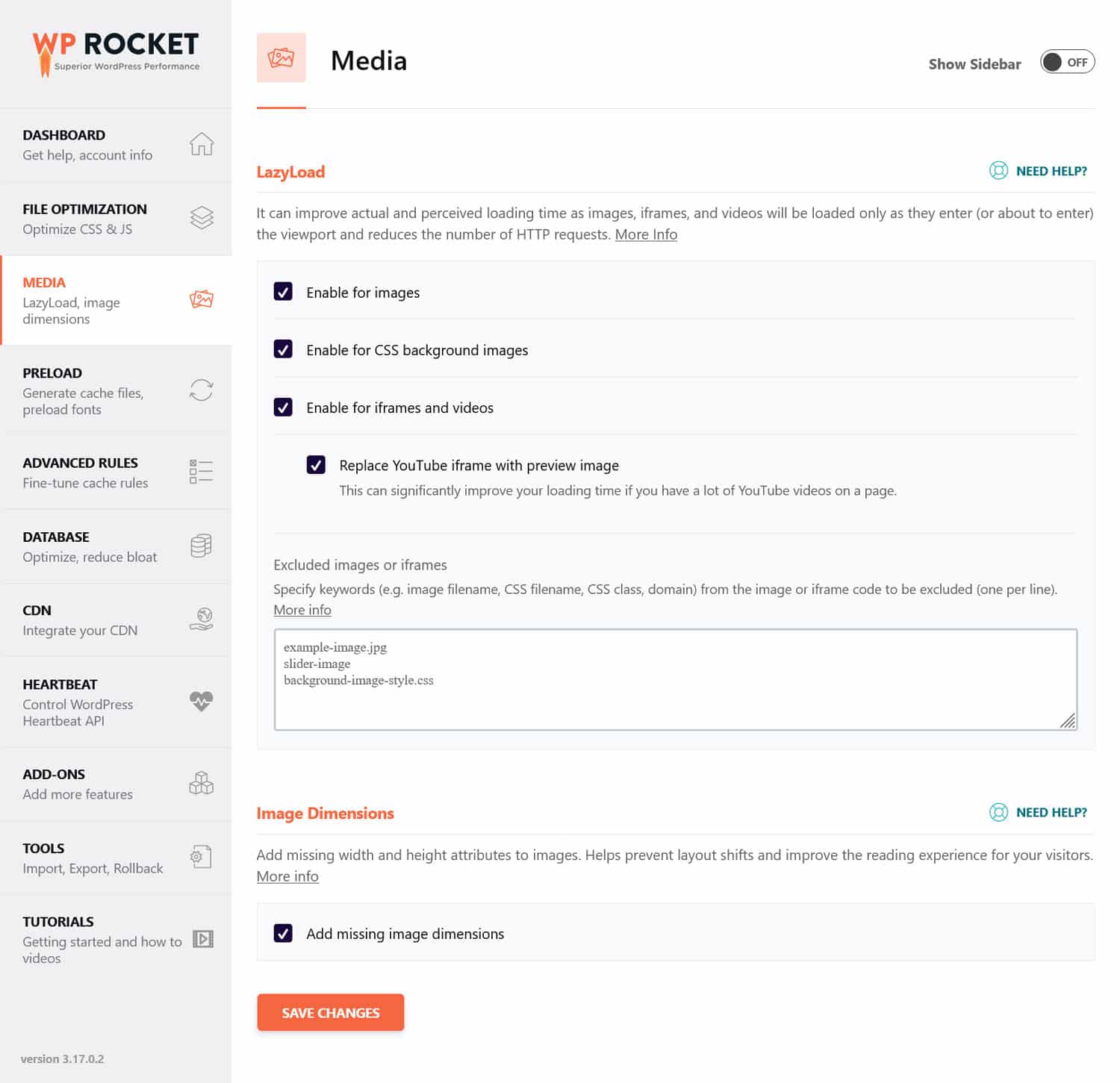
In addition, WP Rocket implements many speed improvements automatically right after you activate it. Among others, the automated features include:
- Browser and server caching (with a dedicated mobile cache)
- GZIP compression
- Optimization of critical images above the fold, to improve Largest Contentful Paint
- Automatic lazy rendering (for a better Interaction to Next Paint score).
Basically, it means you get a faster website without having to lift a finger.
Another important step to make your website load faster on mobile is optimizing your images. That means using the right file format, compressing them, and adjusting their dimensions.
If you are looking for a convenient solution for this, our sister plugin Imagify is a great candidate. It can compress and resize images both in your media library and those that you upload to your site. Its default Smart Compression balances quality and performance, but you can also adjust it to your liking.
In addition, Imagify automatically converts images to the next-gen format WebP. You also have the option to opt for Avif, another modern image type.
| 💡Curious about next-gen image formats? Dive into our dedicated article to uncover the key differences between WebP and AVIF and gain a complete understanding of what each format offers. |
4. Learn What Devices Your Audience Is Using
Understanding which devices people use to view your site can provide valuable insights into where to focus your optimization efforts.
Where do you get this information? In your Google Analytics under Reports > Users > Tech.
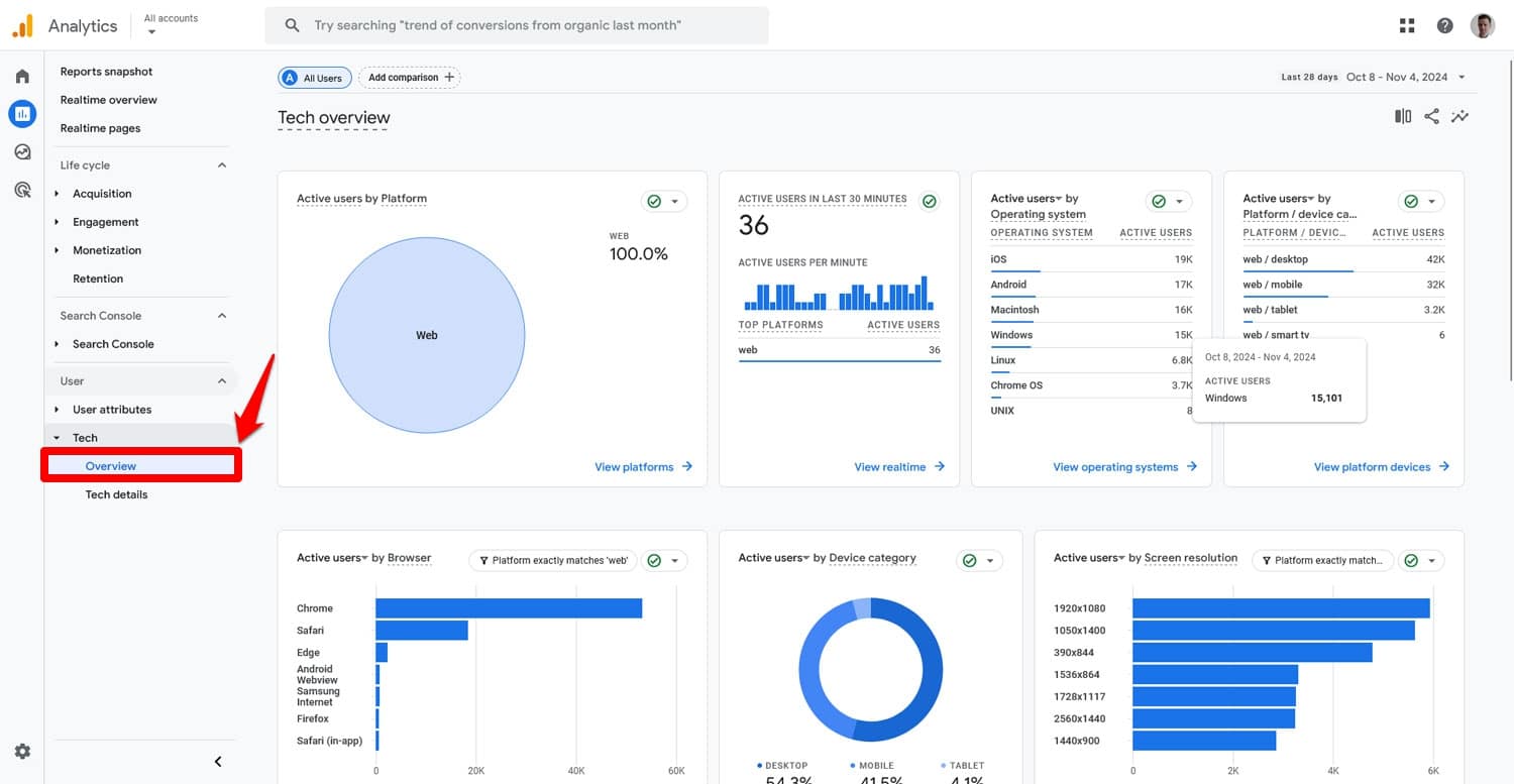
It gives you an overview of your site’s share of mobile traffic, its users’ operating systems, browsers, and screen resolutions. In addition, you can drill down further into this data under Tech Details and find out the exact device models, OS versions, and cross-reference this information with each other.
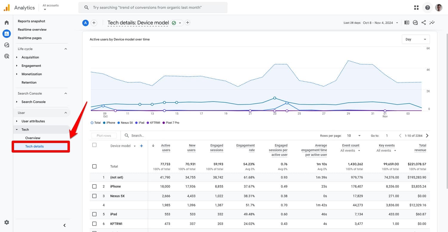
Do so to figure out how to better meet user expectations. For example, if a large percentage of your visitors are on iPhones, you can prioritize testing and optimizing for iOS compatibility. This data can also tell you which screen resolutions to target with your mobile design and more.
5. Compare Desktop and Mobile Traffic
Since we are already in Google Analytics, let’s continue here by comparing your traffic coming from desktop and mobile devices. By doing so, you can potentially uncover issues that affect your mobile visitors that you haven’t noticed before.
Still under Tech Details, open the Device category report using the drop-down menu, to show your traffic broken down by desktop, mobile, and other devices.
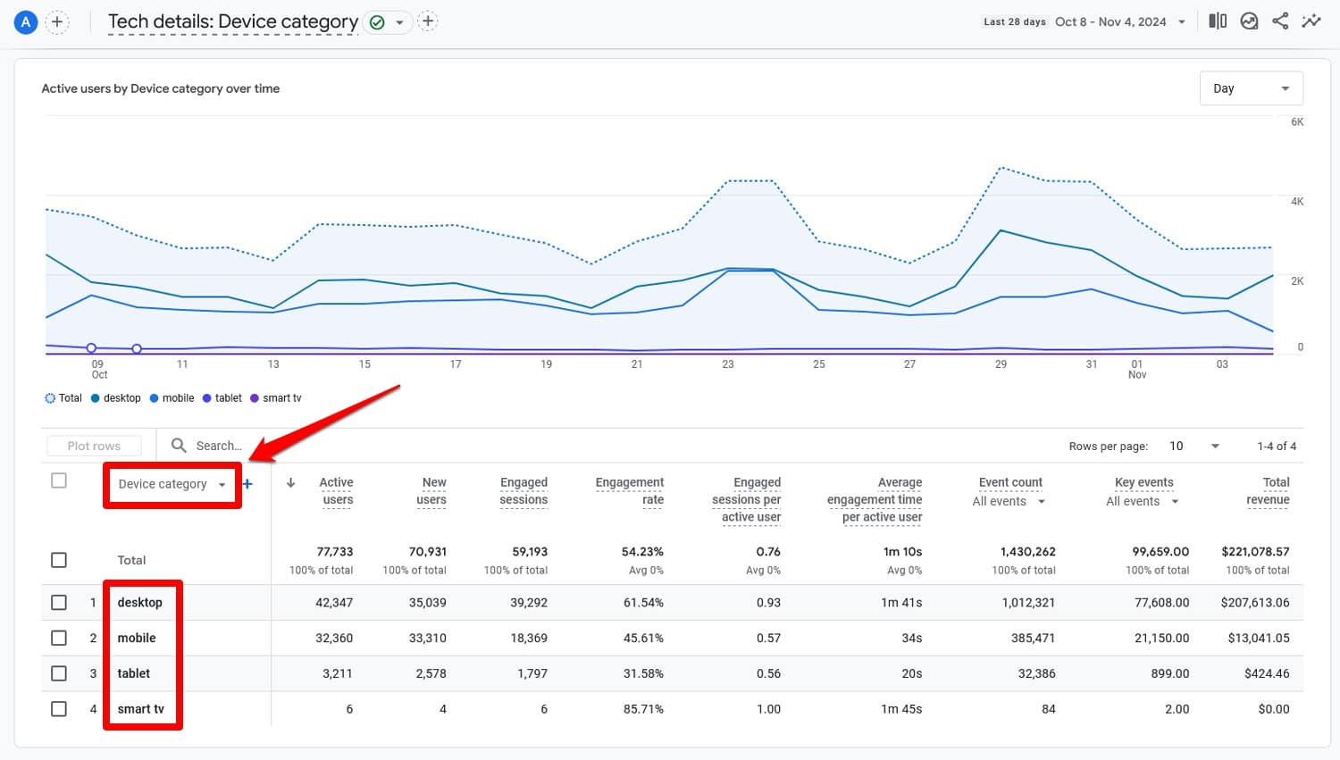
Then, at the top, set the date range to the last twelve months and also enable a comparison with the preceding period.
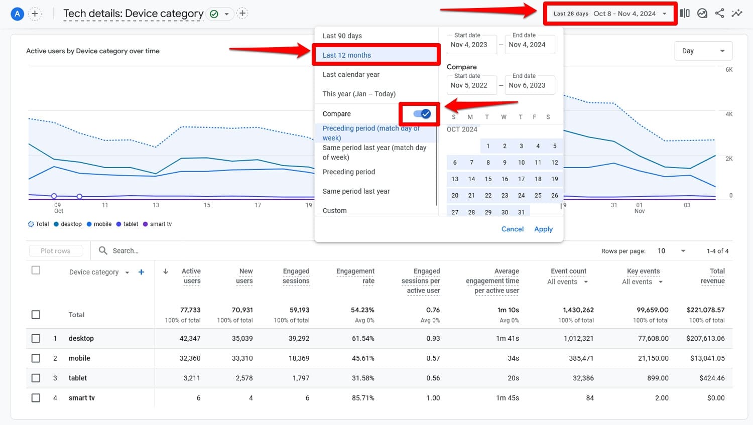
Once you click Apply, you can see how traffic from different device categories has changed over those periods as well as all metrics for those periods.
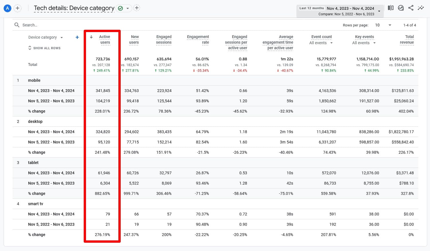
If you notice that overall traffic has increased while, for example, mobile traffic has significantly dropped, that points to an issue with your mobile SEO that needs rectifying.
6. Examine User Behavior
Besides pure traffic, Google Analytics also gives you detailed information about what people do on your website and how well they engage with your content on smaller screens.
For example, in the same report, you can also compare the Engagement rate and Average engagement time of your visitors.

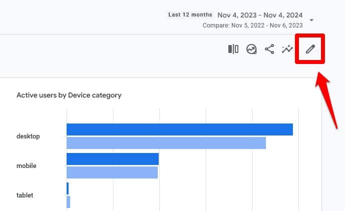
What’s more, you can add more metrics to your report by customizing it. To do so, click on the pencil icon in the upper right corner.
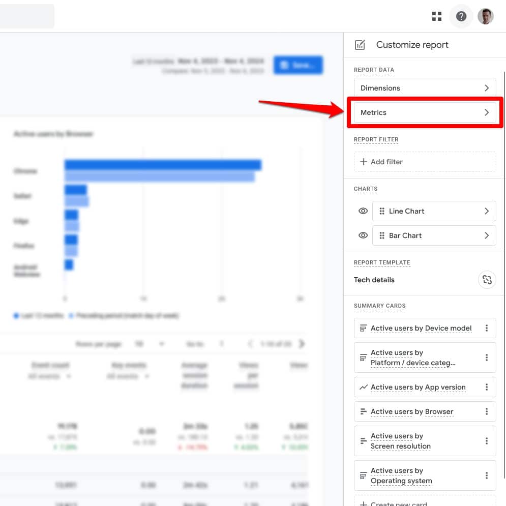
In the window that opens click on Metrics under Report Data.
The next screen allows you to add and subtract metrics to and from the report as well as change their order.
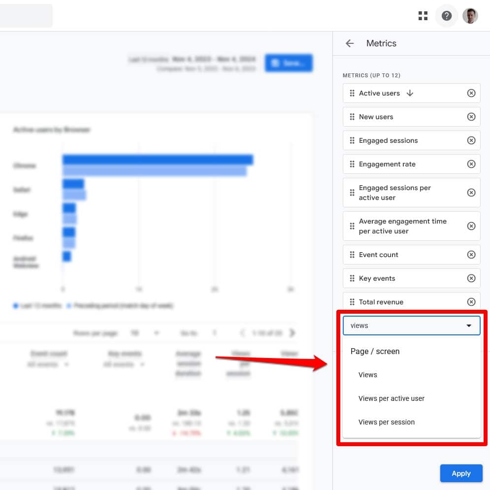
You can add metrics like Views per session, meaning how many pages users look at while on your site, bounce rate, and more. All of these help you further understand user behavior on your site and how it differs between desktop and mobile.

Check Individual Pages
You can also compare mobile and desktop user behavior for individual pages. For that, go to Engagement > Pages > Pages and screens and click Add comparison.
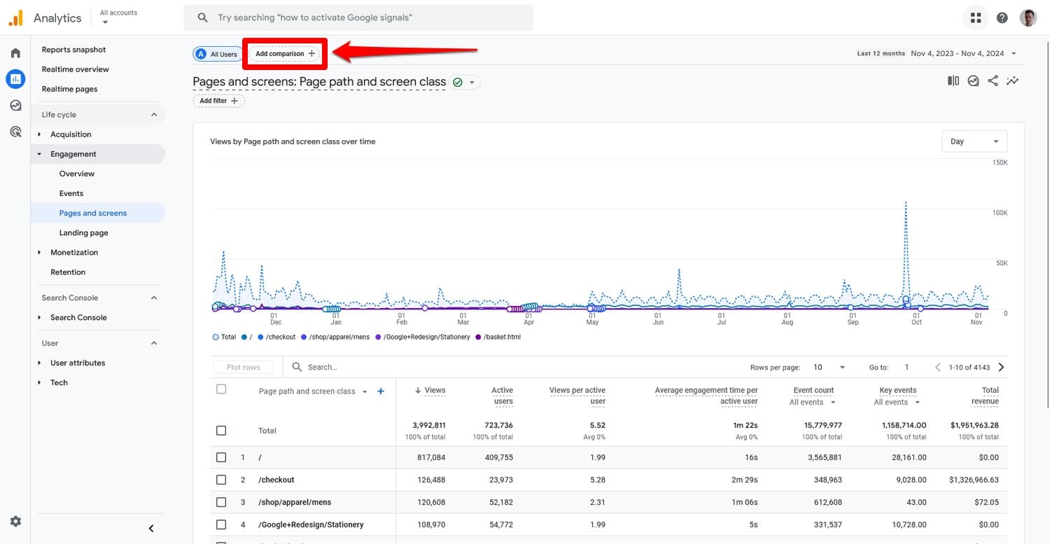
In the fly-in window that opens, tick the boxes for Mobile traffic and Web traffic (you can also include tablets if you want). Untick All users.
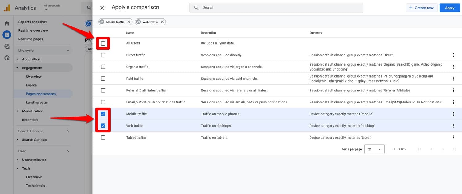
When you now click Apply and return to the screen, you can see these two dimensions for each of your pages.
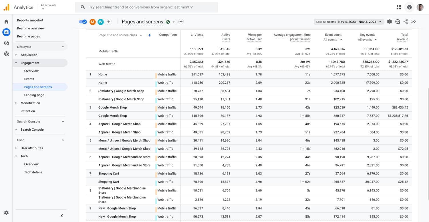
Here, too, you can change the metrics you see by customizing the report.
What Does This Tell You?
Here’s what you can learn from this about your mobile SEO:
- Lower engagement rates or shorter average engagement time on mobile could signal slow loading times or issues with content readability.
- Fewer page visits could be an issue of bad site navigation on mobile.
- If some of your pages are performing much better with mobile users than others, see what is different about them that you could emulate for the rest of your site.
There is a lot of information you can glean from your analytics, and these aren’t the only metrics you can track. You might also want to look into the top landing and exit pages, scroll depth, and conversion rates.
7. Audit Mobile vs Desktop Rankings
Mobile and desktop rankings can differ significantly and help you understand where your mobile SEO might need improvement.
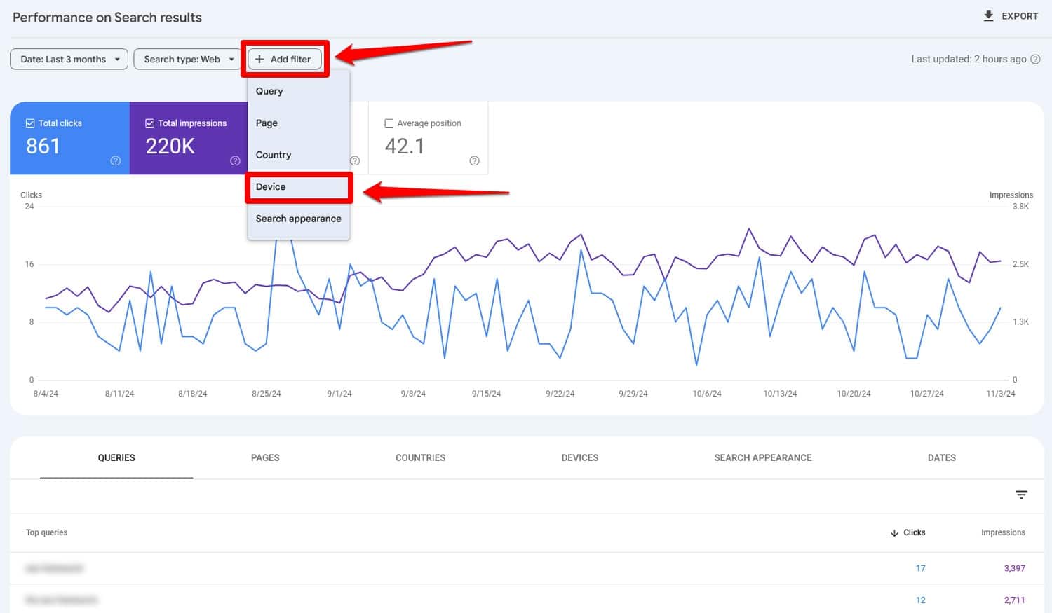
A free way to check on this is Google Search Console. You can compare your site’s performance in Google under Search results by clicking on Add filter and picking Device.
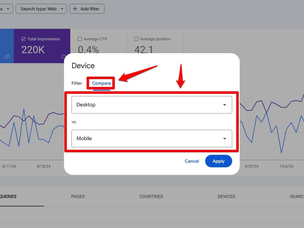
After that, go to the Compare tab and make sure the drop-down menus are set to Desktop and Mobile.
With the Average position active, you can now scroll down to compare the rankings for both keywords and pages. It even shows you the position discrepancy and you can filter the list by it as well.
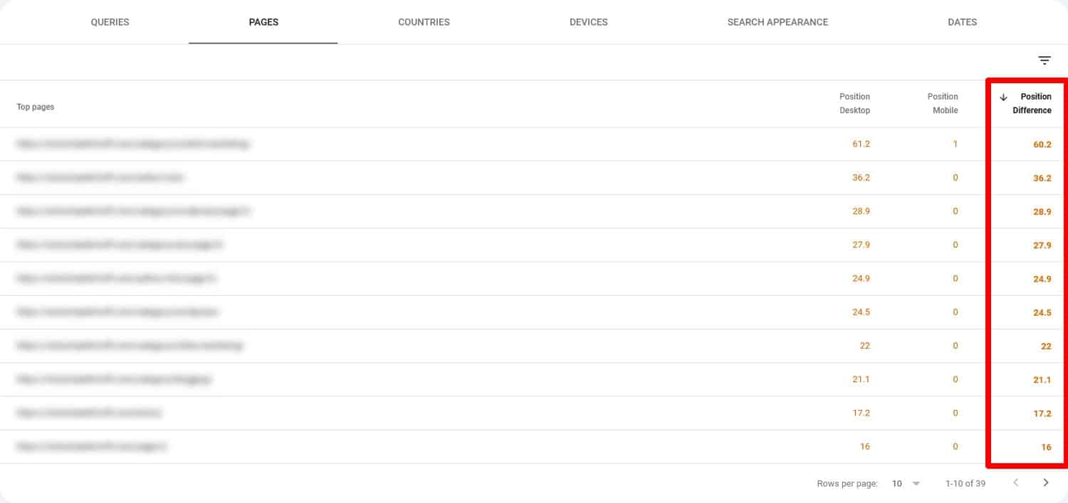
That way, you know which pages to examine for differences on mobile and desktop. If you want more detailed insights into this, you can also use a paid tool like Ahrefs or Semrush.
8. Look at Keyword Differences
Google Search Console not only tells you about ranking differences, it also has information on whether keywords differ on mobile and desktop.
To see it, simply filter the results again, but this time don’t compare device types but examine desktop and mobile search successively. Scroll down to the Queries tab to see the queries that your desktop and mobile users find your site under, respectively.
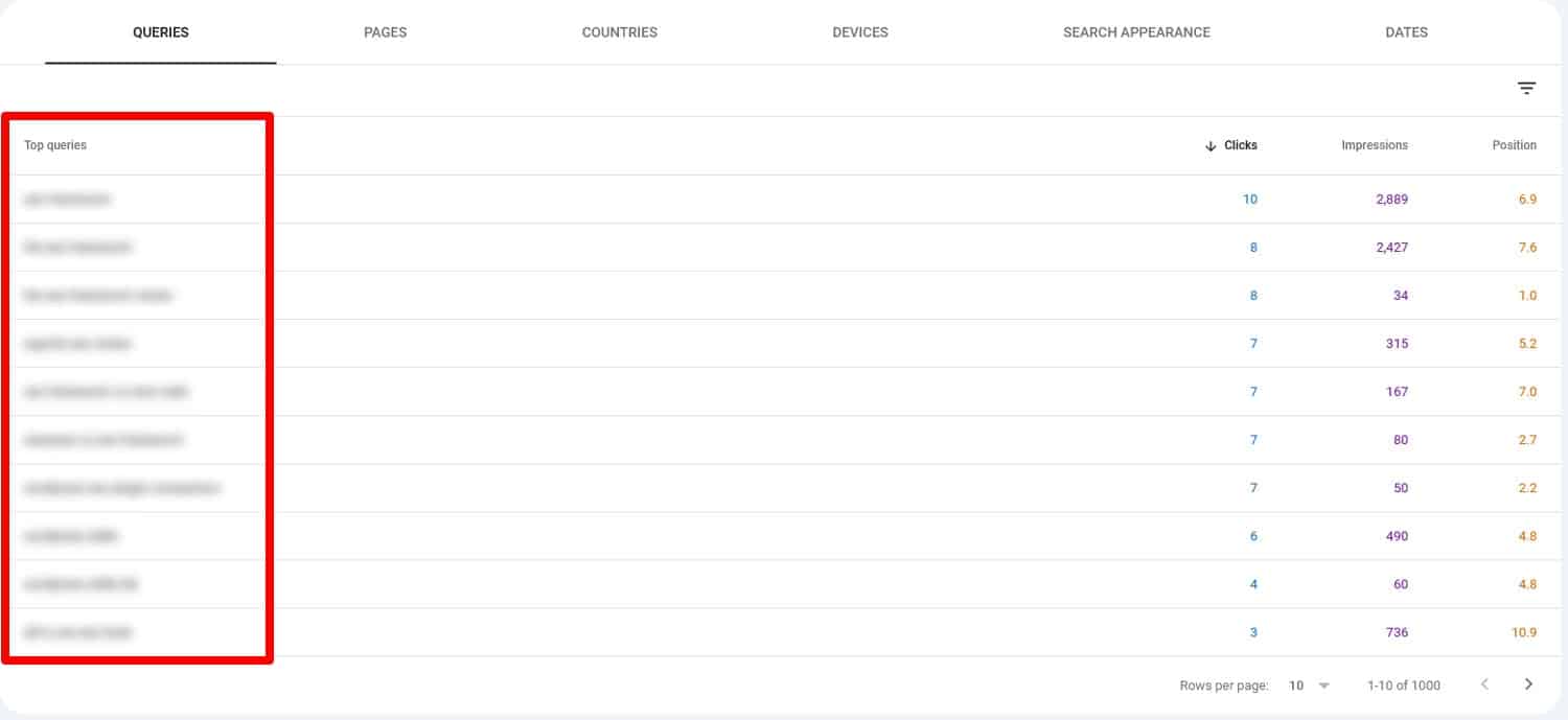
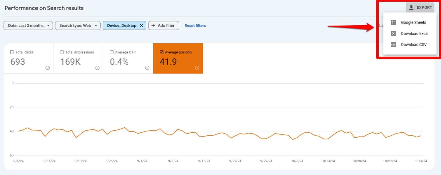
For easier comparison, you can easily export results with the Export button in the upper right corner, even directly to Google Sheets.
This is especially relevant for searches focused on location, done with voice search, or similar queries that happen more often on mobile. That way, you know what to include in your pages to make them more relevant for people searching on smartphones
9. Compare Click-Through Rates
You have probably already noticed the final piece of information that Search Console can deliver, which is your click-through rate (CTR). This is the share of people who click on your links in Google when they see them in search results. You can easily compare mobile and desktop CTR by checking the box and setting up the comparison filter as before.
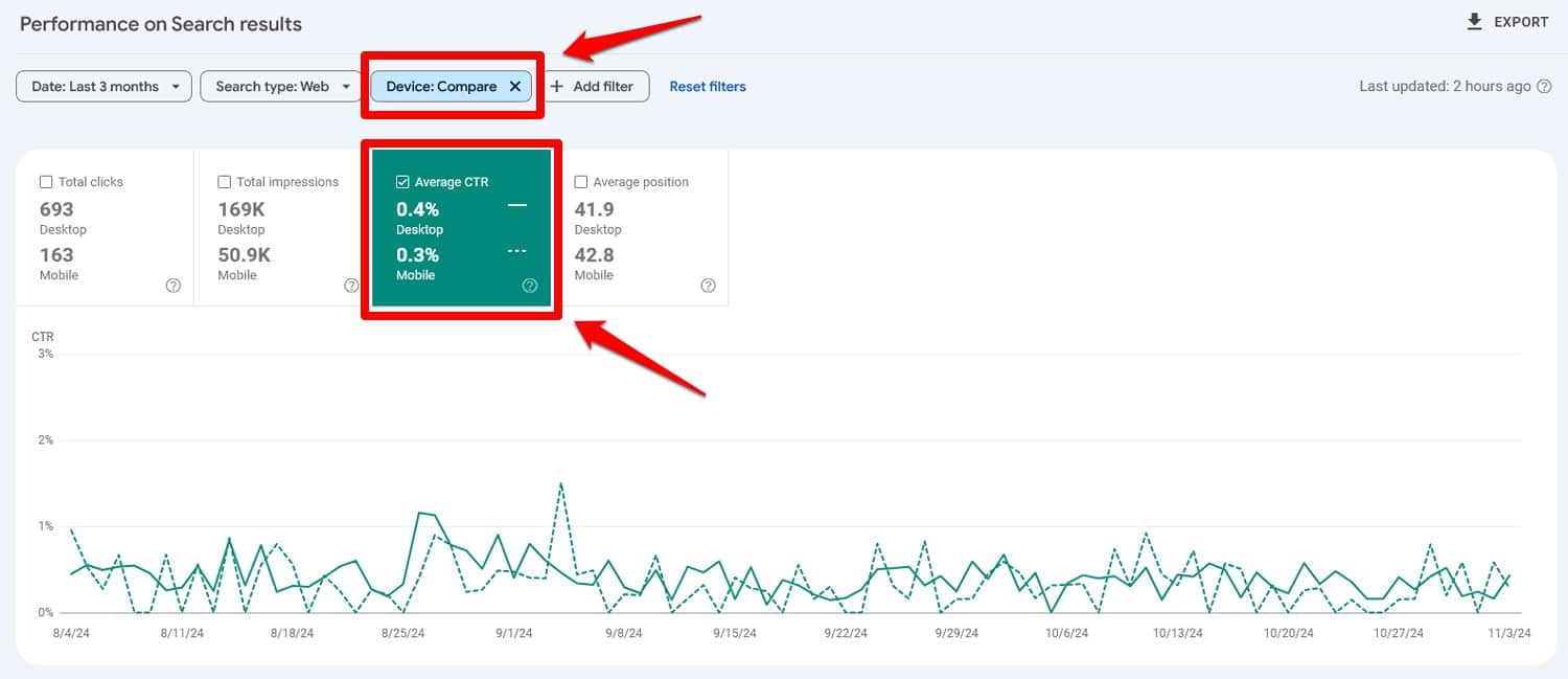
If the difference is significant, it can be a sign that your pages don’t look attractive in mobile search results, for example, because the title is cut off, they are missing structured data or similar problems.
10. Do a Content Audit
Mobile users tend to skim content, so ensuring that your pages are easy to consume and navigate on smaller screens should be part of every mobile SEO audit. Here’s what to consider:
- Show important content first – Visitors are impatient and don’t want to scroll too far, so make sure they don’t have to get to the important information.
- Be concise – Avoid rambling, get to the point quickly.
- Optimize content structure – Break up long paragraphs and use headings, lists, and bullet points to make content scannable.
That leaves the question, which pages should you audit first?
Go with your most important ones and work your way down. You can also use the average engagement time from Google Analytics as an indicator of what content needs the most improvement.
11. Test Your Structured Data
Structured data or Schema markup allows you to display things like images, ratings, breadcrumbs, and other information inside search engines.

It’s a great way to improve click-through rates and make your pages stand out in search results.
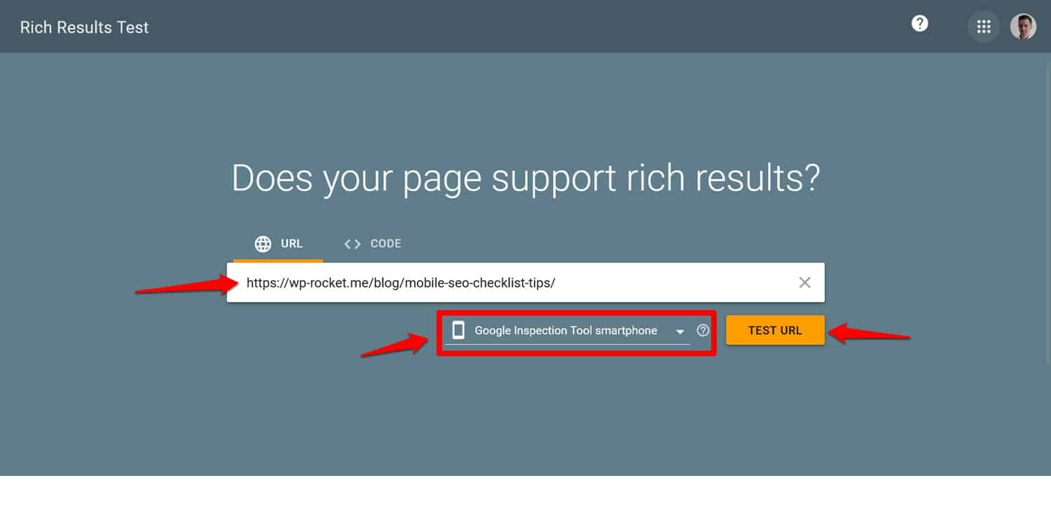
If you have implemented structured data on your website and it doesn’t seem to do anything, it’s worth investigating if there’s a problem. You can use Google’s Rich Results Test tool for this. Simply input your URL, choose your user agent at the bottom (you can test desktop and mobile separately), and run the test.
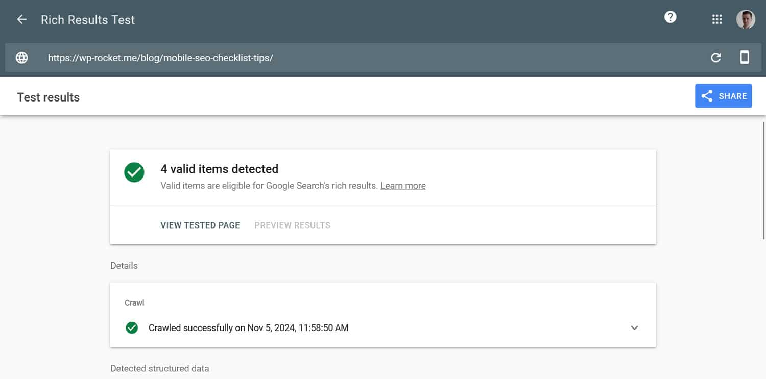
Within a short amount of time, it will validate your structured data and tell you if everything is configured correctly.
12. Check Your Use of Interstitials/Popups
The final part of a mobile SEO audit is to check your use of popups.
Why is it so important?
Smaller screens and touch control make them harder to close and take up more space, greatly impacting user experience. So much so that Google has guidelines for their use on mobile that can get you penalized if you don’t adhere to them.

To avoid that:
- Limit popups on entry – Avoid full-screen popups that cover the entire page, especially right after a user lands on your site. Instead, use smaller, dismissible banners or embedded CTAs that don’t disrupt the user’s experience.
- Connect them to user intent – If you must use popups, trigger them based on user actions, such as clicking a CTA.
- Optimize for mobile devices – Ensure popups are easy to dismiss on mobile screens, with clear “X” buttons that are large enough to tap comfortably..
Audit Your Site’s Mobile SEO Sooner Rather Than Later
Conducting a mobile SEO audit is essential for ensuring your site meets the needs of the mobile-first web environment. All measures on this list help you understand how your site performs in mobile search results and its user experience on smartphones. Use this information to make positive changes.
An area you definitely shouldn’t neglect is page loading speed. If you are struggling to make your website faster on mobile, give WP Rocket a try! It comes with a 14-day money-back guarantee so you can test it completely without risk.


