
Table of Contents
Last update on
Do you want to run a mobile website speed test to understand how visitors experience your site on their phones and tablets? Excellent. While checking website speed on a desktop is essential, this should also come with a mobile analysis.
Optimizing speed and performance for mobile devices can feel overwhelming, and you might need help knowing where to begin. Our list of tools is here to ease that burden and guide you in the right direction! They will help you prioritize your performance efforts to get a fast mobile experience and boost your conversion rates.
Why Testing Mobile Website is Essential and Different from Desktop
Testing mobile website performance is essential due to mobile devices’ unique characteristics. To effectively reach your audience in today’s digital landscape, it’s crucial to consider every device, screen size, and network connection. Speed on a desktop may be different on a mobile.
Here’s why it’s important to run two different performance tests on mobile and desktop:
1. Mobile Dominates the Market
We are clearly in a mobile-first era, and testing your site on mobile should be the heart of your strategy.
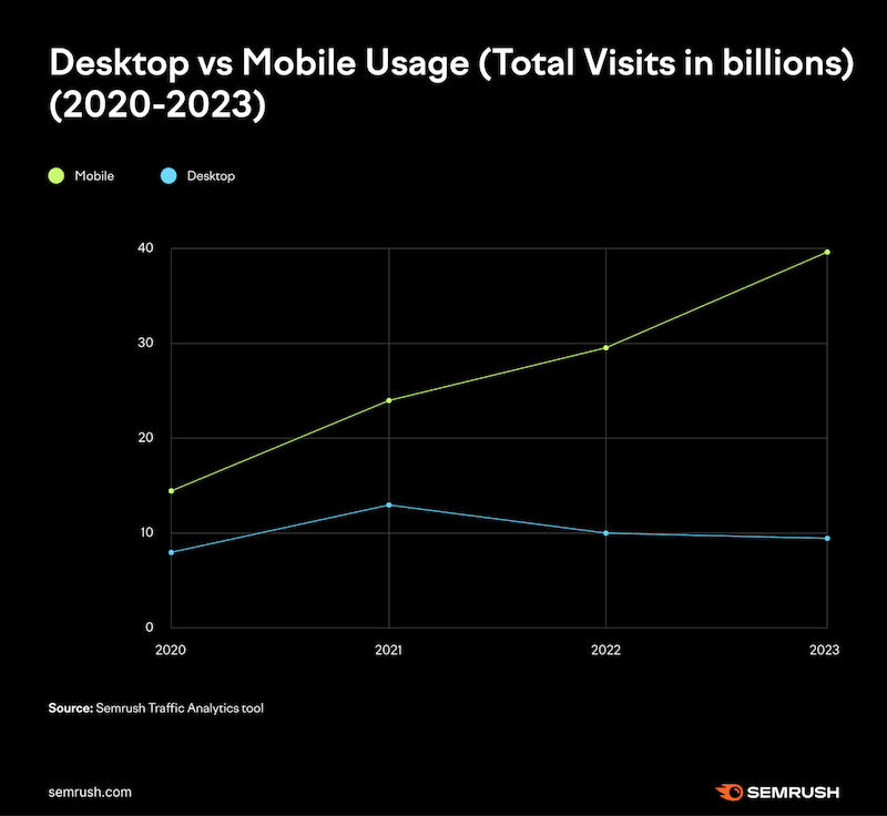
According to Semrush, mobile devices are the primary platform for Google searches, surpassing computer searches. In 2023, 40 billion visits were made on mobile (compared to 9 billion on desktop).
Now, let’s share some important data from Google:
- 82% of smartphone searchers use a search engine, not an app, to find a local business. You may want to optimize your website for mobile search to stay competitive.
- 66% of smartphone users report consulting their phones in-store to help with purchasing decisions. Don’t miss any sales, and monitor your mobile performance.
2. Hardware and Resources
Mobile devices have limited resources like CPU, memory, and battery compared to desktop computers. Testing on mobile requires optimization for these constraints.
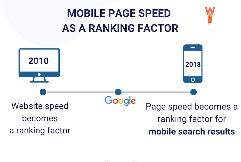
3. Mobile SEO
In 2010, Google significantly shifted its ranking algorithm by considering website speed. Then, in 2018, Google further emphasized this by introducing the page speed ranking factor specifically for mobile search results.
Another reason why you should test speed on mobile – Source: Google
| 💡Hint: Faster websites tend to rank higher in search results on desktop and mobile because page speed directly affects rankings. |
4. Network Conditions
Mobile devices rely on cellular data, which can be slower and unreliable than broadband. Testing considers variations in network speed and reliability, which is less impactful for desktops.
5. Screen Size and Resolution
Mobile screens are smaller and have varying resolutions. Testing ensures responsiveness and layout optimization for different screen sizes.
6. Different Input Methods
Mobile users interact via touch gestures, unlike desktop users who use a mouse and keyboard. Testing includes evaluating responsiveness to touch interactions. Also, layout shifts vary between mobile and desktop, meaning what’s acceptable on desktop may need to meet expectations on mobile.
One crucial metric for measuring these content shifts on major performance test tools is Cumulative Layout Shift (CLS). This metric may appear green on desktop but red on mobile, so it’s always worth checking the score on both.
7. User Expectations
According to Google, users have distinct “micro-moments” with specific expectations. Delivering a fast experience that aligns with the user’s needs almost instantly is even more essential on mobile devices.

Imagine needing urgent information while walking down the street. You’d want to get it quickly, and your visitors expect the same. Creating a seamless customer experience with fast loading time across all screens and channels is crucial. And it all starts with including mobile testing in your strategy.
8. Device Diversity
Testing on diverse devices like Android and Apple ensures consistent performance across various hardware. If you only run tests on a desktop, you overlook many other devices and operating systems.
9. App Store Compliance
This point concerns mobile apps rather than mobile websites. Mobile apps must adhere to the stores’ responsiveness and fast loading time guidelines. This underscores the importance of testing performance on your mobile app, not just on your desktop version.
Now that you understand the significance of testing performance on mobile separately from desktop, let’s explore the best tools available to assess mobile page speed. Using these tools can significantly enhance SEO efforts and improve Google rankings.
Top 8 Tools to Test Mobile Page Speed
We’ve put together eight optimization tools to check a website’s mobile speed. Use them extensively and compare results across different devices and network conditions. These tools are essential for making decisions and offer valuable insights into your site’s current mobile performance.
1. Google PageSpeed Insights
Powered by Lighthouse, Google PageSpeed Insights is a widely used tool that provides information about mobile performance, including Core Web Vitals. It offers actionable suggestions to tackle web performance issues. Achieving a green score indicates that the specific areas are optimized.
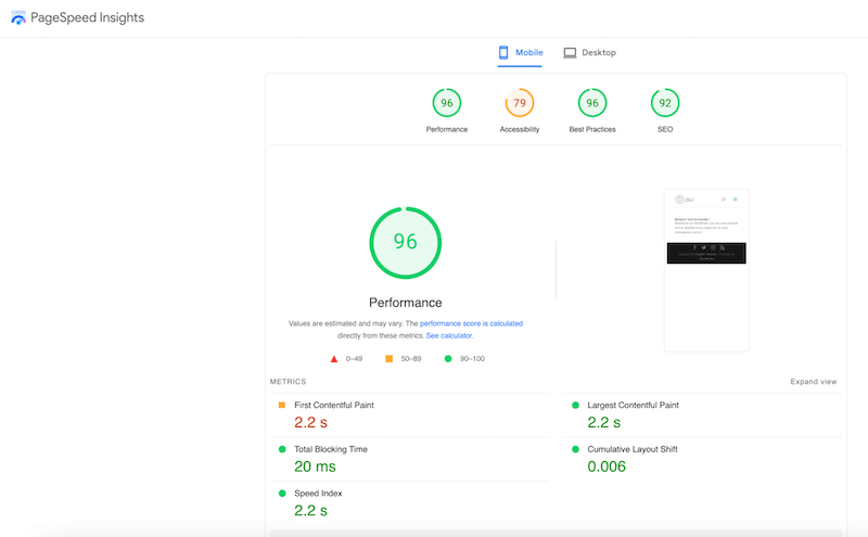
- Mobile-related Optimization KPIs and Features:
The tool offers specific recommendations for optimizing mobile performance, including eliminating render-blocking resources, minimizing font size, and optimizing images for mobile devices.
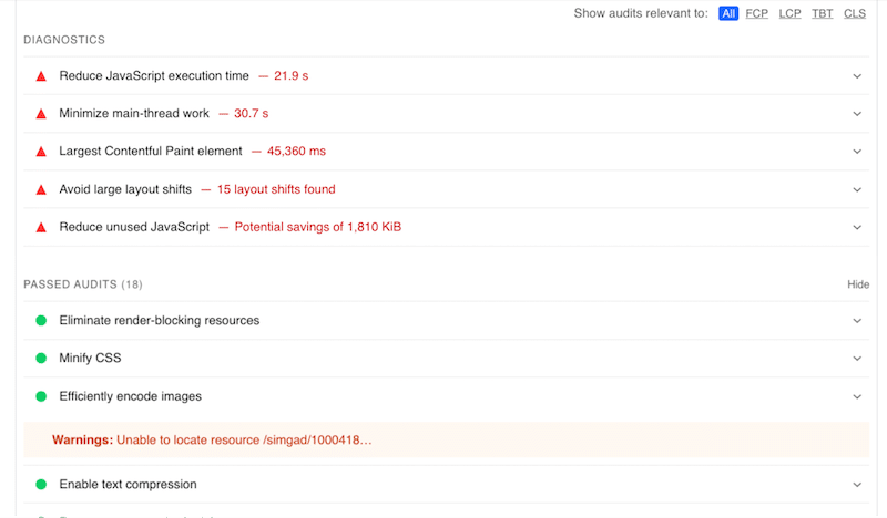
You’ll find two key sections in the report results: the Diagnostics and the Passed Audits.
The Diagnostic section identifies mobile performance issues like render-blocking resources or large images, offering actionable recommendations.
The “Passed” section confirms where the page has been optimized successfully. For example, you can see “minify CSS” in green, which means that the CSS has been minified on mobile.
- Pricing: Free.
- Use it if: You want a list of issues to fix along with their solutions for mobile optimization. PageSpeed includes a knowledge base to learn more about these issues and provides actionable tips to improve performance.
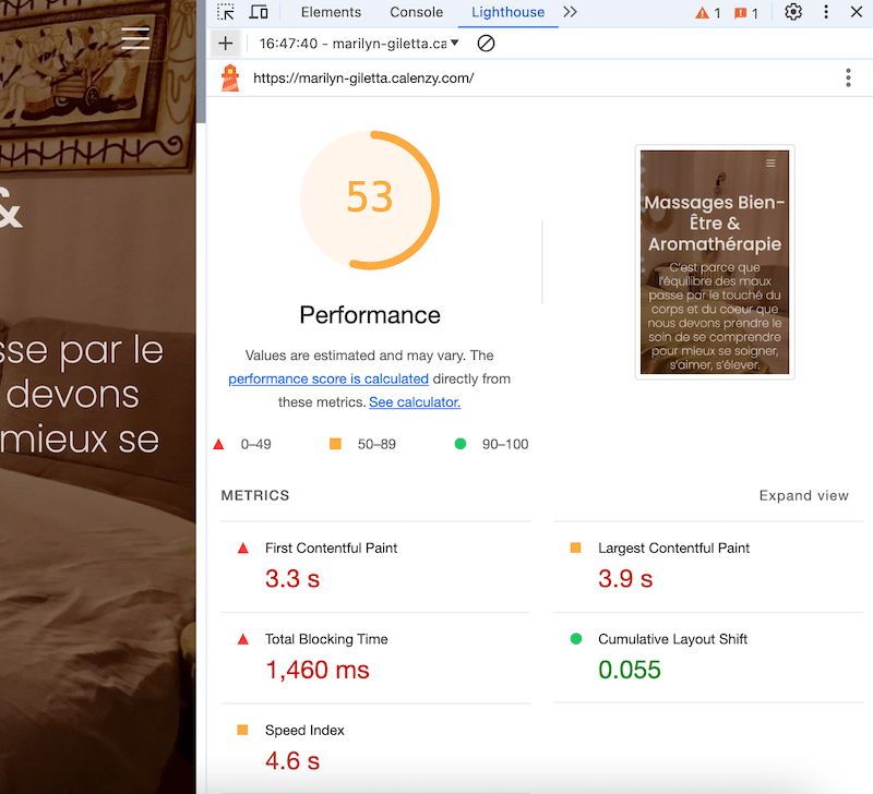
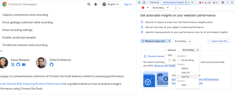
2. Chrome DevTools
Also powered by Lighthouse, Chrome DevTools is a handy tool for assessing your website’s performance on desktop and mobile. It offers a comprehensive assessment of performance, accessibility, and SEO, helping you optimize websites for mobile users directly within the Chrome DevTools environment.
- How to access Chrome DevTools:
Click on the three dots to open Chrome Settings > More Tools > Developer Tools > Lighthouse > Analyze page load.
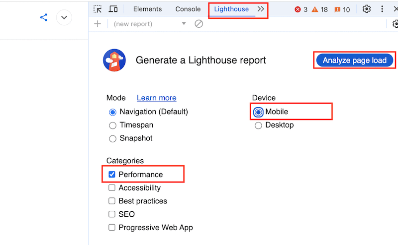
- Mobile-related Optimization KPIs and Features: Once the audit is complete, Lighthouse provides a detailed report on the page’s performance, including Core Web Vitals.
- Another feature for measuring mobile page load times is recording your page to gain an overview of its runtime performance. Additionally, you can adjust the throttling settings and select a fast 4G connection, for example, to simulate how your site performs on mobile devices using 4G networks.
- Pricing: Free.
- Use it if: You want to run a performance test directly from Chrome or measure mobile page load times by recording your page.
3. GTmetrix | Website Performance Testing and Monitoring
GTmetrix is a comprehensive performance testing tool powered by Lighthouse that analyzes mobile speed and provides recommendations. It also gives you the grades for the Core Web Vitals.
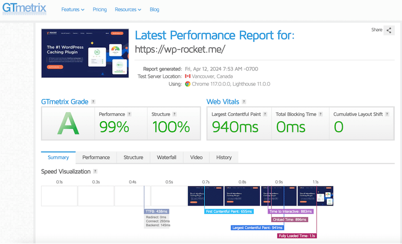
- Mobile-related Optimization Features and KPIs: This tool allows testing from more than 40+ simulated devices and provides insights into mobile-specific performance issues like responsive design and mobile caching. There is also an option for connection throttling, including 4G or custom speed (test with multiple connection speeds to see how your page loads for your mobile visitors).
GTmetrix categorizes suggestions based on their impact, so you should prioritize any red high-impact recommendations first.
- Pricing: A free plan is available, but you will need a premium plan for advanced mobile testing, which starts at $14.95 monthly.
- Use it if: You need a precise page composition analysis. It reveals which elements occupy the most space, such as images or CSS, enabling you to optimize both images and code effectively.
4. WebPageTest
WebPageTest is an open-source tool that offers advanced performance testing options on mobile. The tool is trusted by major brands such as Stripe or Shopify.
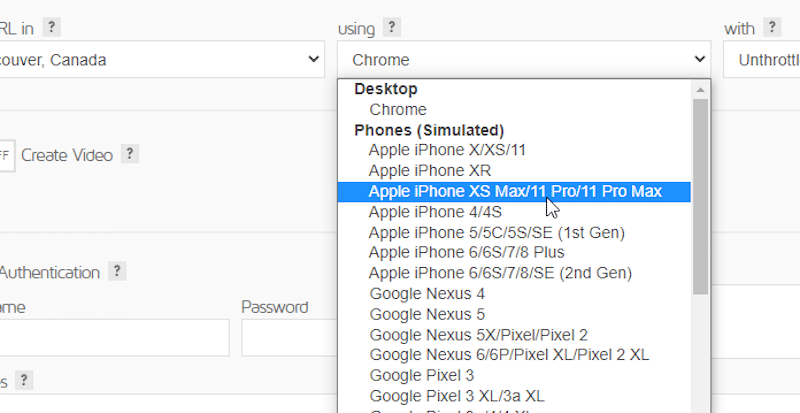
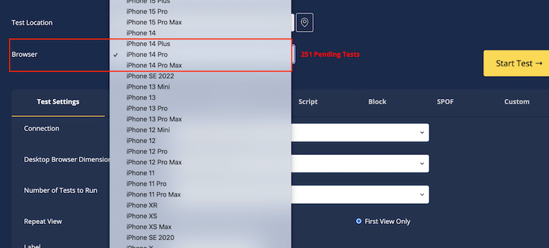
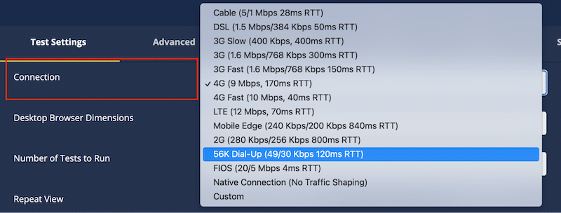
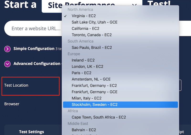
- Mobile-related Optimization Features and KPIs: This tool allows testing from real mobile devices and offers insights into mobile performance optimizations. It lets you change the connection (4G, for instance), the device (iPhone, Google Pixels, etc.), the desktop browser dimension, and the location.
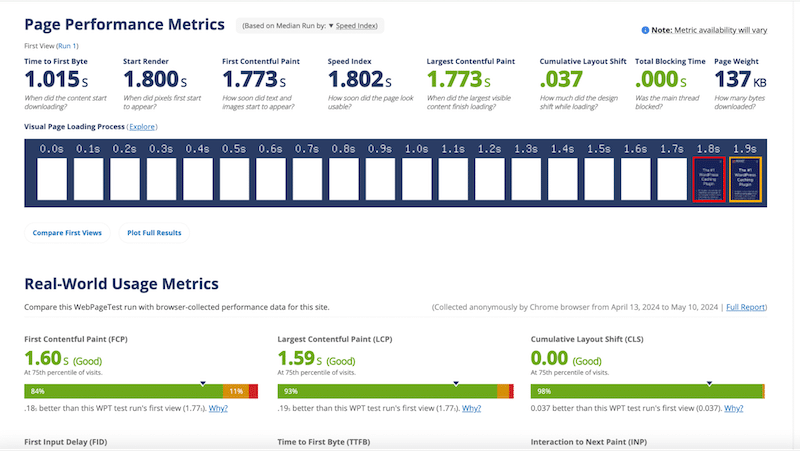
In terms of KPIs, you can measure the Core Web Vitals and other important metrics such as Speed Index, Page Weight, and Time to First Byte:
- Pricing: Free.
- Use it if: You need comprehensive testing on real mobile devices and want to adjust the connection (like 4G or 5G), select different devices (like iPhone or Google Pixel), set desktop browser dimensions, and test from several locations.
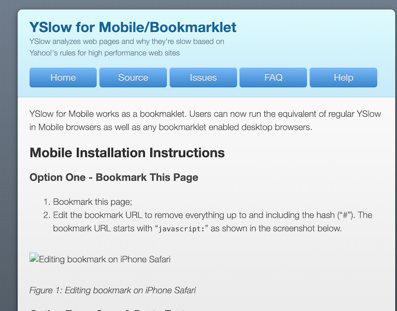
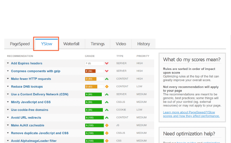
5. YSlow
YSlow is a performance analysis tool provided by Yahoo that analyzes web pages based on Yahoo!’s rules for high-performance websites. YSlow for Mobile works as a bookmarklet.
- Mobile-related Optimization Features and KPIs: YSlow evaluates webpage grades using either one of three default rulesets or a custom ruleset defined by the user. It provides recommendations to enhance the page’s performance, summarizes its components, and showcases statistics regarding the page.
Yahoo!’s Performance team has identified 34 rules that affect web page performance (which are very similar to PageSpeed Insights’s KPIs). These rules are graded from A to F, represented by colors from green to red, and prioritized accordingly. If you want to view the exact numerical weighting of each rule, you can head to this page.
- Note: Follow this tutorial to add YSlow for mobile, as it does not work out of the box.
- Pricing: Free
- Use it if: You want to generate performance reports in a printable format and optimize images, as it also integrates with the Smush tool.
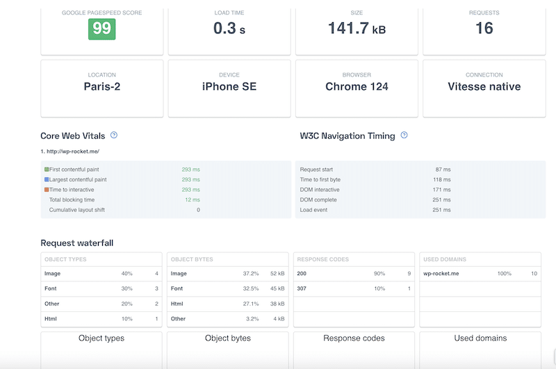
6. UpTrends
UpTrends integrates Google’s Core Web Vitals and W3C navigation timing metrics, providing insights into crucial load events like First Contentful Paint (FCP) and Time to First Byte (TTFB). Additionally, a new feature offers a timeline of screenshots, capturing page updates during loading to visualize the full loading process duration.
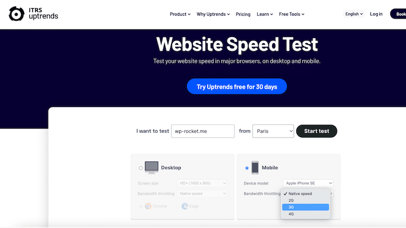
- Mobile-related Optimization Features and KPIs: UpTrends allows you to select the test from 10 global locations. You can also choose your preferred connection type, including 4G, and select from various device options, such as iPhone or Samsung.
- Pricing: It’s free for the performance test but premium if you need all the monitoring features (paid plans start at $100).
- Use it if: You need flexibility to assess website performance from different perspectives and network conditions.
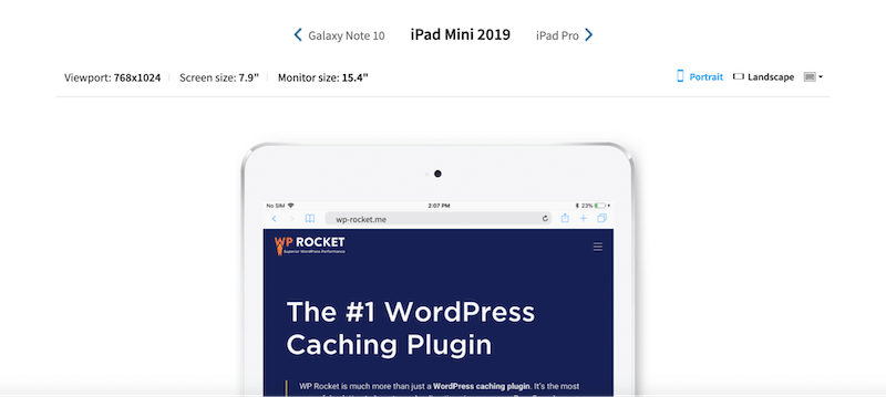
7. BrowserStack
BrowserStack allows you to load your websites on various devices with different screen resolutions. Users can then click on a specific device to confirm if the webpage displays correctly.
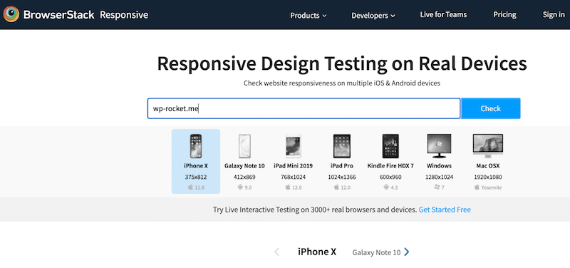
- Mobile-related Optimization Features and KPIs: It lets you check your site on devices like iPhone X, Galaxy Note 10, iPad Pro, and more. It helps find any issues or differences in how the website looks on different devices.
Enter the website URL and click “Check” to assess its responsiveness. You can see how your site appears on each type of device.
- Pricing: free for a few tests, starting at €29/month for a single user.
- Use it if: You need to test your site’s responsiveness and check how it looks exactly on real devices such as iPad minis, Samsung, and more.
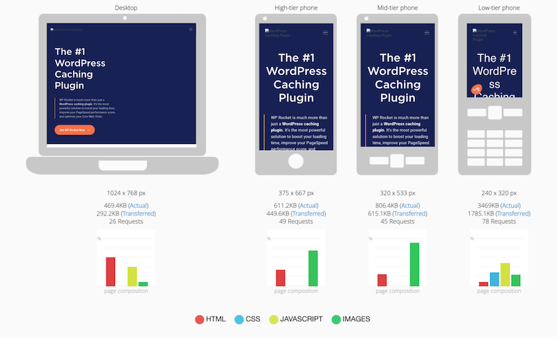
8. MobiReady
MobiReady is a tool designed to assess and optimize mobile websites’ performance across various key performance indicators (KPIs) and devices.
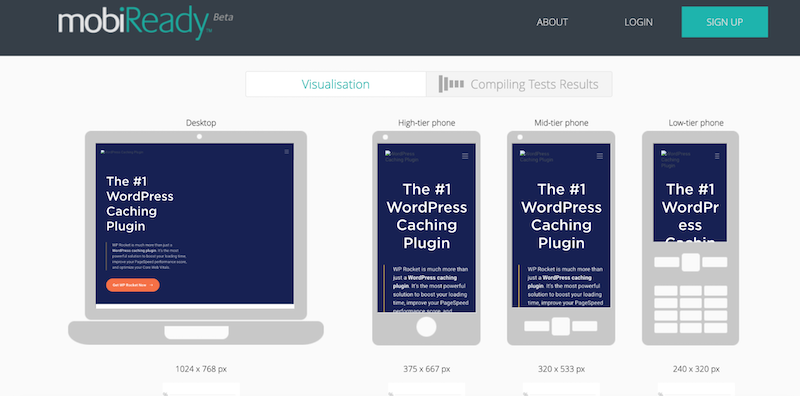
- Mobile-related Optimization Features and KPIs: MobiReady evaluates mobile websites based on critical performance metrics such as page load time, page size, and the number of HTTP requests. MobiReady also tests mobile websites across different devices to ensure compatibility and functionality.
It also tells you the page composition on different devices: HTTP requests, JS, Images, and HTML.
- Pricing: the performance test is free
- Use it if: You need to know how your site looks on desktops and mobile devices and get a brief overview of the page composition (HTML, CSS, JS, and images).
8. Dotcom-tools
Dotcom-Monitor offers comprehensive tools for web page performance testing on mobile and from several locations.
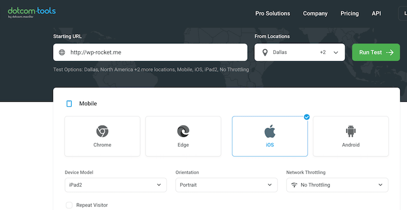
- Mobile-related Optimization Features and KPIs: You can test your website across various devices, locations, and connection types, aiding in the identification of potential issues across different devices.
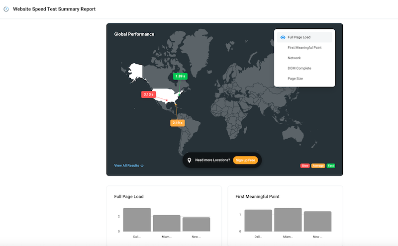
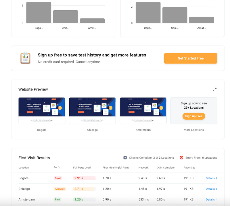
Here’s a summary report detailing key performance indicators (KPIs) such as Fully Page Load, First Meaningful Paint, and Dom Complete in three different locations. Below is an example showcasing Bogota, Chicago, and Amsterdam KPIs.
- Pricing: it’s free.
- Use it if: You need to quickly assess how your site loads in different locations and have all the results on a single screen.
| 💡Hint: All the performance tools have a similar approach when it comes to testing performance on mobile. Visit the tool’s website > Enter your URL in the dedicated field > Select the “Mobile” option > Adjust any device or network settings if needed > Run the test > Analyze results on mobile. |
Checking Your Mobile Website Speed: 4 Tips
Now that you know the best mobile performance tools, here are four recommendations for conducting effective tests.
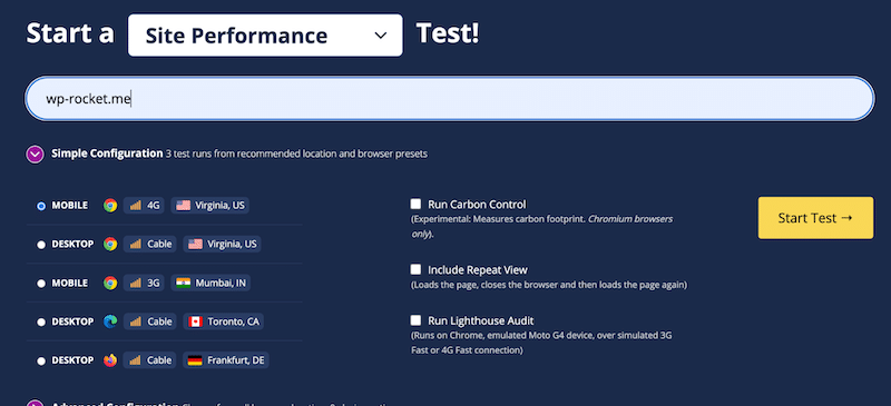
We’ll use WebPageTest to show you how to apply the tips in some real-case scenarios.
1. Test on Different Devices
Ensure your website performs well on various devices such as Samsung or iPhone, tablets, and different screen resolutions. This ensures a consistent user experience across different mobile platforms.
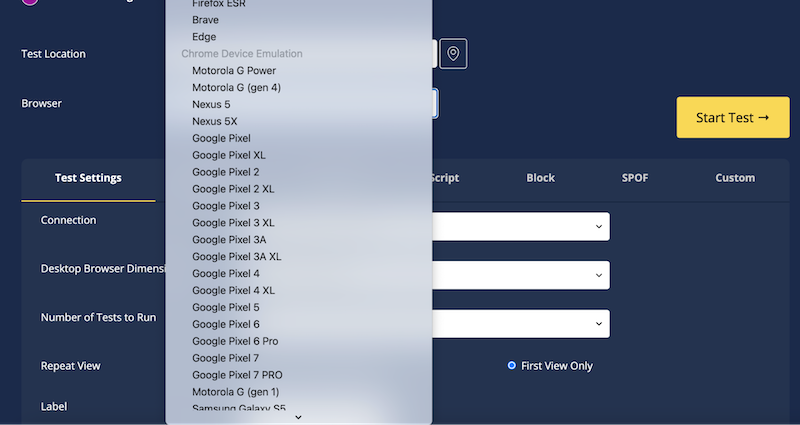
For example, select the device from the browser drop-down menu from which you want to do the simulation. You can choose between iPhones, tablets, and Google ePixel.
2. Test on Different Network Conditions
Adjust network throttling to simulate different conditions like 4G or 5G speeds. This helps understand how your website performs under varying network conditions, ensuring optimal performance for users regardless of their connection speed.
Similar to a desktop test, run several tests from different locations to see how your site performs worldwide.
3. Run Mobile Tests Regularly
Continuously monitor your website’s performance and key performance indicators (KPIs), such as revenue generated from mobile sales. Regular testing helps identify trends and allows timely adjustments to improve mobile performance.
4. Benchmark Against Competitors
Compare your mobile performance against competitors’ sites to identify areas for improvement and stay ahead in the market. Always strive to outperform competitors and offer a better mobile user experience.
Now that you understand the significance of mobile testing and performance and are equipped with the best tools and tips for running tests, let’s delve into four optimization techniques you can implement to speed up your site on mobile.
Some Rapid-Fire Tips To Speed Up Your Mobile Site
To begin optimizing your mobile site’s speed, you can put your focus on these four key optimization techniques:
1. Use Mobile Caching
Implementing mobile caching helps reduce load times by storing frequently accessed data on the user’s device.
✅ WP Rocket is an easy-to-use WordPress performance plugin that automatically implements caching and 80% of the performance best practices upon activation.
2. Optimize Images for Mobile
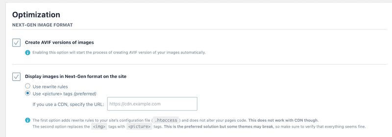
Ensure images are optimized for mobile devices by making them responsive, using next-gen formats like WebP and AVIF, and compressing them without compromising quality.
✅ Image compression on mobile: Imagify is a user-friendly image compression plugin for WordPress that applies compression automatically without impacting image quality.
✅ Serve next-gen formats on mobile: Imagify automatically serves images in the WebP format and allows you to convert them to AVIF as well.
✅ Responsiveness: Use <srcset> and the <picture> element to ensure responsiveness across various screen sizes.
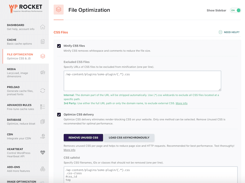
3. Optimize Your Code
Code optimization on WordPress aims to enhance website performance by refining the delivery and execution of CSS and JavaScript files. This involves:
- Minify CSS and JavaScript files: Removing unnecessary characters and spaces from these files reduces their size.
- Defer JavaScript execution: Delaying non-critical JavaScript to prioritize the content seen by the user.
- Remove unused CSS: Eliminating unused CSS rules from WordPress themes and plugins reduces file size and browser processing, further enhancing load times.
✅ WP Rocket offers features to help optimize code automatically and reduce unnecessary CSS and JS code in a few clicks.
4. Build Accelerated Mobile Pages (AMP)
AMP is a framework for creating fast-loading web pages optimized for mobile.
✅ Use the official AMP WordPress plugin.
| 📖 Want to dig deeper into mobile performance? Read our complete guide on how to make your mobile site load faster. |
Wrapping Up
In conclusion, testing the speed of your website on mobile is essential for delivering a seamless user experience. With the best tools at your disposal, you can conduct thorough audits and identify performance issues that need addressing.
Imagify may be your best ally for easy image optimization on mobile if you encounter any image-related issues. Features like smart bulk compression, WebP, and AVIF conversion will help your site to be faster on mobile.
On the other hand, consider using WP Rocket for caching, text compression, lazy loading, and code optimization. There are no risks involved in trying WP Rocket, as it comes with a 14-day money-back guarantee. Optimize your site’s mobile performance confidently!