Table of Contents
Last update on
Do you want to turn more visitors into loyal customers for your e-commerce store? The first step is to maximize your store’s potential with our e-commerce conversion checklist!
The e-commerce conversion rate is a key metric for measuring the effectiveness of your website in turning visitors into customers—whether purchasing, adding an item to the cart, or signing up for a newsletter.
The CRO (Conversion Rate Optimization) checklist helps boost your e-commerce sales by focusing on performance, design, and layout. It also highlights the importance of creating engaging product pages, reducing cart abandonment with practical strategies, and making the checkout process seamless.
This comprehensive checklist includes 10 essential elements to optimize your site and increase conversions.
1. Calculate Your Conversion Rates
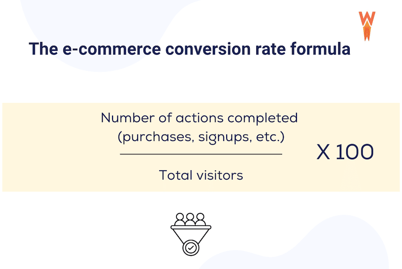
To calculate your conversion rates effectively, you need a clear understanding of your e-commerce site’s performance across various metrics. You can calculate it by dividing the number of conversions by the total number of visitors and multiplying by 100.
🛒 E-commerce example
Here is an example of sales conversion rates for a WooCommerce site:
Suppose your WooCommerce site received 1,000 visitors over a month, and 50 of those visitors made a purchase. The sales conversion rate would be calculated as follows:
Sales Conversion Rate = ( 50 sales / 1,000 visitors ) x 100 = 5%
📊 E-commerce stats
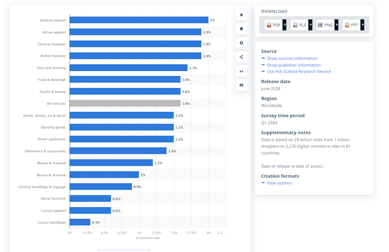
Check out the industry-specific stats below to see how your e-commerce site stacks up against the competition:
✅ Best practices and action plan
Your e-commerce conversion optimization journey starts with the following best practices:
- Start by reviewing your sales reports, the number of sales, sign-ups, and the sales attributed to specific ads or marketing channels. Each channel should be analyzed individually to understand where conversions come from and how different strategies perform.
- Research industry-specific conversion rates to set realistic goals.
- Break down your goals by customer segment (e.g., new vs. returning visitors) for a more focused approach.
- Set SMART Goals (Specific, Measurable, Achievable, Relevant, and Time-bound). Example: “Increase monthly e-commerce sales by 15% over the next three months by launching a targeted email marketing campaign, aiming for a revenue increase from $50,000 to $57,500 by the end of the quarter.”
- Monitor your conversion goals and adjust them based on performance, testing, and user behavior insights.
⚙️ Recommended tools
- WooCommerce or Ecwid plugins have detailed sales reports.
- Google Analytics or Matomo: Those analytics tools track and analyze website traffic and campaign performance, providing insights into user behavior and the effectiveness of marketing efforts. They both offer a free WordPress plugin to monitor your WordPress site easily.
| 📖 Check our guide to find the best shopping cart plugins to help you measure your conversion rate, thanks to their detailed sales reports. |
2. Improve Your Site’s Performance
Page speed and conversions are closely related. Faster-loading pages lead to a better user experience, which in turn increases the likelihood of conversions. If a website takes less time to load, potential customers may become frustrated and abandon their shopping cart. Additionally, Google considers page speed a ranking factor in its SEO algorithm, meaning that a slow site can negatively impact your visibility in search results.
🛒 E-commerce example
Let’s study the performance of the WooCommerce site “Marey” on Page Speed Insights. PageSpeed Insights is a tool that evaluates a webpage’s performance, providing insights and suggestions for improvement.
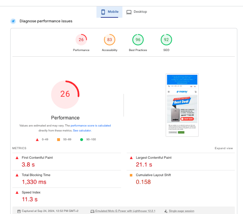
The audit focuses on Core Web Vitals and other key performance metrics, and the Opportunities section highlights actionable suggestions such as optimizing images, eliminating render-blocking resources, using caching, and minimizing unused JavaScript.
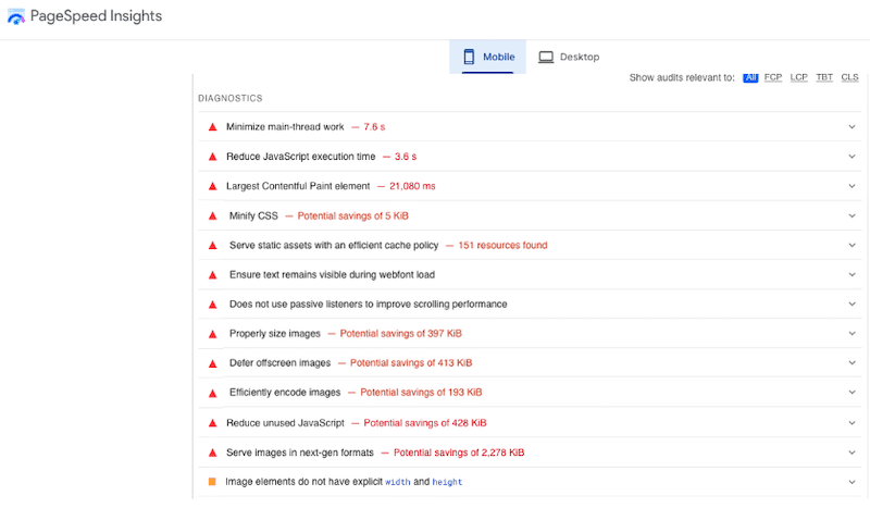
There is also a Passed audits section that shows aspects that are performing well:
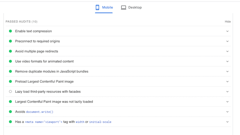
By following the recommendations from PageSpeed Insights, you’ll see your overall score increase, leading to faster page speeds, improved user experience, higher conversion rates, and better search engine rankings.
| 📖 Read our guide to learn more about how to test your WordPress performance. |
📊 E-commerce stats
- A 1-second delay in page load time can result in a 7% reduction in conversions (Source: Neil Patel).
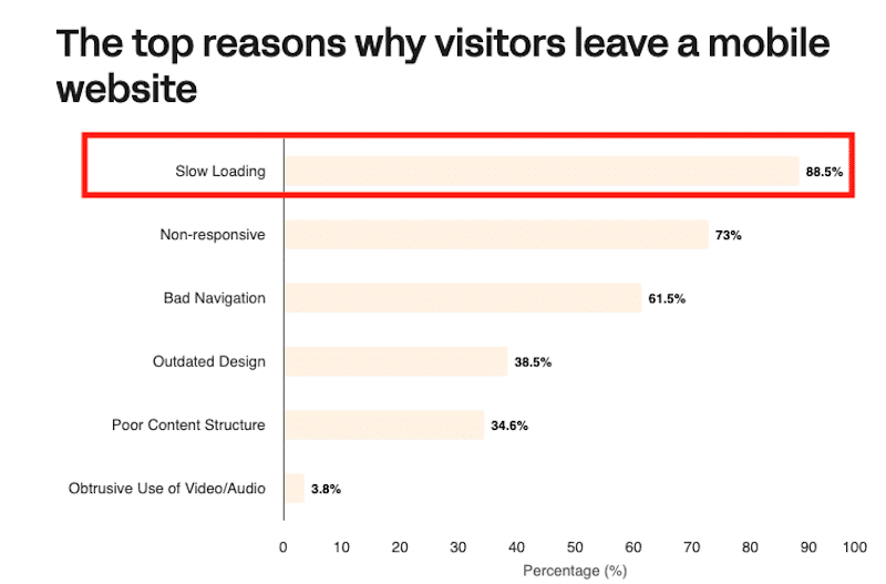
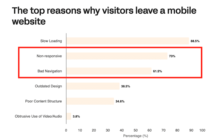
- Almost 90% of mobile users would leave a mobile site if it’s slow (Source: Linearity).
✅ Best practices and action plan
- Opt for a hosting provider known for speed and reliability.
- Select a lightweight theme optimized for performance.
- Too many plugins can slow down your site. Use only plugins that are essential for your e-commerce functionality.
- Implement caching to store a static version of your website, reducing load times for returning visitors. Caching minimizes server requests and serves the content faster to your potential clients.
- Optimize CSS by implementing actions like minification and removing unused CSS to reduce file size and improve page loading time.
- Defer JavaScript loading and delay its execution until the main content has loaded. JavaScript optimization also makes your website faster.
| 💡Example: You want product images and descriptions to load quickly when browsing an online store. By deferring non-essential JavaScript—like chat widgets or pop-ups—the main content loads first, giving you a faster, smoother experience while other features load in the background. |
- Optimize images and videos with compression to reduce file sizes and convert images to next-gen formats (like WebP and Avif).
- Implement lazy loading to ensure the essential images load first. Lazy loading is a technique that delays the loading of pictures until the user scrolls to the point where they are needed.
⚙️ Recommended tools
- Check our list of best WordPress-managed hosting to find providers that prioritize speed.
- Check our list of the fastest WooCommerce themes to select themes that enhance performance.
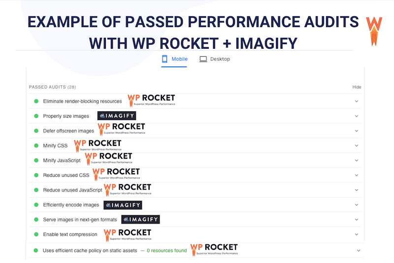
- WP Rocket: It’s the easiest and most powerful WordPress performance plugin that effortlessly improves your site’s speed. WP Rocket automatically applies 80% of the performance best practices upon its activation. WP Rocket features include caching, CSS optimization, defer and delay JS, lazy loading, and much more.
- Imagify: The easiest image optimization plugins that automatically compress images without losing quality. The plugin comes with bulk optimization features, saving you time and effort. It also offers WebP and AVIF conversion, which are next-gen formats Google recommends.
Imagify and WP Rocket are powerful tools that handle the tech for you while delivering excellent results. They boost conversions and help you pass the performance audits on PageSpeed Insights effortlessly.
| 📖 Are you experiencing a slow online store? Check out our in-depth guide on how to speed up your WooCommerce site. |
3. Opt For a Responsive Design and a Clear Navigation
A visually appealing and intuitive layout helps users quickly find what they’re looking for on mobile and desktop. When visitors can easily navigate your site and find products or information, they’re more likely to stay longer, engage more deeply, and ultimately convert into customers.
🛒 E-commerce example
Apple’s site is renowned for its modern design and seamless navigation, making it easy for users to browse, customize products, and complete the buying process with minimal steps.

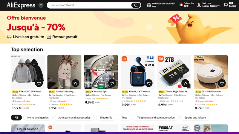
On the other hand, while AliExpress offers a vast range of products, the navigation can sometimes be overwhelming due to complex categories and inconsistent search results. The checkout process also tends to be less straightforward, with delivery and payment options not always clear.
📊 E-commerce stats
- Website design influences 94% of first impressions (Source: WebFX).
- 73% of mobile users leave a mobile site if it’s non-responsive.
- 61.5% of mobile users leave if the site offers terrible navigation.
- Around 35% of mobile users leave the site for an outdated design and a poor content structure (Source: Linearity).
✅ Best practices and action plan
Here are some best practices for a clean design and clear navigation on an e-commerce site to optimize conversions:
- Simplify the layout and keep the design minimal and uncluttered to ensure easy navigation and a clear focus on products.
- Use intuitive menus and submenus to organize product categories logically with easy-to-find.
- Highlight CTAs clearly and use bold and well-placed call-to-action buttons to guide users through purchasing.
- If you prefer more design flexibility, choose a fast WordPress theme or page builder with pre-built demo sites. These demos often feature modern layouts for product and shop pages, giving you a head start on design.
⚙️ Recommended tools
- Use the WordPress Editor with a native WP theme: You can use the WordPress block editor directly with a native WP theme for a streamlined design process. This approach leverages WooCommerce’s straightforward UX for product displays and checkout processes, making it easy to manage an e-commerce site without overcomplicating the design.
- The WooCommerce Builder of Elementor or Avada lets you customize every part of your WooCommerce site—from product pages to checkout- to create a unique and user-friendly shopping experience.
4. Implement Advanced Filters
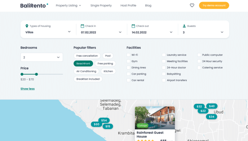
Advanced filters are essential for enhancing user experience in e-commerce by allowing customers to narrow down their product searches based on specific attributes such as size, color, brand, or price. When users can easily find what they are looking for, they are more likely to make a purchase, leading to greater customer satisfaction and increased sales.
🛒 E-commerce example
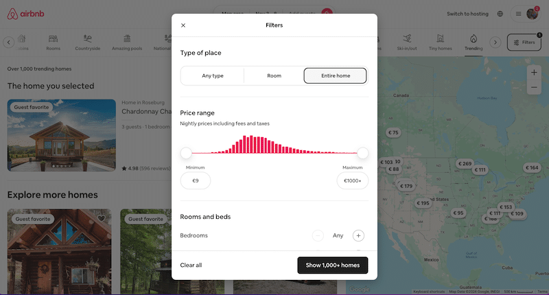
A great example of effective filtering is Airbnb, which utilizes advanced filters such as dynamic pricing and map searches to help users find their perfect accommodation.
📊 E-commerce stats
- 31% of all product searches end in failure when visitors use search tools on e-commerce sites. (Source: Baymard).
- 43% of consumers would pay more if they could find what they’re looking for in just a few clicks. (Source: Sales Force).
✅ Best practices and action plan
To address common issues in e-commerce filtering, consider these best practices:
- Ensure search boxes are easy to find, avoiding low-visibility designs like tiny magnifying glass icons or hidden menus.
- Implement functionality that supports common keyword synonyms and forgives typos.
- Use consistent pagination, sorting, and filtering to present search results clearly.
- Ensure filters are relevant and functional, avoiding irrelevant attributes and empty result sets.
⚙️ Recommended tools
- Advanced AJAX Product Filters: It enables smooth and dynamic filtering without page reload on WooCommerce.
- Toolset Views: It allows you to create custom searches and filters to improve product visibility and user navigation.
- JetSmartFilters: It provides advanced filtering options that can be customized to fit various e-commerce needs.
5. Make sure your shop is trustworthy
Building trust is essential for boosting conversions on an e-commerce site. Trust indicators help reassure customers that your store is secure and reliable, making them more likely to complete a purchase. That’s how it works: if you feel confident that your information and transactions are safe, you will most likely make a purchase.
🛒 E-commerce example
A typical example of a trust-inducing design is Amazon, where product reviews, seller ratings, and clear return policies build customer confidence. The presence of security symbols (like padlocks) on payment pages and easy access to support information also enhances trust.
💡 Examples of trust indicators
- An “about us” page.
- Customer reviews and ratings to help shoppers make informed decisions.
- Security badges or trust seals such as SSL certificates or padlock icons “Verified by Visa” or “McAfee Secure” on payment pages to reassure customers that their data is protected.
- A straightforward way to reach customer support.
📊 E-commerce stats
Here are some stats that show how credibility, safety, and customer reviews influence purchasing decisions:
- 69% of customers abandon their shopping carts due to concerns about payment security (Source: Baymard Institute).
- 87% of consumers read online reviews before purchasing (Source: BrightLocal Consumer Review Survey).
✅ Best practices and action plan
- Display verified customer reviews prominently on product pages.
- Use SSL certificates to secure your site and display security badges on checkout pages.
- Offer clear, easy-to-understand return policies.
- Provide multiple payment options that customers recognize and trust.
- Display trust seals and certifications from reputable security providers.
- Make it easy for your customers to get in touch with you.
- Draft a human-centric “about us” page.
⚙️ Recommended tools
- Customer Reviews for WooCommerce: This plugin allows customers to leave verified reviews, making your product pages more trustworthy.
- Site Reviews: A comprehensive review management plugin for your website, offering features like review pinning, verification requests, approval processes, user login requirements, notifications, and response capabilities.
6. Create Custom Landing Pages That Match Your Ads
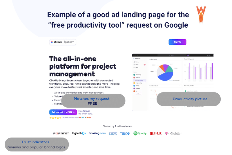
Creating custom landing pages that align with your ads is key for optimizing conversions. When potential clients click on your ad, they expect to be directed to a relevant and tailored page that matches their interests.
🛒 E-commerce example
If your ad promises a “free tool for enhancing productivity,” visitors should arrive on a page that presents the free solution and its benefits:
📊 E-commerce stats
- 72% of businesses that optimize their landing pages see improved conversion rates (Source: HubSpot).
- Landing pages with a single call-to-action can increase conversions by 266% (Source: WordStream).
✅ Best practices and action plan
- The landing page content should directly relate to the ad copy and keywords.
- Make it easy for visitors to know what to do next, whether purchasing, signing up, or downloading, with clear call-to-actions.
- Avoid clutter and distractions; focus on a single goal for the landing page.
- Ensure the landing page is responsive and looks great on all devices.
⚙️ Recommended tools
- ThriveArchitect: A powerful WordPress plugin for building visually engaging, conversion-focused landing pages without coding.
- Elementor: Elementor is an intuitive drag-and-drop builder that makes designing responsive, high-converting landing pages accessible on WordPress.
7. Provide Easy Access and Clear Return and Shipping Policies
Clear and easily accessible return and shipping policies are crucial for boosting conversions and minimizing cart abandonment. Displaying transparent shipping and return information reassures customers and reduces last-minute hesitation, leading to higher trust and conversions.
🛒 E-commerce example
We’ve made up two e-commerce examples—one showcasing good practices in shipping and the other highlighting poor practices. It’s a bit extreme, but it helps illustrate the point.
Here’s a good example:
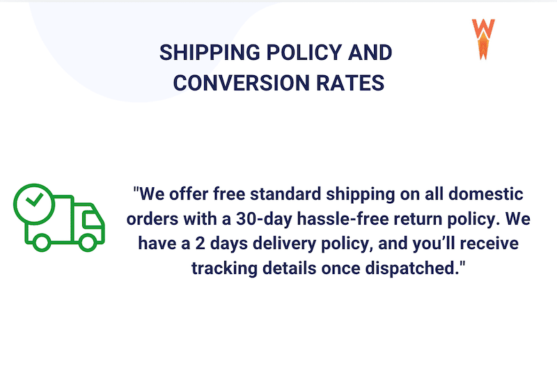
Why it works: The policy is clear, offers value (free shipping), and sets customer expectations for delivery and returns, eliminating confusion.
Here’s a bad example:
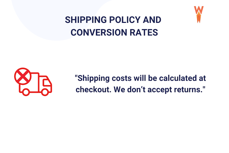
Why it fails: The lack of upfront shipping information and strict return policy creates uncertainty and discourages customers from proceeding with the purchase.
📊 E-commerce stats
Unexpected shipping costs are the top reason for cart abandonment, causing 48% of shoppers to leave their purchase incomplete. (Source: Baymard Institute)
✅ Best practices and action plan
- Display shipping costs, delivery times, and return options clearly on product pages and during checkout.
- If possible, offer free or flat-rate shipping.
- Make returns easy by offering labels with clear instructions;
- Reinforce trust by sending shipping and return details post-purchase.
⚙️ Recommended Tools
- Cartflows: Use this tool to add custom fields and provide additional shipping, returns, or order info during the checkout process.
8. Offer Multiple Payment Gateways
Having a variety of payment gateways is a key strategy to increase conversions in e-commerce. Different countries have distinct payment preferences, and businesses can reduce friction at checkout and boost customer satisfaction. Also, customers feel more secure using their preferred payment method, increasing their likelihood of completing the purchase.
🛒 E-commerce example
For example, in the figure below, we showcase options such as UnionPay, PayPal, and Credit Card, allowing users to choose their preferred payment method. This is particularly useful for businesses with a global audience.

📊 E-commerce stats
- 9% of shoppers abandon their purchase if there aren’t enough payment options. (Source: Tidio).
✅ Best practices and action plan
- Ensure the payment gateway supports various payment methods that match your audience’s preferences. This includes credit and debit cards, digital wallets (like PayPal and Apple Pay), and local payment options relevant to your market.
- Use tools like Statista, eMarketer, or Worldpay’s Global Payments Report to conduct market research on payment preferences in different countries. This can help identify the most widely used gateways in your target regions.
- Make sure your solution works with your e-commerce shopping cart plugins or platform.
⚙️ Recommended tools
- WooCommerce Payments: Specifically designed for WooCommerce stores, this plugin provides seamless integration and supports a wide range of payment methods, including cash collection, bank transfers, Apple Pay, and PayPal.
- Payment Plugins for Stripe & WooCommerce: This plugin offers advanced Stripe payment features while supporting additional local payment gateways.
9. Craft Engaging Product Pages
A product page is a crucial element of your e-commerce store and should be crafted with care to maximize conversions. A well-designed product page attracts visitors and persuades them to make a purchase. It serves as the final touchpoint before customers commit to buying, making it essential to provide all necessary information, build trust, and highlight the value of the product.
🛒 E-commerce example
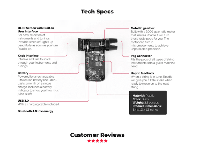
An example of a product page built with WooCommerce can be seen with the Roadie 2 camera, which presents a smart and visual way to highlight its technical specifications.
📊 E-commerce stats
- 93% of consumers look at product reviews on the product page before making a purchase (Source: Podium’s Consumer Review Survey.)
✅ Best practices and action plan
To create a high-converting e-commerce product page, consider implementing the following best practices:
- Highlight the unique aspects of your product that differentiate it from competitors.
- Use professional images and videos that showcase the product from multiple angles. Interactive elements like 360-degree views can enhance the shopping experience.
- Include customer reviews and ratings prominently on the product page.
- Clearly outline what makes the product valuable. Use bullet points for easy readability, focusing on how the product meets the needs of the customer.
- Offer a transparent delivery and returns policy to provide customers with peace of mind.
- Address common customer questions and concerns proactively in a FAQ.
- Ensure your Call to Action (CTA) buttons, such as “Add to Cart” or “Buy Now,” are clear, prominent, and specially optimized for mobile devices.
- Suggest related products as customers browse, such as “Products You May Like” or “We Keep It for 20 Minutes!”
⚙️ Recommended tools
- WooCommerce: By default, WooCommerce includes many best practice elements for product pages, but its design options are limited. Consider choosing a WooCommerce theme that fits your brand to improve layout and design.
- Elementor or Divi: These page builders come with WooCommerce templates that allow you to create fully customizable product pages.
10. Offer Guest Checkout and/or an Easy Sign-Up Process
Providing a guest checkout option and a simple sign-up process can significantly impact conversion rates for your e-commerce store.
Imagine you’re running a WooCommerce store. When first-time customers visit, they may not want to create an account immediately. By offering guest checkout, they can make their purchase without the hassle of registration, which streamlines the buying process.
On the other hand, providing a fast and easy sign-up process can encourage repeat purchases by saving their preferences and details for future transactions.
🛒 E-commerce example
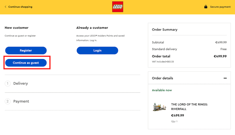
Lego provides three checkout options to enhance the shopping experience for all users: Guest Checkout for quick purchases without account creation, Login for returning customers to access saved details, and Sign-Up for new customers to create accounts and personalize their future shopping.
📊 E-commerce stats
- Simply offering guest checkout can increase conversion rates by 45%. (Source from Bolt).
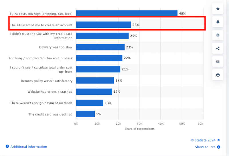
- Studies show that 26% of consumers abandon their carts because they’re forced to create an account. (Source from Statista).
✅ Best practices and action plan
Both guest checkout and easy sign-up have their advantages. Here’s how to identify which option suits your business needs:
- Guest checkout: This is ideal for first-time buyers or customers in a hurry. It reduces friction by allowing them to quickly complete their purchase without creating an account, which encourages faster transactions and fewer abandoned carts.
- Easy sign-up: This option works best if your goal is to build a customer database. A simple, hassle-free sign-up process allows users to save their preferences, access order history, and receive personalized offers, improving customer retention and loyalty over time.
⚙️ Recommended tools
- WooCommerce: For WooCommerce users, enabling both features is easy.
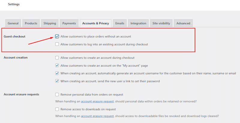
Go to WooCommerce > Settings > Accounts & Privacy, and in the Guest Checkout section, uncheck “Allow customers to place orders without an account” to enable guest checkout. You can also customize the account creation process to make it simple and user-friendly, encouraging sign-ups without forcing it.
Wrapping Up
By applying our best practices and following our e-commerce conversion optimization checklist, you’ll be well on your way to beating the 2.03% average e-commerce conversion rate.
Optimizing your e-commerce site ensures users can navigate and complete purchases quickly, signaling to search engines like Google that your site is efficient, leading to improved visibility and engagement.
Since speed is often the #1 reason for mobile cart abandonment and hurting your conversion rate, avoid losing potential customers by using WP Rocket—and don’t forget, you’re covered by the 14-day money-back guarantee so you can test it risk-free!


