
Table of Contents
Last update on
Looking for the best mobile site speed optimization techniques? That’s the right article. Did you know that mobile users now outnumber desktop users? Mobile has become the primary way people browse, shop, and interact online.
In this guide, you’ll learn how to improve mobile website speed and properly test mobile performance. You’ll also discover the mobile optimization best practices and the most common mistakes to avoid, based on real-world feedback from WordPress experts.
By the end, you’ll know exactly how to monitor, optimize, and maintain strong mobile site performance in the long term.
| TL;DR: Mobile site speed optimization starts with testing and optimizing under real mobile conditions, not ideal desktop setups. Beyond performance scores, experts recommend focusing on audit and insight sections in tools like PageSpeed Insights and GTmetrix to get actionable recommendations for mobile load time optimization. To improve mobile performance, serve smaller images, keep pages lightweight with optimized code, implement caching, and use a CDN for faster loading for international visitors. |
Key takeaways for mobile site speed optimization
✅ Always test and optimize on mobile first, using real devices, 4G connections, and multiple locations (Best tool: Gtmetrix).
✅ Use WP Rocket to implement mobile caching, font preloading, CSS and JS optimization, lazy loading, and critical image optimization.
✅ Optimize images for mobile with Imagify, using smart compression and conversion to next-gen formats like WebP and AVIF.
✅ Serve mobile-sized images (not desktop assets) to reduce payload and speed up mobile websites.
✅ Use a CDN to reduce latency and improve mobile site performance for international visitors.
What’s Mobile Site Speed Optimization?
Mobile site speed optimization is a set of techniques aimed at making your website load quickly on smartphones and tablets, so visitors get a fast experience no matter the device they use. It relies on techniques like image optimization, mobile caching, JavaScript and CSS optimization, and fast content delivery to users worldwide.
Why does it matter? Mobile performance directly impacts SEO, conversions, and user experience. A fast mobile site keeps users engaged, reduces bounce rates, and helps you achieve better financial results.
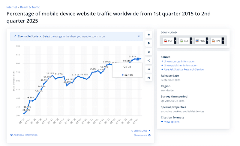
According to Statista, mobile traffic now dominates the web. In 2025, around 63% of all global web traffic came from mobile devices, meaning most people experience your site first on a phone or tablet.
Mobile Site Speed vs Desktop Speed
Mobile site performance differs from desktop performance because mobile devices typically have slower processors, less memory, and less stable connections, such as 4G or variable Wi-Fi. User behavior and expectations are also different on mobile.
Let’s take a simple example. If you want to purchase a bus ticket quickly while you’re on the go, just before the bus arrives, you expect the page to load almost instantly. Mobile users are often “in a hurry”, and even a one-second delay can lead to frustration and higher bounce rates. On desktop, speed still matters, but users are usually less rushed, and their browsing or purchasing habits tend to differ.
| 💡Hint: When it comes to mobile performance optimization, always test and optimize for mobile first. In most cases, mobile scores are worse than desktop scores, so fixing mobile issues naturally improves overall site performance. |
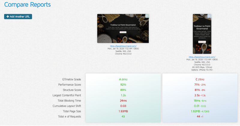
For example, with GTmetrix – a powerful performance tool that measures Core Web Vitals and other key performance indicators – you can test performance on both mobile and desktop.
You can also compare results across devices and network conditions, such as an iPhone 15 on a 4G connection versus a desktop. As you can see below, performance scores are often lower on mobile, underscoring why mobile load-time optimization should be the priority.
Responsive Design vs Mobile Performance
Being “responsive” doesn’t automatically mean your mobile website is fast. Responsive design makes sure your layout adapts to different screen sizes, but it doesn’t automatically optimize images, use caching, or cut unnecessary code.
Why “Mobile-friendly” Does not Mean “Mobile-fast”
Mobile-friendly design ensures your site looks good on all screen sizes, but a common mistake is assuming that good layout equals good performance. A responsive site can still be slow on mobile if images, scripts, and assets aren’t optimized for mobile speed.
For example, a WooCommerce product page might display well on mobile, but if it’s using large desktop-sized images or complex animations, the page will still load slowly. A truly mobile-fast site not only looks good but also loads quickly by serving the right-sized images, minimizing heavy scripts, and reducing layout shifts, all of which are part of effective mobile website speed optimization.
What Slows Down Websites on Mobile?
A mobile website often feels slow because it loads too much, too soon. On WordPress sites, this usually means heavy JavaScript files, unused CSS, large images, and multiple third-party scripts loading at once.
When these resources block rendering, metrics like First Contentful Paint (FCP) suffer. Users end up staring at a blank or nearly empty screen while the page loads, which creates the impression of a broken or unresponsive site.
On slower mobile networks, poor mobile optimization, layout shifts, and an overloaded mobile user experience increase frustration and page abandonment, directly hurting mobile site speed, Core Web Vitals, and conversions.
Ozgur Sar of WP Fix Fast says:
“For mobile site speed optimization, one of the biggest mistakes is loading too much JavaScript too early. Non-critical JS, third-party scripts, and cookie banners often block rendering and delay key metrics like FCP and LCP. Deferring non-essential JavaScript and delaying unused CSS is one of the fastest ways to improve mobile performance and Core Web Vitals.”
How to Measure Mobile Site Speed Correctly
The easiest and most reliable way to measure mobile site speed is to use Lighthouse-based tools such as GTmetrix, Google PageSpeed Insights, or Google Search Console. These tools analyze mobile performance using metrics like Core Web Vitals, loading speed and visual stability. Beyond the numbers, the most valuable insights come from the Audit, Insights or Passed Audit sections, where Lighthouse points out exactly what’s slowing your mobile site down:
To properly measure mobile website speed optimization, keep these tips in mind:
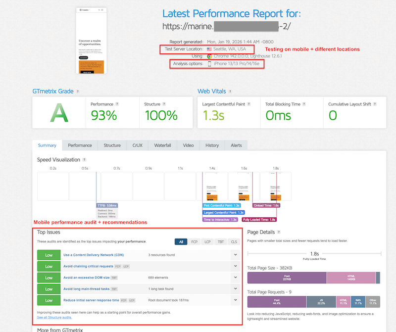
✅ When using tools like PageSpeed Insights or GTmetrix, always switch to mobile view. Even better, GTmetrix lets you test using a specific mobile device, helping you simulate real-world mobile load times more accurately.
✅ Test on slower network conditions (4G or throttled connections).
✅ Use different locations from your servers to see how international visitors are experiencing performance on mobile.
✅ Test several URLs, not just your homepage, to identify bottlenecks on a larger scale.
5 Mobile Site Speed Optimization Best Practices
To build this list, we asked WordPress experts and developers who work daily on real client sites. Their feedback was consistent: mobile site speed optimization best practices should always focus on mobile conditions, not ideal desktop scenarios. Let’s go over each of them along with tools you can use to make your site load faster on mobile.
1. Test And Optimize on Mobile First
Mobile website speed optimization should always start with mobile testing. When using performance tools, explicitly select mobile devices and simulate 4G (or slower) connections. Desktop tests on fiber connections hide real bottlenecks. If a site performs well on mobile, desktop performance usually follows naturally.
🛠️ Tool: GTmetrix. Powered by Lighthouse, GTmetrix measures Core Web Vitals on mobile (LCP, INP, CLS) and other KPIs, including fully loaded time and page size. It also offers multi-device testing, like iPhone and Samsung, mobile connection throttling, and multi-location testing.
2. Clean And Optimize JavaScript and CSS
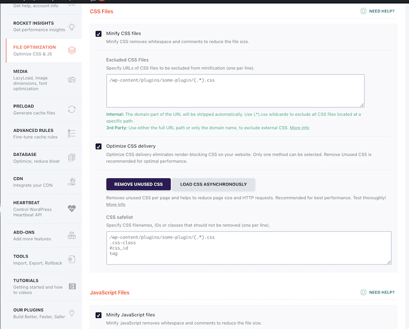
Mobile performance optimization requires reducing render-blocking resources. Minify JavaScript and CSS, remove unused code, optimize CSS delivery, and defer or delay non-critical JavaScript. This helps the browser render visible content faster and improves mobile site performance and Core Web Vitals.
🛠️Tool: WP Rocket. It’s the simplest and most powerful performance plugin, handling 80% of performance best practices upon activation, including CSS/JS minification. The intuitive interface allows you to also enable powerful features such as removing unused CSS, loading JavaScript deferred, and delaying JavaScript execution in a few clicks – without touching any code and directly from WordPress.
3. Optimize Images Properly for Mobile
Images are one of the biggest levers to improve mobile website speed. Use compression, next-gen formats (WebP or AVIF), and lazy loading for non-critical images. Always load the critical image first and serve mobile-sized assets. A hero image at 2500px may be fine for desktop, but on mobile, around 860px is usually enough and has a significant impact on mobile load time optimization.
🛠️ Tools:
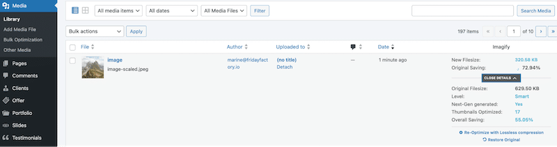
- Imagify. It converts images to WebP or AVIF and applies smart compression without quality loss, with single or bulk optimization to serve mobile-ready images in seconds.
- WP Rocket. The main features include lazy loading, critical image optimization, and automatic lazy rendering to also improve mobile speed.
4. Use Mobile Caching
Mobile caching allows your site to serve pre-generated pages instead of rebuilding them on every request. This drastically reduces server processing time and improves perceived speed for mobile users, especially on slower or unstable networks.
🛠️Tool: WP Rocket. It comes with built-in mobile caching, cache preloading, and GZIP compression.
5. Use A CDN and Test from Multiple Locations
A CDN helps speed up mobile websites by serving assets closer to users. Beyond enabling a CDN, it’s important to test performance from different geographic locations, especially if your audience is international. This helps you understand how mobile users far from your servers actually experience performance.
🛠️ Tool: Rocket CDN. It’s the easiest WordPress CDN that does all the technical setup for you. All you need is activating the plugin to deliver static assets from a global network.
Mobile Site Speed Optimization Best Practices Recap
This table brings together essential mobile site performance best practices and tools to help speed up mobile websites and improve load times.
| Mobile optimization best practice | Recommended tool |
| Mobile-first testing | GTmetrix (multi-device testing, multi-connection, multi-location) |
| Image optimization: compression, next-gen format, resize large images | Imagify |
| Lazy loading, critical image loaded first | WP Rocket |
| JS/CSS optimization & mobile caching | WP Rocket |
| CDN delivery | Rocket CDN |
5 Mobile Speed Optimization Mistakes to Avoid (+ Experts’ Insights)
These mistakes come directly from what WordPress experts see in real audits and production sites. They reflect mobile performance optimization issues observed in the field, not theory.
1. Starting Performance Testing on Desktop
One of the most common mistakes is beginning performance analysis on the desktop. Desktop conditions are ideal and rarely reflect real usage. Mobile site performance issues only become visible when testing mobile devices and slower connections. Don’t forget to test multiple URLs too, so you can identify easily where the performance bottlenecks are located on your site.
2. Using Unoptimized Large Images on Mobile
Large desktop images served unchanged on mobile are a frequent issue. This includes oversized hero banners and background images. Fixing this requires serving mobile-sized images, using next-gen formats, compressing files, loading critical images first, and lazy loading the rest below the fold.
3. Ignoring Mobile Caching
Without mobile caching, each visit forces the server to rebuild the page, increasing load times and Time to First Byte. This is especially damaging on mobile networks.
4. Leaving JavaScript and CSS Unoptimized
Unused JavaScript, render-blocking CSS, and excessive third-party scripts slow down mobile rendering and hurt mobile site speed optimization. These issues are often not so serious on desktop but critical on mobile.
5. Not Using a CDN For Mobile Visitors
Serving assets from a single server location increases latency for mobile users, particularly international visitors. Without a CDN, mobile load time optimization becomes much harder at scale.
To conclude with the mistakes in mobile optimization, here’s a short interview insight we had with Nicolas Richer, founder of WP Chef. He shares the most common mobile performance mistakes he sees every day while working with real WordPress clients:
“Mobile performance testing should be the default. Testing on desktop with a fast connection hides real issues, true performance problems show up on mobile first. Another common mistake is focusing too much on the PageSpeed score instead of using the diagnostics and field data that explain what’s actually slowing pages down.
Testing only one URL is also misleading. Batch testing across multiple pages quickly reveals which page is dragging overall performance down—often oversized images, heavy forms, or unoptimized hero banners. Desktop images around 2500px that aren’t properly resized for mobile (around 860px) are a frequent issue, which is why hero sections should always use dedicated mobile images.”
Mobile Speed Optimization Mistakes Recap
If you’re looking to easily improve mobile website speed, this table summarizes the most frequent mobile performance mistakes and the tools to identify and fix them.
| Mistake | Impact | How to fix it | Best tools |
| Desktop-first testing | Hidden mobile issues | Test directly on mobile (device + 4G) | GTmetrix, PageSpeed Insights |
| Unoptimized large images | Mobile devices have to download heavy files. It increases loading time and drains mobile data | Convert images to a next-gen format, and reduce large images to fit mobile screens | Imagify |
| Not prioritizing critical content to load first | Mobile users may see blank spaces or a half-loaded page for several seconds | Apply lazy loading only below the fold, optimize critical images (above the fold) | WP Rocket |
| No mobile caching | Mobile users may wait several seconds on a blank screen before anything loads | Enable mobile caching and preload | WP Rocket |
| Unoptimized JS/CSS | Mobile pages load and respond more slowly | Defer JS, delay JS, remove unused CSS | WP Rocket |
| No CDN | A slow site for international visitors on mobile | Use a CDN for global mobile visitors | Rocket CDN |
Real Case Study: How to Boost Mobile Site Performance
The easiest way to improve mobile website speed on WordPress is to use WP Rocket and Imagify. You’ve seen them before in the best practice section, but let’s go over a quick recap of both plugins:
WP Rocket handles around 80% of performance best practices right after activation, including mobile caching, GZIP compression, CSS and JS minification, critical image optimization, and automatic lazy rendering. Its intuitive interface also lets you enable lazy loading for images, videos, frames and CSS background images, remove unused CSS, defer JavaScript, and delay JavaScript execution in just a few clicks, without touching code.
Imagify complements this by compressing images without quality loss and converting them to next-gen formats like WebP or AVIF directly from WordPress.
Ready to see how both WP Rocket and Imagify help speed up a mobile site?
To show how mobile site speed optimization translates into a performance boost, we ran a simple before-and-after mobile performance test using Google PageSpeed Insights.
The Test Setup
We used a basic WordPress site built with the Twenty Twenty-Two theme and the Block Editor. The page includes a hero banner, a services section, and a testimonials block—elements commonly found on real websites.
All tests were run on mobile using PageSpeed Insights.
Step 1: Mobile Performance Testing (Before Optimization)
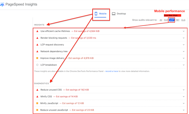
We first added the URL to PageSpeed Insights and analyzed mobile performance.

The initial mobile score gives a quick overview, but the real value lies in the Insights and Diagnostics sections, which highlight what’s slowing down mobile site performance.
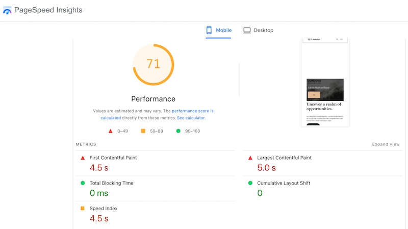
Common issues flagged included inefficient cache lifetimes, render-blocking requests, LCP discovery delays, and image delivery problems. Diagnostics further identified unused CSS, unminified files, and unused JavaScript — all of which negatively impact mobile load-time optimization.
Step 2: Applying Mobile Performance Optimizations
Based on the audit, it was clear we needed to focus on mobile caching, CSS and JavaScript optimization, render-blocking resources, and image optimization.
We used WP Rocket to apply mobile caching, cache and font preloading, CSS and JS optimization, and lazy loading. These optimizations significantly reduce render-blocking resources and accelerate mobile websites.
To fix image delivery, we optimized images by serving the right sizes, compressing them efficiently, and converting them to modern formats. Imagify made this step effortless by applying smart compression and converting images to AVIF directly from WordPress.
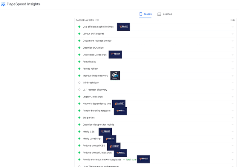
Step 3: Mobile Performance Testing (After Optimization with WP Rocket and Imagify)
WP Rocket and Imagify are definitely an easy and effective way to speed up mobile websites. The results speak for themselves:
- On mobile the overall mobile score jumped from 71/100 to 100/100.
- The Largest Contentful Paint (Core Web Vital) dropped from 5.0 seconds (red) to 0.5 seconds (green).
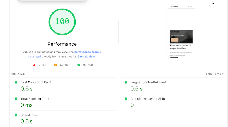
Most audits in the Insights section are now marked as passed, confirming a clear improvement in mobile performance optimization:
FAQ
What is mobile site speed optimization?
Mobile site speed optimization is the process of making a WordPress website load faster on mobile devices by applying several techniques such as image optimization, mobile caching, JavaScript and CSS cleanup, and CDN delivery. The goal is to improve site performance, user experience, and mobile SEO performance.
Why is my website fast on desktop but slow on mobile?
This is completely normal. Desktop tests run under ideal conditions: fast processors, stable fiber connections, and large screens, while mobile users rely on slower networks and less powerful devices.
How fast should a mobile website load?
According to Google’s guidelines, anything over 3 seconds is considered slow for mobile users. To improve mobile website speed and reduce abandonment, pages should load as quickly as possible, ideally well under that threshold.
What affects mobile website speed the most?
The biggest factors impacting mobile load time optimization are a lack of mobile caching and serving oversized images designed for desktop. Unoptimized JavaScript and CSS can also significantly slow down mobile site performance.
How often should I optimize mobile site speed?
Mobile performance optimization isn’t a one-time task. You should monitor mobile site speed weekly and always recheck performance after updating a plugin, changing a theme, or publishing new content.
Do tools and plugins help improve mobile performance?
Yes, using the right tools makes a big difference in mobile performance. WP Rocket is the easiest way to speed up mobile websites, thanks to features like mobile caching, CSS and JS optimization, lazy loading, font preloading, and critical image optimization. Imagify complements this by optimizing images with smart compression and converting them to next-gen formats such as WebP and AVIF, which are essential for mobile site speed optimization.
Wrapping Up
Ready to boost your mobile page speed?
WP Rocket is the easiest way to boost mobile site speed optimization on WordPress. In our real-world test, it helped us achieve a 100/100 mobile performance score and resolve the most common mobile performance audit issues, including caching, render-blocking resources, and slow load times.
This guide provides a solid starting point for improving mobile website speed: you now have the right tools, proven best practices, and a clear understanding of the mistakes to avoid.
WP Rocket is your best ally to apply most of the mobile performance optimizations (no code required). And with a 14-day money-back guarantee, there’s no risk in getting started. Now it’s time to dive in and optimize your mobile site performance. 🚀