
Table of Contents
Last update on
Doing SEO for mobile devices is different than for desktop computers. You have to pay attention to certain details if you want your site to appear high in search results on smartphones and tablets.
But what exactly is the difference? And how can you ensure your website’s mobile SEO is on point?
Those are exactly the questions we will answer in this blog post. Below, we’ll provide you with a detailed definition of mobile SEO, why it matters, and how it’s different from “normal” search engine optimization. After that, we’ll go over a detailed checklist to fully optimize your site for mobile search, as well as useful tools to help you do so.
What Is Mobile SEO?
Let’s start with definitions. As already alluded to, mobile SEO means optimizing your site to rank well in searches performed on mobile devices. It matters for the success of your website for several reasons.
The Importance of Mobile SEO
People use mobile devices to surf the Internet more than ever. In fact, more than 60% of online traffic is now coming from phones and tablets.
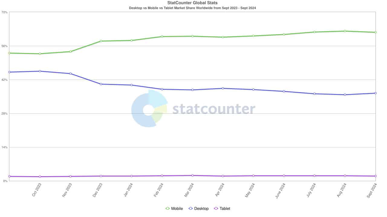
That includes search. In 2021, 63% of visits to search engines in the US were mobile devices. This figure has likely increased by now and is probably higher in other parts of the world. It also extends to e-commerce, where over 40% of people say they prefer to do their entire shopping on mobile—from research to purchase.
So, right off the bat, mobile SEO matters because the majority of potential website visitors are using phones and tablets. Ignoring them and their needs is a risky business decision.
What’s more, because of this development, Google started switching to a mobile-first index, a process that was completed in 2023.
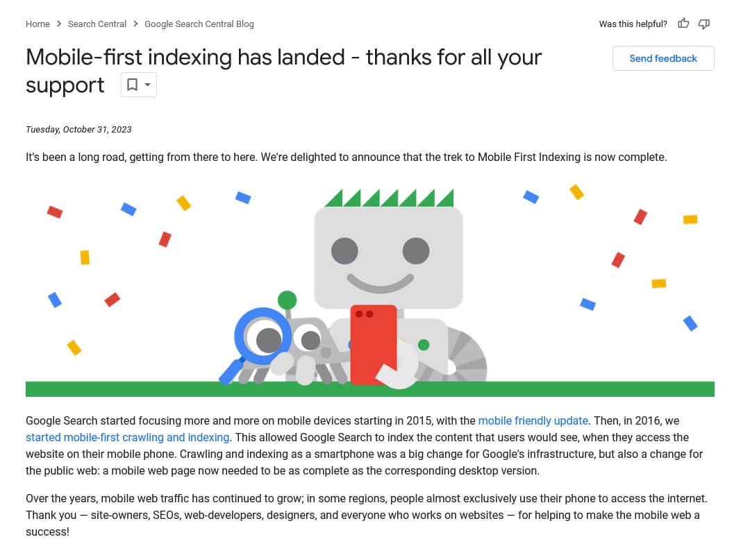
That means the search engine uses the mobile version of your site to determine how to rank it, including for desktop-based search results. The only exception is when you have separate URLs for the mobile and desktop versions of your website. We’ll discuss this practice in detail below.
However, the important part is that a website that’s not optimized for mobile search results will generally have a hard time ranking well.
Mobile SEO vs. Desktop SEO
So, what are the main differences in doing SEO for mobile vs desktop? It comes down to a few key factors:
- Usability – Mobile screens are smaller and your design needs to adjust to that. Your site needs to remain readable, be operable via touch, and overall provide a good user experience, including fast loading times.
- Keywords – Many mobile searches are performed on the go and frequently have local intent and/or are done using voice commands. This changes the keywords you need to aim for.
- Search appearance – Search results look different on mobile devices and you need to know how to make your pages stand out there.
If you don’t account for those differences, you run the risk of repelling mobile users. So, let’s talk about how to avoid doing so.
Mobile SEO Best Practices: A Comprehensive Checklist
Ready to optimize your website for mobile search results? Then, let’s get going.
1. Do a Mobile SEO Audit
The first step is to figure out how good or bad your mobile SEO is currently. Having a clear picture of the status quo makes it easier to take targeted action for improvement.
One thing you can do is go to Google Analytics and compare last year’s mobile traffic to this year’s.
If it is going down while overall traffic is up, it can mean your mobile SEO needs some work.
Google Analytics also lets you compare the behavior of mobile and desktop users on single pages, such as their bounce rate and dwell time.
Significant differences can point to issues that need fixing.
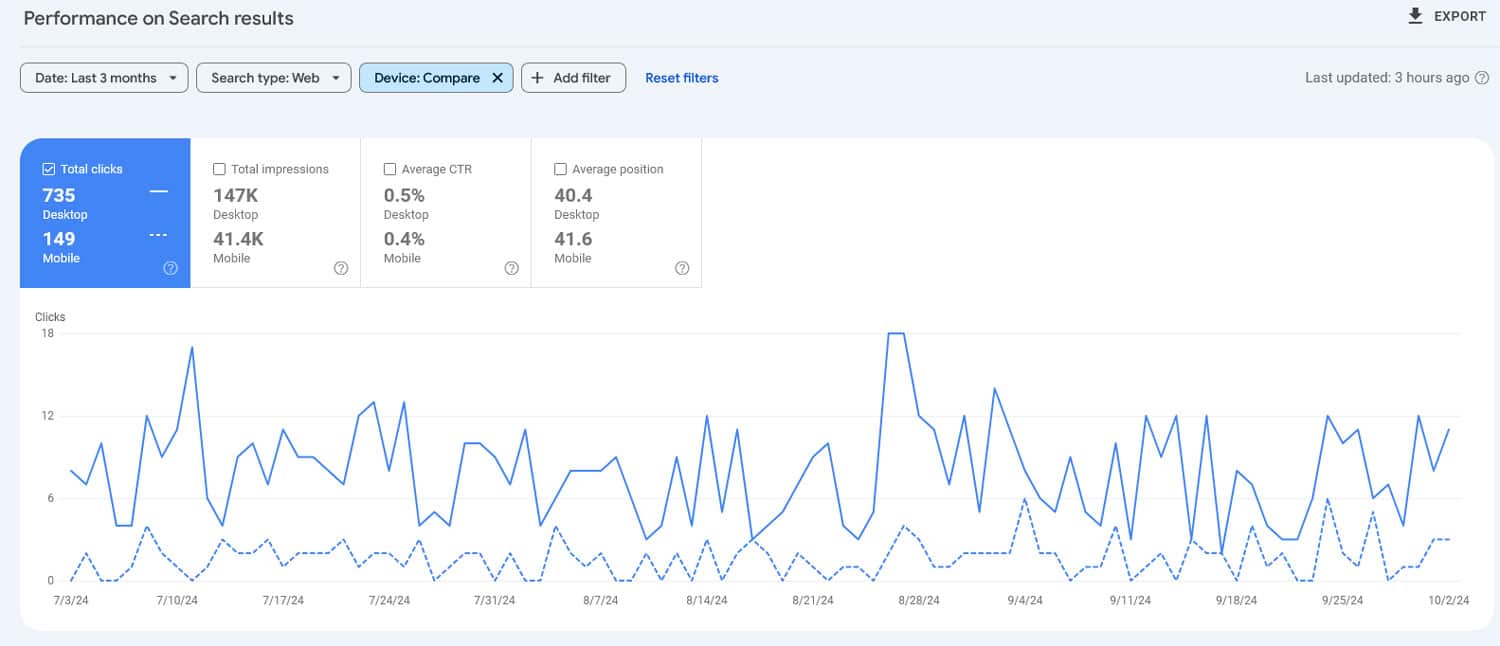
In Google Search Console you can do similar comparisons for your click-through rate, impressions, clicks, and search rank.
Another important step is to use a mobile-friendliness test tool like Bing’s.
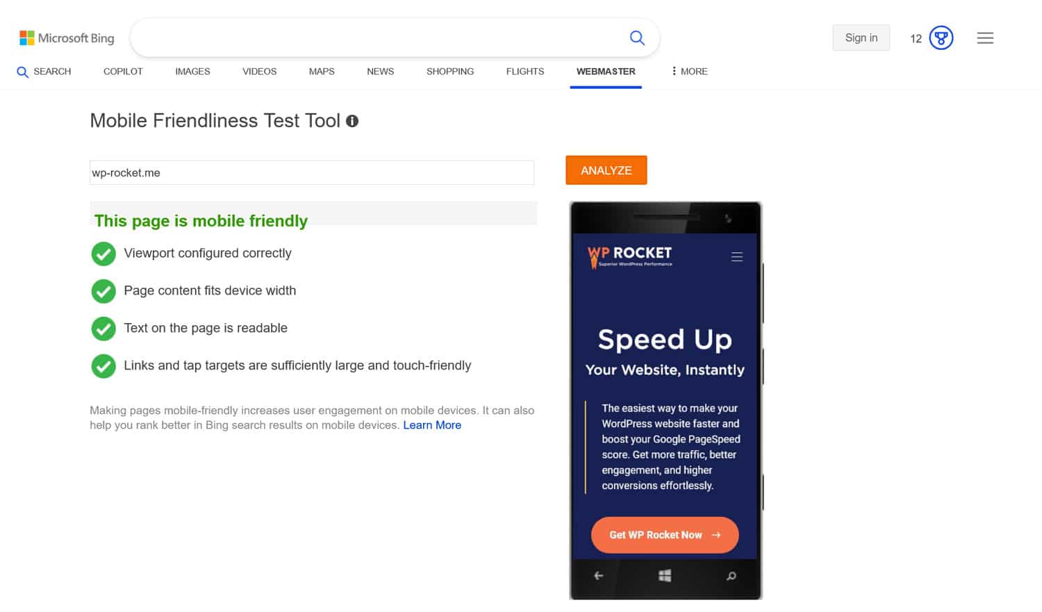
It will let you know about issues on your pages, such as text that is too small to read on smaller screens, if elements are too close together to use via touch, etc.
2. Use a Mobile-Friendly Design
You have three main ways to adjust your website design to smaller screens.
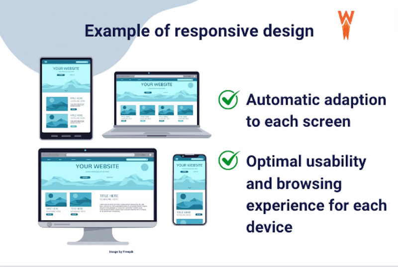
Responsive Design
This is the solution recommended by Google. Here, mobile and desktop users access pages with the same content using the same URL. The design automatically adjusts to fit smaller screens with some clever CSS.
This method comes with a number of benefits, namely:
- Any changes you make to the page will automatically be translated for all users.
- There is no need to filter and redirect mobile traffic (which can reduce load time).
- It preserves the crawl budget for your site because there is only one page to examine.
All of this makes this the most user- and SEO-friendly version. It has also become the de facto standard.
Dynamic Serving
In this method, page content is delivered over the same domain, but the HTML markup changes dynamically depending on what kind of device the server detects.
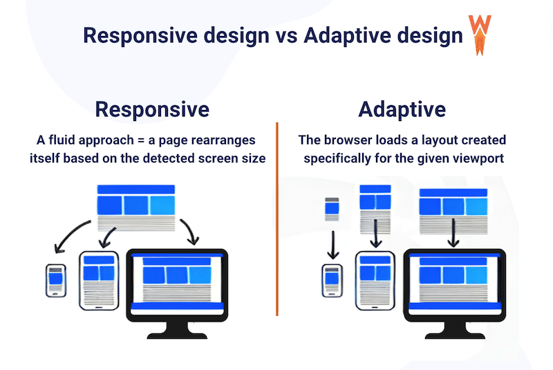
This, too, only needs one URL and even allows you to create different designs for different devices. For example, you can move some mobile content into tabs and accordions to save space.
On the other hand, dynamic serving is technically more complex and a bit infamous for accidentally serving users the wrong site version for their devices.
Separate URLs for Mobile and Desktop
The third option is to have two different URLs for the two versions of your website, such as “yoursite.com” and “m.yoursite.com.” Here, too, users are automatically redirected according to the device they use.
This setup lets you administer each site version separately. You don’t have to deal with conditional CSS and can optimize each edition for its purpose.
That said, this setup is quite complicated to set up and maintain. You need to add rel=”canonical” and rel=”alternate” tags to each of your pages so that Google knows to index them correctly. Otherwise, you might run into duplicate content issues. You also need to ensure all content is the same in both versions, including matching meta tags, structured data, ALT tags, and more.
Therefore, the recommendation is clear: stick with responsive design. By now, all WordPress themes should be responsive by default, so if you use one that is properly maintained, you should already be good.
3. Ace Your Technical SEO
Proper technical SEO, meaning making sure search engines can easily crawl and index your website, is generally a prerequisite for ranking well. This is no different in mobile SEO. Here’s what that means:
- Make sure your site is crawlable.
- Use SSL/HTTPS to encrypt your website traffic.
- Use an SEO-friendly URL structure and website hierarchy.
- Correctly use internal links and eliminate 404 errors.
- Create and submit a sitemap to webmaster tools.
- Optimize robots.txt.
- Invest in malware protection and accessibility.
One thing specific to technical SEO for mobile devices is to avoid blocking Google from accessing site resources. Doing so makes it hard for Google to know if your site is mobile-friendly, which might keep you out of the index.
| 💡Loking for detailed step-by-step tips? Check our article on technical SEO. |
4. Prioritize Mobile Website Performance
Speed is absolutely paramount when it comes to mobile SEO. Mobile connections are often slower and loading speed is part of page experience, which Google uses as a ranking signal. They even introduced a number of metrics specifically to measure user experience during page load, called Core Web Vitals.
How can you make your mobile site as fast as possible?
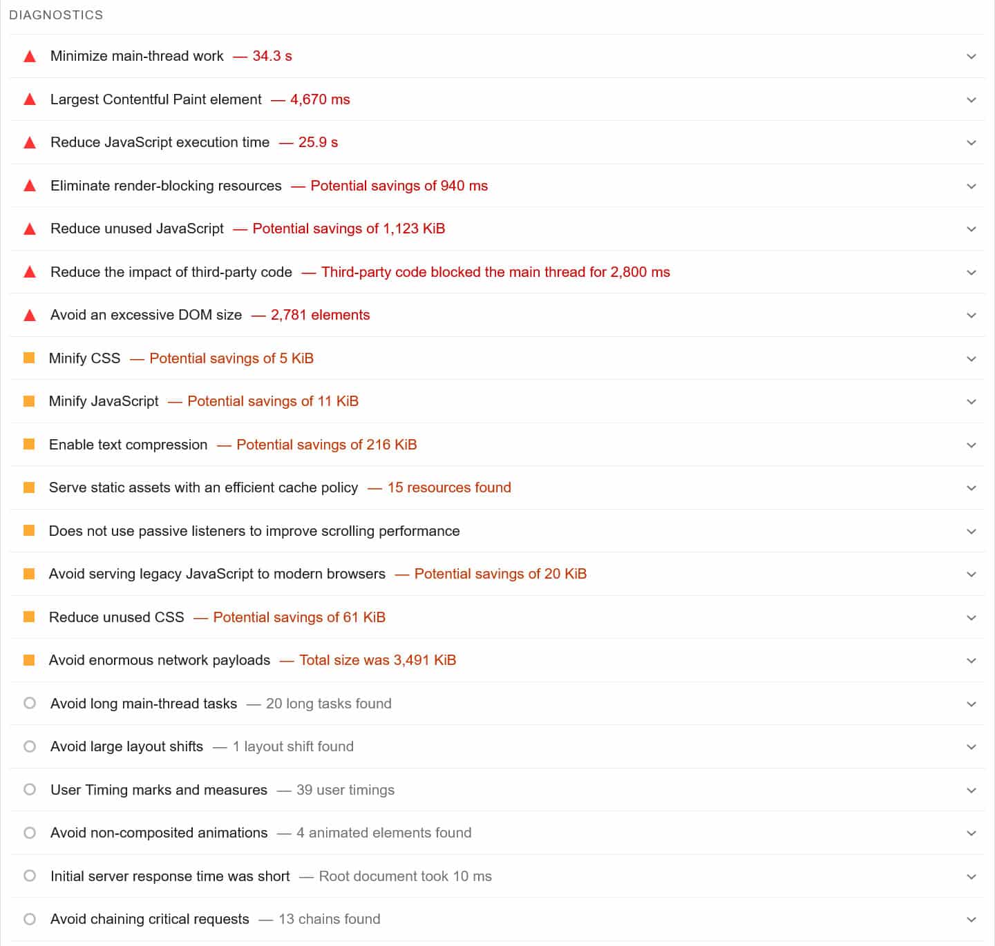
The first step is to speed test your website, for example with PageSpeed Insights since it measures your desktop and mobile performance separately (find more tools here).
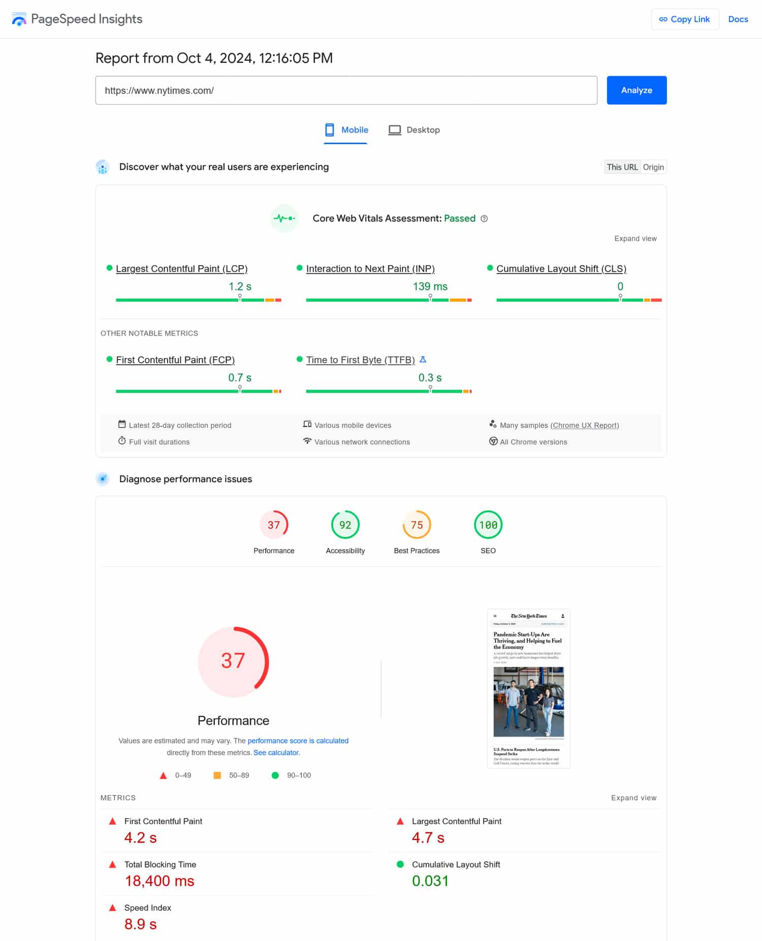
The tool will also give you a detailed list of problems and practical ways to eliminate them.
| 💡 Want to learn how to improve your key performance metrics? A good starting point is to understand what to do if you fail your Core Web Vitals assessment. |
Common ways to address performance issues include caching, minifying CSS and JavaScript files, or using a Content Delivery Network (CDN). Which fixes apply to your website depends on your individual case.
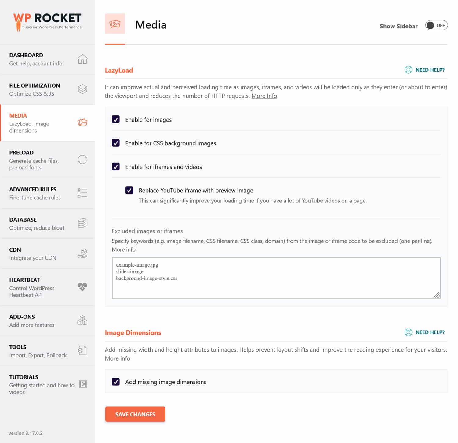
If you feel that these tasks go beyond your capabilities, you can also use a performance plugin like WP Rocket. Here’s what it can help you implement on your website:
- Lazy loading for images and videos.
- Minify and defer render-blocking resources.
- Preloading cache, links, external files, and fonts.
- Database optimization.
Additionally, the user-friendly interface makes it very easy to switch each of these features on and off.
What’s more, WP Rocket does a lot of optimization automatically immediately after you activate it. Examples include browser and server caching (with a dedicated mobile cache), GZIP compression, optimization for images above the fold (since those are usually the LCP element), and more. As a result, your website gets faster automatically after activating the plugin without any action on your part.
Another very important factor in mobile performance is image optimization. It means making your images as small as possible with the right file format, compressing them, and adjusting their size to how large they appear on the page.
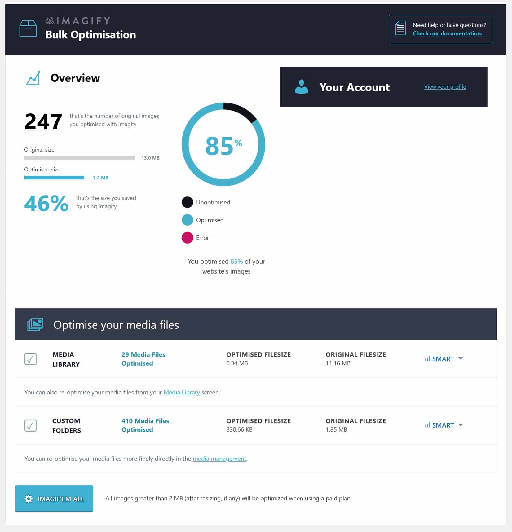
Our sister plugin, Imagify, can help you do much of that quickly and easily. It allows you to automatically compress and resize images you upload to your WordPress site without losing quality. If you wish, it will also convert them to modern image formats like WebP and AVIF, and you can do the same for existing images individually and in bulk.
5. Perform Mobile Keyword Research
You might be surprised to hear that mobile and desktop keywords aren’t the same. Yet, as mentioned earlier, mobile users search differently than people on desktop computers.
Most of all, mobile users are more likely to use voice input, either in the form of a virtual assistant like Siri or simply through dictation functionality. Their search phrases tend to be more conversational, for example, “what can i do to make my website load faster?” vs “increase website speed.” They also often include local search terms, such as “near me” or the name of the neighborhood they are in.
Therefore, it is crucial for your mobile SEO that you include such keywords in your content. For example, you can use conversational keywords as your headings. Additionally, pay attention to our local SEO tips for mobile users below.
6. Make Your Content Mobile Friendly
In addition to using the right keywords and having a mobile-friendly design, the content itself needs to be pleasant to consume on mobile. An important factor here is readability on smaller screens. Here are some tips for that:
- Use a good font size – Make your text large enough (at least 16px) and give it sufficient contrast with the background.
- Include whitespace – Ensure breathing room around text with enough line height and margins between paragraphs and images.
- Condense introductions – Mobile visitors won’t see much of your text when they land on your pages. You need to draw them in right away, so make important points upfront, and reduce the size of header images to reduce the need for scrolling.
- Shorten your paragraphs – Paragraphs appear longer on phones because of less space. So keep the number of your sentences low and shorten them.

In addition, avoid other practices that turn users off. A common problem is mobile popups, which are often hard to close and can cover the entire screen. Google has specific rules for them that you should follow to avoid penalties.
7. Optimize Mobile Search Appearance
Next up, you want to make your pages look attractive in mobile search results. This can increase click-through rates (CTR), which is a positive ranking signal.
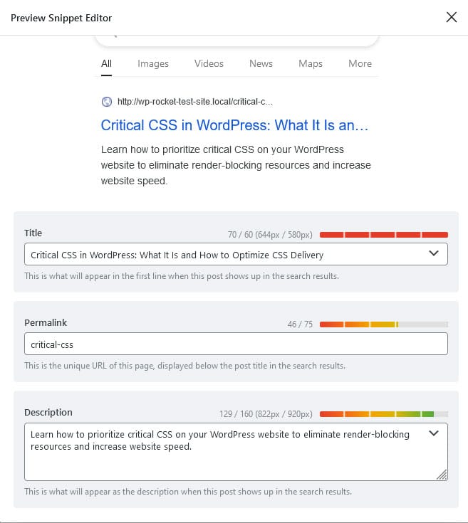
Two of your main tools for this are the title tag and meta description—the two things that appear most prominently in search engine result pages (SERPs).
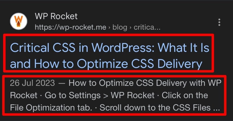
The best way to optimize these in WordPress is by using an SEO plugin like Rank Math. It not only gives you an easy way to customize this information for your posts and pages but also has a preview and indicators. That way, you can make sure the title and description aren’t too long and get cut off.
See to it that your titles and descriptions are unique, accurately describe the page content, include the main keyword (for the title, at the beginning), and you put a call-to-action or value proposition in the description.
By the way, mobile search results can have more characters than desktop ones. So, if you find in your audit that the vast majority of traffic comes from phones and tablets, consider taking advantage of the extra space to pack in more information. Even if they get cut off on desktop, it might be worth it for mobile CTR.
8. Use Structured Data & Schema Markup
Another way to stand out in search results is structured data. It allows you to display additional information such as ratings, images, and other elements on your pages.

These so-called rich snippets can help attract more clicks. They also take up more space in search results, especially on mobile, making your pages look more prominent.

The way to add this to your content is with Schema markup. It exists for different content types, such as blog posts, news, or recipes. If you are using a WordPress website, the easiest way to add Schema markup is by using a plugin such as Schema.
9. Do Local Mobile SEO
As mentioned, many mobile searches are location-related. If your website and business depend on people finding you in real life, you need to engage in local SEO for mobile users.
Here are the most important steps:
- Claim your Google Business – With a fully filled-out and active Google Business Profile, you are more likely to appear as a recommendation directly in search results (in the “local three-pack”).
- Include local keywords on your site – For example, mention the location of your business, neighborhood, or a nearby landmark. That way, you can show up for local search queries.
- Have a strategy for online reviews – Online reviews are super important for local search. Make sure you encourage reviews and respond professionally to all public feedback.
Should You Use AMP for Mobile SEO?
AMP stands for “Accelerated Mobile Pages,” a technology Google rolled out in 2015. Its stripped-down HTML markup helps mobile pages load extremely fast.
When it first came out, people jumped on it hoping that Google would rank pages with AMP favorably. However, by now, the consensus is that it’s mostly not worth it. AMP limits page functionality, makes page design very similar, and keeps visitors within Google instead of leading them to your site.
Therefore, you probably shouldn’t bother.
Mobile SEO Tools to Make Your Work Easier
We have already mentioned a few mobile SEO tools in the course of this guide. Let’s go over them and a few additional choices one more time:
- PageSpeed Insights – Analyze page performance specifically for mobile (as well as desktop) and receive targeted tips for improvements, including Core Web Vitals.
- Google Analytics – Compare important engagement markers of mobile vs desktop site visitors.
- Google Search Console – See how search performance compares between the mobile and desktop versions of your site.
- Semrush – Offers a number of features to analyze mobile SEO performance and do mobile-specific keyword research.
- Ahrefs – Similar to Semrush, provides insights into mobile search rankings, mobile keyword performance, and tracks mobile-specific SEO metrics, such as traffic and backlinks.
- Rank Math – Not only allows you to control title tags and meta descriptions for your pages, it also has a dedicated local SEO module.
Mobile SEO: Start Ranking in Search Today!
Optimizing your website for mobile SEO is no longer optional—it’s mandatory. Mobile devices continue to dominate online searches and influence consumer behavior. Therefore, ensuring your website is set up for mobile search is key to maintaining its visibility.
You can do plenty, from improving mobile usability and technical fitness to focusing on local and voice search. By following best practices and utilizing the right tools, you’re well on your way to meeting the needs of mobile users and boosting your website’s performance in mobile search results.
Remember that site performance is a central piece of the puzzle! If you need any help with that, give WP Rocket a try.