
Table of Contents
Last update on
Are you looking for a WordPress responsive theme for your next project? You are completely right! Responsiveness is not just a feature anymore but a necessity, as most online traffic now comes from mobile devices. Choosing a responsive theme for your WordPress site is crucial to ensuring a seamless user experience across various screen sizes. This article presents a selection of the 12 best responsive themes for WordPress, both free and paid. Since responsiveness can impact page loading speed, we also provide performance tests for each theme, allowing you to select one that is both responsive and fast.
What are Responsive Themes?
A responsive WordPress theme means that it will adjust to fit any screen size or device, whether it’s a desktop, tablet, or smartphone. It ensures that your site looks great and functions smoothly for all the users, no matter how they’re accessing it.
What’s Responsive Design
Responsive design is a fundamental principle in web development that ensures an optimal user experience across various devices. It guarantees that your website maintains a beautiful design and usability across all types of screens.
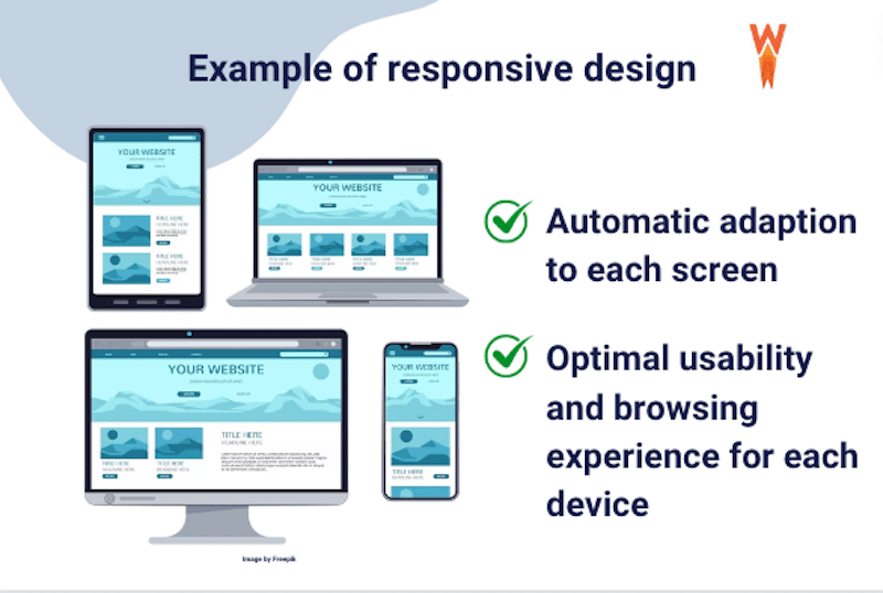
Responsive web design relies on a fluid grid layout, which is crucial for adjusting content as browsers or devices change sizes. Responsiveness aims to make websites easy to navigate and read across different devices, improving user satisfaction and engagement while also preventing frustration caused by non-adaptive mobile websites.
| 🎨 Responsive design ensures that your website looks good and is easy to use no matter what device your visitors are using to access it. |
Why Responsive Design Matters
According to research from Statista.com, mobile internet traffic accounts for almost 60 % of total web traffic. Below is the mobile internet traffic as a percentage of total web traffic in January 2024 (global and by continent):
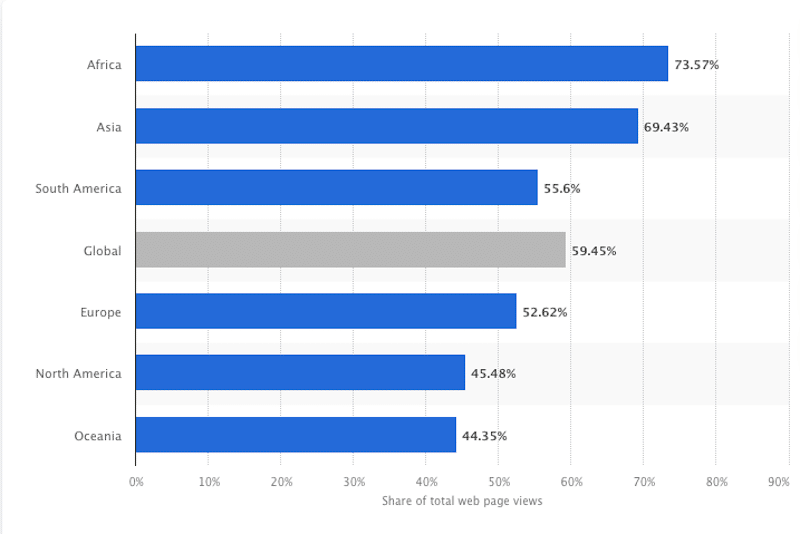
It means that statistically, around half of your visitors are coming from a mobile device, not just desktops. That’s evidence that a website must be well-designed for mobile as well. Choosing a responsive theme will benefit (at least) half of your visitors!
How to Find a Responsive WordPress Theme
Here are three steps you can follow to find a responsive theme for WordPress:
- Browse theme directories and filter by responsiveness: Explore reputable theme directories like WordPress.org’s Theme Directory, ThemeForest, and other theme marketplaces. When searching for themes, use filters or add your own keywords, such as “responsive” or “mobile-friendly”, to narrow down your options.
- Test Demo Sites: Some WordPress authors may already offer theme demos equipped with a toolbar that allows you to switch directly to mobile view from your desktop browser.
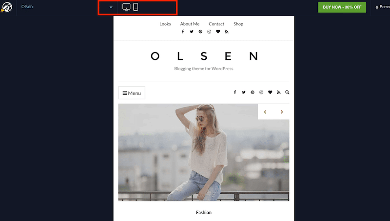
- Access the demo site directly from your mobile to evaluate its responsiveness. Feel free to interact with the site to ensure that navigation, content layout, and functionality work smoothly across different screen sizes. For example, browse the images in the gallery from your tablet and your computer to see if the experiences are similar.
3. Read reviews and ratings: Pay attention to user reviews and ratings to gauge the code and design quality of the theme. Look for themes with positive comments regarding responsiveness and compatibility across multi-device.
How Do I Know If My WordPress Theme is Responsive?
Simply access your site from mobile, tablet and desktop to compare the design and the whole experience you are getting across devices. If the content on the template adjusts to fit the screen, such as images and columns becoming smaller or stacking vertically as the screen size decreases, then it’s responsive.
Responsive Theme Risks for Performance
Responsive design is great for user experience and usability, but it can impact performance, and here are the reasons why:
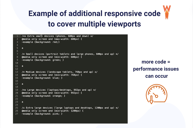
- More code to cover multiple viewports – Responsive design necessitates additional code to instruct content, for instance, to adapt from a wide layout to a narrower one based on different screen sizes.
| 💡Responsive design may lead to slower page loading because all elements are downloaded regardless of whether they’re visible or not. |
- High DOM size as elements are generally hidden but are still there in the code – Even if responsive elements are hidden on certain screen sizes, they still exist in the code. This can eventually increase the Document Object Model (DOM) size, which can slow down your website.
- High DOM manipulation to inject selectors – CSS selectors dictate which HTML elements receive specific CSS properties and values, defining how parts of your web page appear. However, injecting selectors can delay your site and reduce its speed.
- High level of style recalculation (especially if the style is not isolated) – When your website switches styles based on different screen sizes, the browser needs to recalculate how elements should look and behave. This process – known as style recalculation – can be resource-consuming.
In summary, while responsive design is essential for providing a good user experience across devices, it can also introduce performance challenges due to increased code complexity, larger DOM size, DOM manipulation, and style recalculation.
The Solutions to Avoid Performance Issues with a Responsive Theme
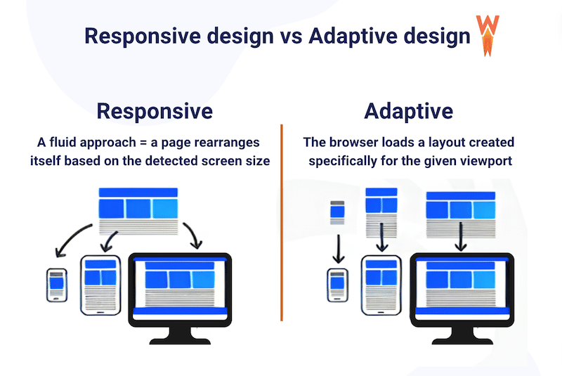
1. Consider Adaptive Design
Adaptive design is more efficient for performance, where each design’s screen size is built separately. Adaptive design uses static layouts based on breakpoints that don’t respond once they’re initially loaded, meaning that no unessential code is loaded. This approach often provides a simpler experience for low-resolution screens with lower CPU/bandwidth requirements while enhancing the experience for more capable devices like smartphones, laptops, and desktops.
2. Optimize your Responsive Site to Boost Performance
To optimize your responsive site and enhance WordPress performance, consider a few key strategies:
- Use a cache plugin and optimize CSS and JavaScript files.
- Optimize images with compression and convert them to the WebP format with an image optimizer plugin like Imagify.
- Consider using a content delivery network (CDN) to distribute content globally.
- Regularly update WordPress, themes, and plugins to ensure compatibility and security patches.
| 📖 Want to give your responsive theme an extra speed boost? Check our 19 techniques for page speed optimization in WordPress. |
Best and Fastest Responsive WordPress Themes (Free and Premium)
We’ve carefully curated a selection of 12 top responsive WordPress themes that are multipurpose or tailored to specific industries such as travel, wellness, finance, and cryptocurrency, among others. To help you make your decision, we also ran a performance test on mobile for each of them using PageSpeed Insights and GTmetrix, with servers based in Paris.
| 📖 Not familiar with PageSpeed Insights? Here’s more information on how to test the performance of your WordPress site. |
Let’s go over the best 12 responsive themes!
1. Avada
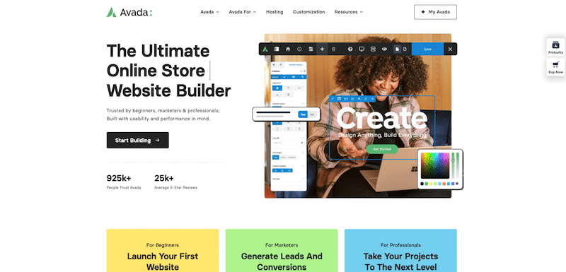
Key features:
- Comprehensive Fusion Builder for easy drag-and-drop customization.
- Over 70 pre-built website designs for various industries and niches.
- Extensive theme options panel for advanced customization.
- Integration with popular plugins like WooCommerce and Contact Form 7.
Why we chose it: The #1-selling multipurpose theme on ThemeForest for more than 10 years.
Overall user opinion based on reviews: User reviews consistently praise Avada for its user-friendly interface, rich feature set, and excellent customer support. The regular updates and ongoing support also contribute to a positive user experience.
It’s best for: Avada is best suited for users with no coding skills but requires a highly customizable and feature-rich WordPress theme for their website projects.
Main performance KPIs:
- PSI mobile performance score: 77/100
- Total Loading time: 3.9 s
- Largest Contentful Paint: 3.1
- Cumulative Layout Shift: 0.08
- Total Blocking Time: 10 ms
- HTTP requests: 39
2. Divi
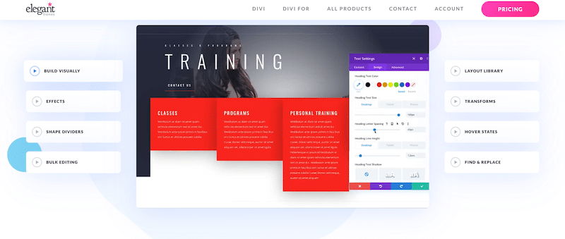
Key features
- Powerful Divi Builder for intuitive drag-and-drop website customization.
- Over 800 pre-made designs and templates covering various industries and purposes.
- Customization options include advanced styling controls and global elements.
- Integration with popular plugins like WooCommerce and Yoast SEO.
Why we chose it: Divi is one of the most powerful and intuitive visual builders. It’s also a responsive theme that comes with such an active community that provides valuable support through forums, tutorials, and resources.
Overall user opinion based on reviews: Many users appreciate the vast selection of pre-made designs and the intuitive nature of the Divi Builder.
It’s best for: Divi is best suited for users who value customization and flexibility in their WordPress themes using a powerful visual page builder.
Main performance KPIs:
- PSI mobile performance score: 76/100
- Total Loading time: 3.8 s
- Largest Contentful Paint: 3.1 s
- Cumulative Layout Shift: 0
- Total Blocking Time: 300 ms
- HTTP requests: 41
3. The 7
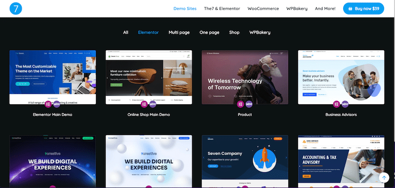
Key features:
- Over 40 pre-built website demos covering various industries and purposes
- A vast array of design options, including unlimited color schemes, layouts, and header styles, gives you the flexibility to create a website that matches your vision.
- Includes premium slider plugins such as Slider Revolution and LayerSlider.
- Bundled with Elementor.
Why we chose it: It is one of the best themes on ThemeForest and the #1 selling theme bundled with the Elementor Pro page builder.
Overall user opinion based on reviews: 4.75/5 (reviews from ThemeForest). Clients are happy with the support and the flexibility provided by the theme.
It’s best for: Users looking for flexibility and willing to use Elementor or the WPBakery page builder to build their site.
Main performance KPIs:
- PSI mobile performance score: 83/100
- Total Loading time: 3.6 s
- Largest Contentful Paint: 3.6 s
- Cumulative Layout Shift: 0.025
- Total Blocking Time: 800 ms
- HTTP requests: 39
4. Traveler
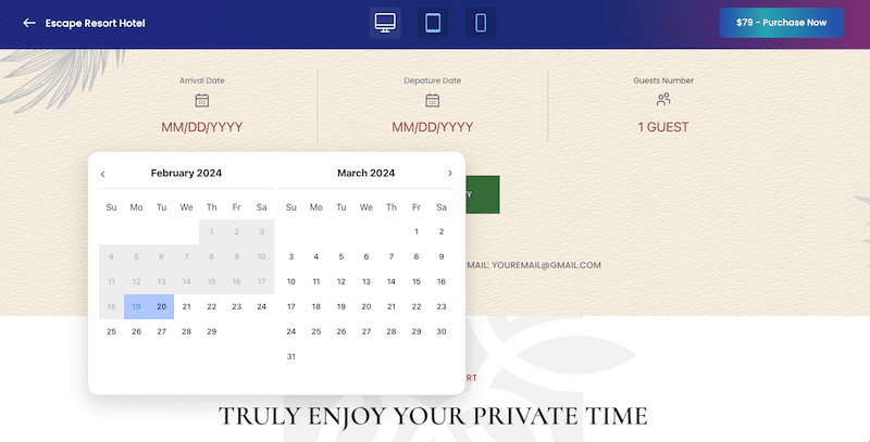
Key features:
- Complete booking form: Allow your customers to search and book hotels, tours, and accommodations.
- 150+ pre-design templates for hotel, tour, rental, car, and activity.
- Partners interface to pay commissions and set prices.
- Support many major OTA Calendar syncs (ICal), such as Google Calendar, TripAdvisor Calendar, Airbnb Calendar, and HomeAway Calendar.
Why we chose it: The best seller on Themeforest and the most advanced options available for the tourism industry (create dynamic packaging, set commissions, and powerful online payment).
Overall user opinion based on reviews: 4.46/5 (reviews from ThemeForest). Clients are happy with the advanced features, the demos, the flexibility, and the customer service.
It’s best for: Users who need to create a travel website like Airbnb with advanced search options, custom page results, and final booking.
Main performance KPIs:
- PSI mobile performance score: 67/100
- Total Loading time: 4.1 s
- Largest Contentful Paint: 2.3 s
- Cumulative Layout Shift: 0.015
- Total Blocking Time: 1800 ms
- HTTP requests: 48
5. Real Homes
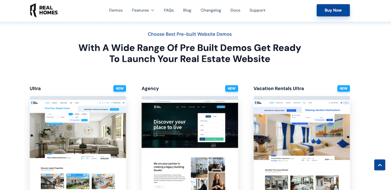
Key features:
- Sellers can publish listings either for free or through a paid membership package.
- Advanced listing information layouts.
- Easy property management from the WordPress dashboard.
- Advanced custom search.
- Map integration with custom pins.
Why we chose it: It has a beautiful design and is probably one of the most complete themes for real estate agents.
Overall user opinion based on reviews: 4.76/5 (reviews from ThemeForest). Clients love it for the quality of the code, and the amount of advanced features that match the real estate industry needs.
It’s best for: Real estate agents needing custom websites for marketing and selling properties.
Main performance KPIs:
- PSI mobile performance score: 68/100
- Total Loading time: 4.3 s
- Largest Contentful Paint: 4.1 s
- Cumulative Layout Shift: 0.264
- Total Blocking Time: 800 ms
- HTTP requests: 58
6. Jacqueline
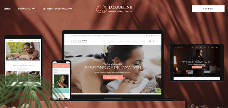
Key features:
- Complete solution for contemporary spa salons, beauty companies, hair or makeup salons, wellness centers & massage services agencies.
- Before/after modules.
- Gift cards available for sale with online payment.
- Newsletter popups to grow your mailing list.
- Integrated with AI to create content and images.
Why we chose it: The design and the value for money as the theme is bundled with Bookly, Booked, and Slider Revolution plugins.
Overall user opinion based on reviews: Users enjoy the design quality and the integration with the online appointment systems.
It’s best for: Users willing to create elegant wellness websites and easily accept online appointments to stop juggling with calls and emails.
Main performance KPIs:
- PSI mobile performance score:69/100
- Total Loading time: 3.9 s
- Largest Contentful Paint: 2.7 s
- Cumulative Layout Shift: 0.08
- Total Blocking Time: 600 ms
- HTTP requests: 28
7. Yogamo
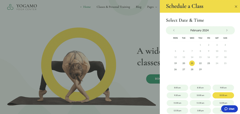
Key features:
- A clean-looking yoga WordPress theme.
- Comes with a booking plugin that makes it easy to set the session duration, cost, and number of free spots.
- Online payment and instant reservation.
- Login and signup feature.
Why we chose it: The responsive booking wizard makes it easy to book a class even on mobile.
Overall user opinion based on reviews: The theme is praised for its clean and calming website ambiance. Users appreciate its ease of use in constructing websites, especially with the pre-installed pages and appointment booking plugin, making it ideal for selling classes and courses online.
It’s best for: Yoga teachers or personal trainers who need a simple theme with a class booking tool.
Main performance KPIs:
- PSI mobile performance score: 78/100
- Total Loading time: 3.1 s
- Largest Contentful Paint: 3.1 s
- Cumulative Layout Shift: 0
- Total Blocking Time: 300 ms
- HTTP requests: 36
8. Multiple Event and Conference
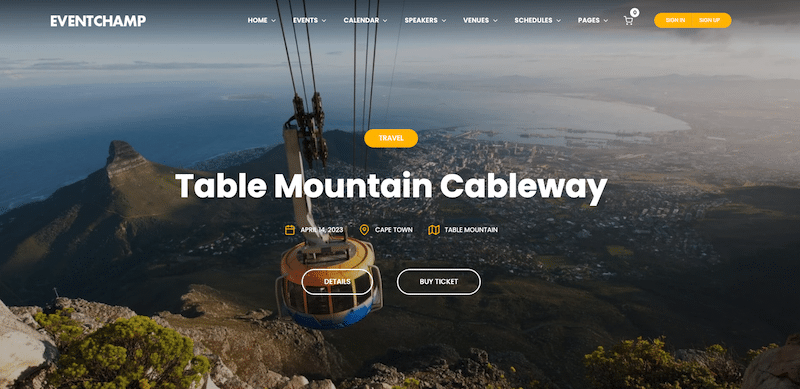
Key features:
- Multiple Event Management: Efficiently manage and organize multiple events and conferences within a single platform.
- Offers customizable templates and layouts tailored to the needs of event organizers, allowing for easy branding and personalization.
- Ticketing and registration integration system (integrated with plugins like the Events Calendar).
- Speaker and schedule management with an overview for everybody.
Why we chose it: The most complete solution for creating, managing, and enhancing any events, including ticket sales, speaker, and venue listings. It’s even integrated with external websites like Eventbrite.
Overall user opinion based on reviews: 4.67/5 (reviews from ThemeForest). Clients appreciate its extensive array of features that allow building a full custom events site.
It’s best for: Events manager who needs a customizable theme to showcase all the events attractively and with usability in mind.
Main performance KPIs:
- PSI mobile performance score: 71/100
- Total Loading time: 3.7 s
- Largest Contentful Paint: 3.9 s
- Cumulative Layout Shift: 0
- Total Blocking Time: 100 ms
- HTTP requests: 32
9. Crypterio
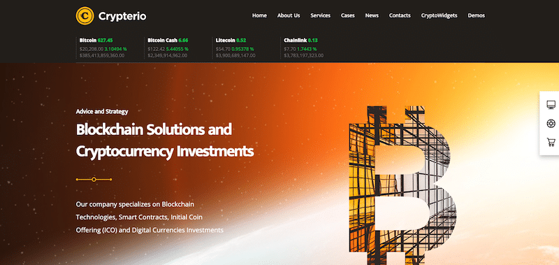
Key features:
- ICO Whitelist pre-sign up to allow users to register for ICOs before they officially launch.
- Token sales countdown to create a sense of emergency.
- Real-time cryptocurrency exchange rates.
- Coin exchange calculator to calculate coin exchange rates and conversions.
- ICO Directory that shows a directory of ongoing, upcoming, and completed ICOs.
Why we chose it: Simply the most complete theme on the market. It comes with a “Virtual Coin Widgets” and offers 10 widgets for your crypto-project with 1000+ cryptocurrencies. On top of that, Exchange Rates are updated every 10 minutes, so the information displayed is always up-to-date.
Overall user opinion based on reviews: 4.70/5 (reviews from ThemeForest). Users like the design of the template (really crypto-oriented) and the advanced widgets.
It’s best for: Users who have no coding skills but need to run a blog or a website related to crypto, ICO, and NFTs.
Main performance KPIs:
- PSI mobile performance score: 57/100
- Total Loading time: 4.8 s
- Largest Contentful Paint: 4.1 s
- Cumulative Layout Shift: 0.126 s
- Total Blocking Time: 1328 ms
- HTTP requests: 76
10. Hello
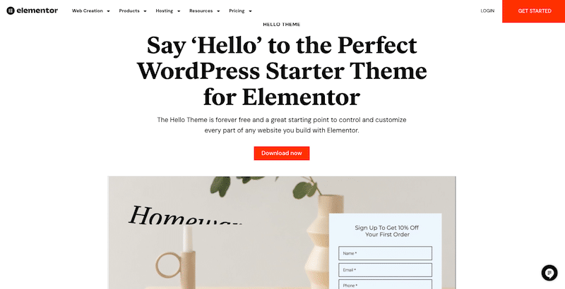
Key features:
- Lightweight and minimalistic design.
- Optimized for speed and performance.
- Built by Elementor, so seamless integration with the page builder.
- Clean and well-structured codebase for better SEO.
Why we chose it: We selected the Hello theme for its lightweight nature and its seamless integration capabilities with Elementor. The page builder allows users to create fully responsive designs with a mobile-first approach.
Overall user opinion based on reviews: Based on user reviews, the Hello theme has received widespread praise for its simplicity, speed, and compatibility with Elementor.
It’s best for: Users who want an easy theme as a starting point to create highly customizable websites using the Elementor page builder (or website builder) without compromising on performance.
Main performance KPIs:
- PSI mobile performance score: 88/100
- Total Loading time: 2.8 s
- Largest Contentful Paint: 1.8 s
- Cumulative Layout Shift: 0
- Total Blocking Time: 0 ms
- HTTP requests: 18
11. Astra
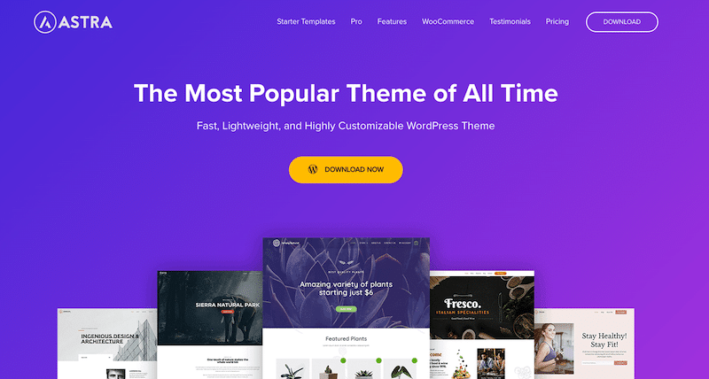
Key features:
- Lightweight and highly customizable WordPress theme.
- Offers a wide range of starter templates for various industries and niches.
- Integrates seamlessly with popular page builders like Elementor and Beaver Builder.
- Optimized for speed and performance with clean and efficient code.
- Built-in compatibility with WooCommerce for creating online stores.
Why we chose it: Versatility, performance, and ease of use. Its lightweight nature and extensive library of starter templates make it an excellent choice.
Overall user opinion based on reviews: User reviews consistently praise the Astra theme for its simplicity, flexibility, and performance. Users appreciate the extensive collection of starter templates, which provide a solid foundation for various types of websites.
It’s best for: An ideal choice for entrepreneurs, small businesses, bloggers, and agencies looking to create professional websites without the need for extensive coding knowledge.
Main performance KPIs:
- PSI mobile performance score: 89/100
- Total Loading time: 2.6 s
- Largest Contentful Paint: 1.7 s
- Cumulative Layout Shift: 0
- Total Blocking Time: 0 ms
- HTTP requests: 21
12. OceanWP
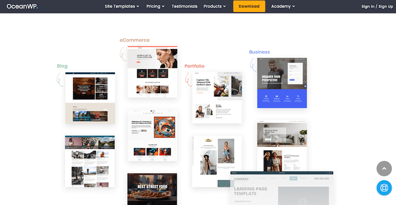
Key Features:
- Highly customizable and light WordPress theme.
- Offers a variety of starter demo sites covering different industries and niches.
- Seamless integration with popular page builders like Elementor and Beaver Builder.
- Built-in compatibility with WooCommerce for creating online stores.
Why we chose it: We selected the OceanWP theme for its impressive blend of flexibility, performance, and user-friendly features.
Overall user opinion based on reviews: Users appreciate the wide selection of starter demo sites, which provide a solid foundation for various types of websites.
It’s best for: The OceanWP theme is well-suited for a diverse range of users and website types. It’s particularly ideal for entrepreneurs, bloggers, agencies, and e-commerce businesses looking to establish a professional online presence.
Main performance KPIs:
- PSI mobile performance score: 86/100
- Total Loading time: 2.8 s
- Largest Contentful Paint: 1.9 s
- Cumulative Layout Shift: 0
- Total Blocking Time: 0 ms
- HTTP requests: 24
Finally, make sure you go through our checklist about how to choose a WordPress theme in general. Those steps will help you narrow your search and ensure that the theme you are considering is the best choice for you.
Wrapping Up
Opting for a responsive WordPress theme enables you to effortlessly create a website that smoothly adjusts to all screens. When it comes to building a site with a responsive WordPress theme, always consider the specific features and restrictions of each device and customize your UX design to make the most of their advantages, and take advantage of our list!