
Table of Contents
Last update on
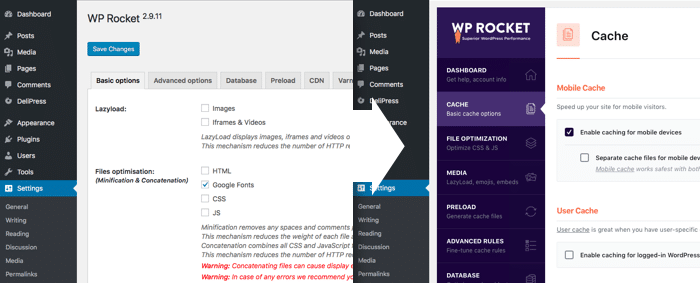
On April 3rd we released WP Rocket 3.0 which debuted a brand new look. It’s a really big departure from our previous UI and from that of most WordPress plugins. So we wanted to share some insights from behind the scenes and how we arrived at this new release.
Simplicity is Not Easy
One of the major goals of the new release was to move closer toward our goal of making the complex task of website optimization, simple for our customers. It’s part of a larger vision which we will roll out in phases, with a major release each quarter.
Our previous interface, while simple in design, was starting to restrict what we could and could not do, in terms of user experience. We knew we had to radically change it in order to create a foundation for the future.
The horizontal tab layout was becoming restrictive and we needed the flexibility to add options where needed, but without continuing to clutter up the UI.
Our other plugin Imagify is a joy to use due to its beautiful UI and we wanted the same experience for WP Rocket. The more pleasing to the eye an interface is, the better a person will feel while using it. We recognize that it’s a big change, but once you’re used to it, the new tab organization makes more sense and feels more intuitive to use.
To accomplish this vision – to reimagine what could be possible – was going to require some insight into the minds of our users.
A True Team Effort
Our in-house UX expert Geoffrey began by conducting interviews with many members of the WP Rocket support team. He asked us various questions about the interface, our customers, what needs and issues we saw.
He then distilled all that information into something like a mind map using a tool called RealTimeBoard.com
He divided his findings into 4 quadrants:
- High effort / high need
- Low effort / high need
- High effort / low need
- Low effort / low need
Knowing that we couldn’t accomplish everything in our minds with one release, this provided some direction and prioritization of what could be done in the first iteration, and what would come later.
Geoffrey then worked with our in-house designer Matthieu to create wireframes for the new UI.
Once those were approved, Matthieu worked on making everything look beautiful. He used Invision to create interactive mockups.
The WP Rocket support team provided feedback on the mockups before they went into development. WP Rocket’s lead developer Remy handled all the backend code, while our freelance developer Thomas handled the frontend integration.
It’s not just UI…
In addition to the design planning and development, there are lots of micro-projects that go into a big release like this.
The big picture planning of projects related to Imagify and WP Rocket falls to our COO and developer-whisperer, Emilie.
The specifics of identifying what discrete tasks need to be handled in preparation for a new version, and which team members would handle them, was taken care of by Customer Support Rocketeer Renee. She project managed our last release and also took the helm on 3.0 – coordinating our efforts with precision and empathy, and keeping us on deadline.
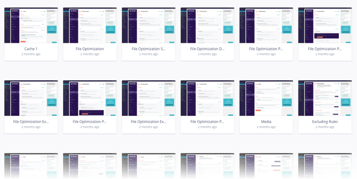
WP Rocket has extensive documentation and a significant change to the UI means we have to update all our docs and screenshots.
Along with Rocketeers Romain and Caspar, Renee created the list of documentation to update and they handled the arduous task of updating screenshots and text.

We are blessed with a multilingual customer support team. Alice, Romain and Caspar were also in charge of translating the new plugin strings into French, Spanish, Italian and German.
We use Transifex for all other languages and we have an awesome team of volunteers who contribute there.
We use HelpScout for managing support and in this version of WP Rocket, we elected to integrate HelpScout’s Beacon system directly into the interface. This means that on every tab you have quick links to documentation (we use HelpScout for that too, ) and you can easily submit a support ticket on any page in the plugin. Rocketeers Romain and Alice hand-selected the most relevant documentation guides to provide contextual help in the interface.
Then we have to do as much testing as we can to try and catch as many bugs as possible. Almost the whole WP Rocket support team, as well as our product manager and CGO Jonathan were involved in that.
We accomplished all this in about 3 months – work began in December and we released at the beginning of April.
What’s Next?

Our grand vision is expansive and it cannot be done in one step; this is just the first.
Now that we have laid the groundwork with the new UI we’re going to expand on it with new features like onboarding, to make configuration as easy as possible.
We’ll be conducting interviews with our customers as well, to get more insights into their needs and wants.
We’ve also received a lot of feedback on the new UI and will consider that as we move forward.
We’re really proud of what we’ve accomplished, not only because it’s beautiful and lays the foundation for what’s next, but because it shows how we can work together as a team to utilize our diverse skill sets.