Table of Contents
Last update on
A waterfall chart probably is the most valuable piece of data you can get from a website’s performance review. But it also is one of the bulkier ones. It sometimes scares off inexperienced users and even pros need some time to analyze waterfall charts. In this article, I’ll show you 7 tricks with which you will rock your next website analysis in just a couple of minutes. You’ll easily learn how to read and analyze a waterfall chart.
Performance, page speed, website load time––all these terms describe one of the most important aspects of any web project. Loading time can influence Google’s rankings, and it also determines user engagement. Especially on mobile devices. Google’s latest Performance Tool, Test My Site, is a great example of the importance of website loading speed: If you analyze your website with Test My Site, Google will tell you how many website users you will probably lose due to your website’s loading speed.
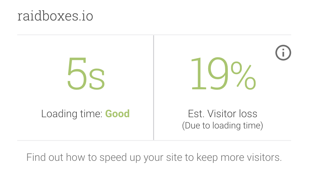
For raidboxes.io, Google predicts a 19 percent visitor loss due to our five-second loading speed.
A fast-loading and well-optimized website is an important precondition for a web project’s success––be it selling products, sharing opinions and information, or raising money for your business or a good cause.
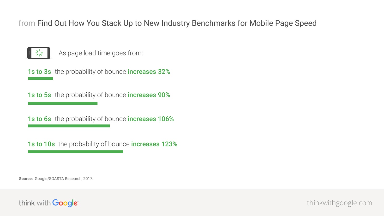
Data by Google shows that the probability of a mobile user leaving your website prematurely increases, the longer your site takes to load. If, for example, your website loads in about six seconds, the probability of a visitor leaving your website early is 106 percent higher than in the control group.
Therefore, analyzing the perceived load speed of a website is an important but sometimes tedious task. Since we analyze dozens of WordPress websites every week, we not only automated the process but also came up with some handy hacks for you to use in order to speed up your own analysis tremendously.
Just a few tools provide you with the performance info you need
But first things first: There are a plethora of tools out there that can measure your website’s performance in some way. Basically, there are two kinds of tests: Optimization Audits and Performance Audits. The former shows you how well your WordPress website is already optimized and how it can be improved even further. Google PageSpeed Insights, Google Test My Site, and Yahoo’s YSlow are well-known examples. What these tools basically do is compare your website to a set of rules. The more rules your website complies with, the better your test result.
Performance Audits, or speed tests, on the other hand actually measure how long it takes your website to be rendered in a user’s browser. Webpagetest, Pingdom, and GTMetrix are three well-known (and free) examples. These are the tools you want to use. Because only Performance Audits provide you with the data you need to properly optimize a website and measure your success.
And Performance Audits will provide you with one of the most valuable pieces of data: The waterfall chart. This chart will show you exactly what happens when a user visits your website, when it happens and how long it takes your webserver to do it.
What’s a Waterfall chart and why it can look complex (it’s just shapes and colors)
The chronological structure is what makes a waterfall chart so valuable. It allows you to understand exactly what your website does and enables you to identify potentially harmful processes and elements that slow your website down.
No matter which tool you use, the waterfall chart always has four identical characteristics, that you need to know:
- The x-axis (horizontal) is the time axis. It indicates how long it takes to load every single element of your website.
GTMetrix displays your website’s load time in the bottom right corner of the waterfall chart.
Pingdom––which probably has the prettiest waterfall charts––displays the load time in the middle of the lower edge of its waterfall views.
Webpagetest doesn’t display the overall loading time of your website on the lower edge of the chart. But it contains a whole scale, making it easier to read.
2) The y-axis (vertical) contains every single request and resource that is needed in order to fully load your website.
Waterfall charts depict your website’s requests in chronological order. If you click on a requests, you will additional information about the corresponding resource that is loaded.
3) A code of some kind shows what type of resources are loaded (image, CSS, JavaScript etc.)

Webpagetest for example uses this color code to identify images, JavaScript, CSS etc.
Pingdom on the other hand uses these symbols to identify the different types of resources.
4) An additional coding system shows how individual requests are executed (how long it takes to connect to the web server, how many connections need to be opened and whether or not HTTPS is used)

Pingdom uses colors to indicate the different phases of an HTTP requests.
Every tool has its own logic, when it comes to color codes. But basically they all use the same four elements in their waterfall charts. Once you understand that, an analysis really is child’s play 😉
The 2-Minute Waterfall Chart Analysis
Now that you know how to read a waterfall chart, it’s time to show you the 7 hacks we came up with that allow you to analyze any webpage in 5 seconds or less. These tricks will help you understand how and how fast your website loads. And they will show you where the potential lies to make your project faster and better.
Rule #1 – Size matters: The shorter, the better
The longer your waterfall view, the more requests need to be rendered and the slower it may be. However: A “long” waterfall view isn’t always a bad thing. Since you need certain features and external resources on your website––like a support chat plugin, a Google Map or Google Analytics––it may have to have a certain length after all. And if you use HTTP/2, which is only possible if your website loads via HTTPS, your website can also profit from parallel loading and server push. This technology mitigates the negative effects of too many HTTP requests.
In our experience, there is no direct correlation between the length of a waterfall chart and the actual loading speed. There is a limit though: 100 requests seem to be the threshold. If your website produces more requests, you should take a closer look at it and try to reduce the number of HTTP requests, e.g. by getting rid of some external resources.
– If your waterfall view is longer than 100 requests, take a closer look at it and try to reduce the number of requests.
Rule #2 – Total load time
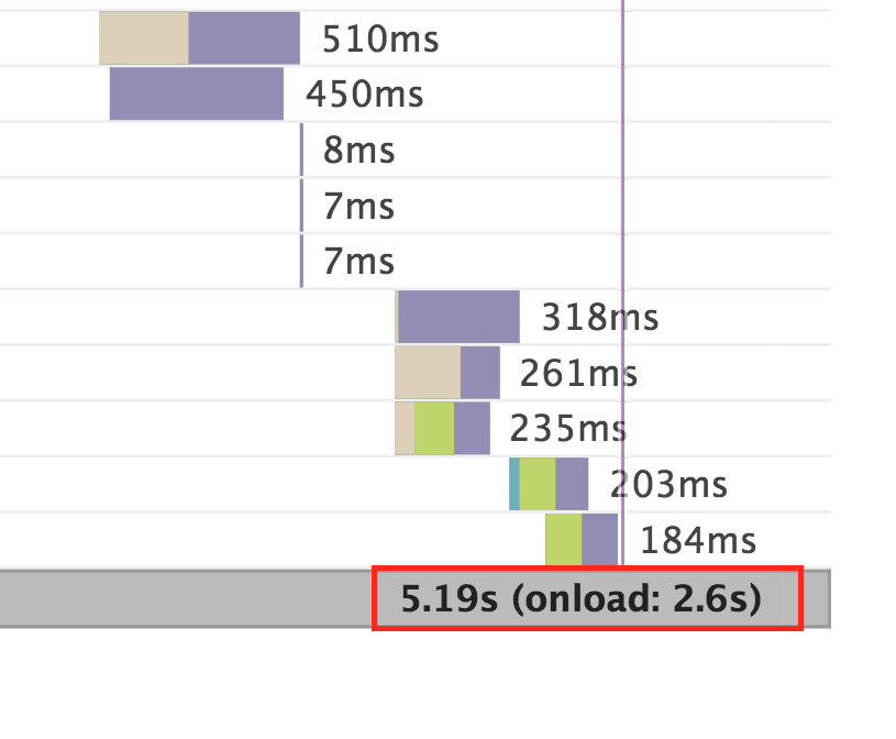
The maximum value of your x-axis is crucial for your analysis. It will show you how long it takes until your website is completely rendered. The smaller the count at the end of your x-axis, the better.
If this value is larger than 10 seconds, using the fully loaded metric (the default in GT Metrix), you should definitely look into your website’s loading speed.
–– The overall loading speed count should be <10 sec.
Rule #3 – Green and blue: What the user feels
As an internet user and website visitor, you do not care about a website’s speed “on paper”. All that matters is how fast you perceive a website to be. As a webmaster, you can anticipate this fact by using caching and a CDN.
The fact that users act on what they perceive––not on what you measure––is all the more important when you analyze a website’s page load speed. Webpagetest is the only free test tool we know, that actually differentiates between a technological loading speed and a perceived loading speed. The whole waterfall chart, or the “Fully Loaded” value, represents the less important technological loading speed. The blue and green lines in your waterfall view, however, represent what users perceive, when they visit your website.
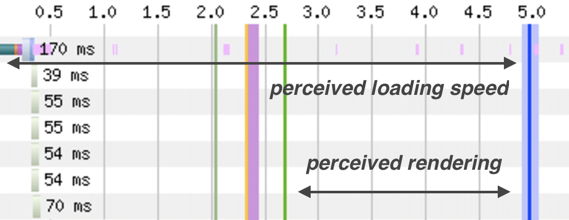
The time period where your users actually see rendering on your website is marked by the space in between the green and blue line.
These two lines need to be as far to the left and as close to each other as possible. The green line represents the “Start Render” event, which is the point in time when your website starts loading its first visual element. The blue line marks the point in time, when users perceive a website as fully loaded, meaning that they are very likely to interact with it.
As I said: Webpagetest is the only free test tool we know that differentiates between those two values. Other test tools, like the Pingdom Tools or GTMetrix, don’t. Ergo, this rule only applies for Webpagetest’s waterfall charts:
– The green bar should appear around 2-3 seconds from the baseline and the blue bar shouldn’t be further away than 6 seconds from the baseline.
Rule #4 – Detecting HTTP/2
Those first three rules basically come to mind very naturally: Few requests, short periods of time, small distances etc. This fourth one too is very easy to detect. With it you can check whether or not your hoster uses HTTP/2––a standard that speeds up your website tremendously compared to HTTP/1. Note that HTTP/2 only works, if your website is loaded via HTTPS.
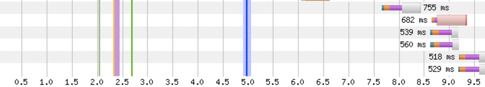
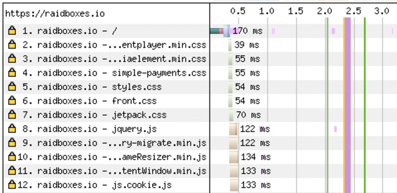
One of the most important improvements, compared to HTTP/1.1 is parallel processing. Your website is able to request and load several resources from the server at once. And this process is clearly visible in your waterfall view.
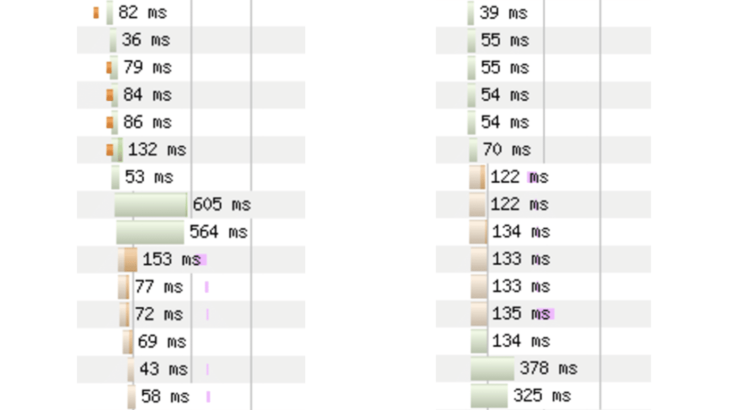
On the left, you can see the first requests of raidboxes.io loaded via HTTP. As you can see, the individual requests are loaded chronologically. On the right you see the same section loaded via HTTPS. In this case, the individual requests are loaded in parallel and rendered faster.
So, if consecutive requests load in parallel, your website benefits from the new, faster standard. If it doesn’t, you should check in with your hosting provider. But remember: HTTP/2 can only be used if your website is equipped with a valid SSL certificate.
If you’re not sure, you can also use a tool like this to check for HTTP/2
Note: If your website does not load in parallel, it doesn’t use HTTP/2
Rule #5 – Your images could be smaller
Images probably are the single most important performance factor of your WordPress website, after caching. Because for every image you upload, WordPress creates a whole bunch of images for your site, the so-called featured images, or thumbnails. Therefore, image compression is one of the most powerful methods to reduce your website’s size.
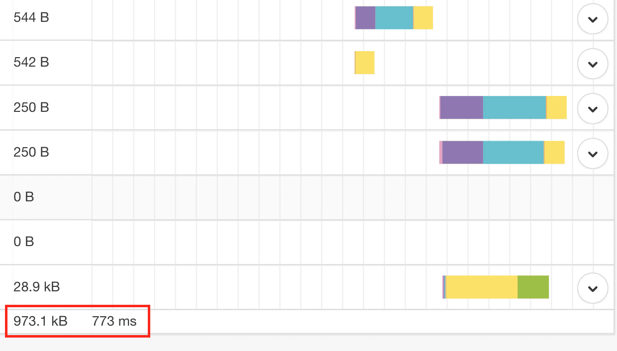
Images are very easy to detect in your waterfall chart: They are represented by violet bars (in Webpagetest, in Pingdom they are represented by an icon, GTMetrix doesn’t highlight images). And if those bars are suspiciously longer than your website’s other requests (meaning that it takes them significantly longer to load), you should take a look at your images in detail.
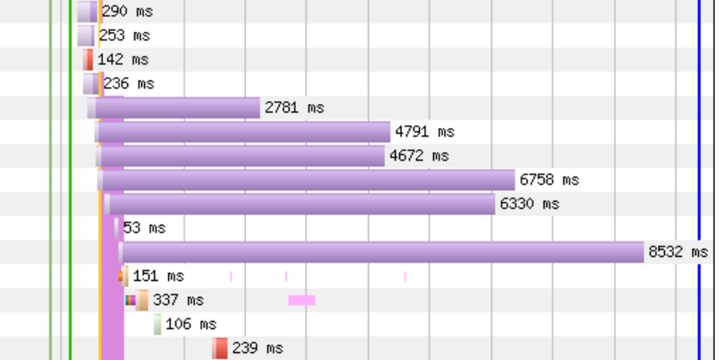
Caption: These two websites are a great example of uncompressed vs. optimized website images. The images on the first website need up to 8.5 seconds to render. That’s way too long. The second example has well-optimized images but as you can see still lacks use of HTTP/2.
In our experience, about 30 percent of the websites we tested, have the potential to compress their images even further.
– If your image bars are significantly longer than other website elements, try and reduce your images’ size or improve their compression.
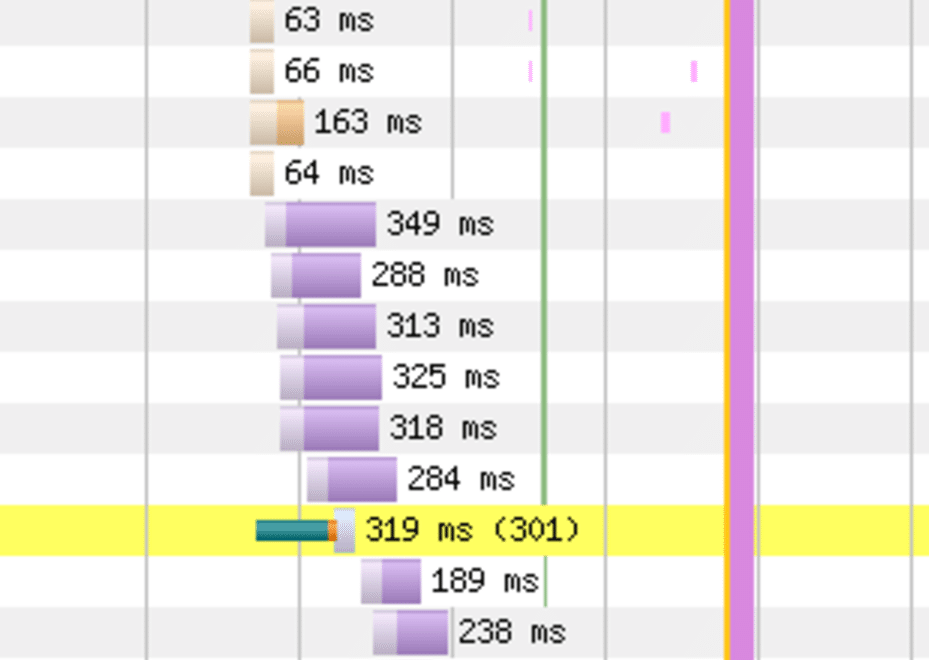
Rule #6 – Identifying redirections
A waterfall chart is a great tool for understanding your website. It shows you which elements are loaded, whether your website encounters problems or errors while loading and it also shows you how many redirections are set and where they point to.
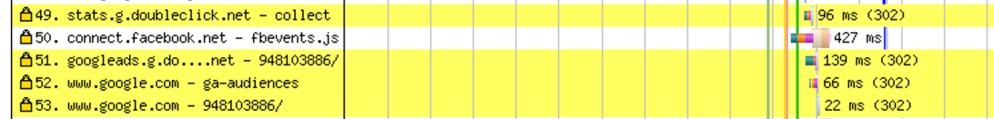
Caption: As you can see here, several HTTP requests of raidboxes.io are redirected to other URLs. Every 3xx-response is marked with a yellow row.
Every redirection is highlighted and includes the redirection type. More than once we were able to detect unnecessary or harmful redirections on customer websites with the help of a waterfall chart.
– Yellow rows are redirections. If one doesn’t make sense, look into it.
Rule #7 – Identify errors with one glance
Sometimes, the components of your website are not rendered properly. For example an AdSense frame, a map, or a font. With a waterfall chart, you can easily identify these components: Every red row is an error of some kind.
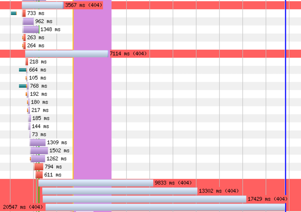
Caption: This website is producing several 4xx-errors. Again the test tool also shows you which kind of error it encountered.
The above website is producing several 404 errors. An analysis of the requests shows that they are all linked to a missing theme license. Once renewed, all the 404s disappeared.
– Red rows indicate 4xx-errors.
Wrapping up: A waterfall view is probably the most valuable piece of data you can get
Ok, now we got it 😉 It just took us a little more than 2,100 words. But now you know our 7 waterfall hacks that enable you to perform a fundamental performance audit and analysis of any website within a couple of minutes.
A waterfall chart combines several sets of information, including loading times, rendering order, and debugging console. That makes it a very valuable piece of data. And if you know how to properly analyze it, it usually doesn’t take you more than one glance to know all the important facts about a web project.
Just look for the treacherous patterns:
- Is the waterfall chart too long? (100+ requests)
- Is the loading time too large? (10+ seconds)
- Do requests load in parallel? (= use of HTTP/2)
- Are there too many and too long violet bars? (= poorly optimized images)
- Are the green and blue lines too far to the right or too far apart? (= a user’s perceived page load experience)
- Are there any unexpected yellow rows? (= redirections)
- Are there any red rows? (= rendering errors)
And don’t worry: If you do this analysis many times, you will not only be able to perform it in a couple of minutes, you will also be able to better understand all of your websites and WordPress projects with just one glance.