
Table of Contents
Last update on
Typography is fundamental to good web design – readability, legibility, accessibility and well-crafted branding are crucial in successfully delivering your message. Webfonts enable all of this, allowing text to be selectable, searchable and zoomable, while at the same time providing consistent and sharp rendering regardless of screen size and resolution.
However, this improved user experience can come at a performance cost: each font you use is an additional resource that visitors must download when accessing your site, adding to the time it takes to load your pages.
But using web fonts doesn’t mean your pages have to be slow. In fact, using optimized fonts together with a prudent strategy for how they are loaded and applied to your site can help reduce total page size and improve page speed. What’s more, optimizing web fonts will improve the Core Web Vitals grades – in particular, the CLS metric.
What Are Web Fonts?
There are two basic types of fonts used on the web:
- Web-safe fonts: These are standard fonts that come pre-installed on devices, including as Times New Roman, Arial, and Courier.
- Webfonts: These are fonts that are not pre-installed and must be downloaded by the browser before they are displayed.
To the casual eye, webfonts are a collection of letters of the alphabet, at least to us English speakers. But delve deeper and they are actually a collection of glyphs, and each glyph is a vector shape that describes a letter or symbol in many languages, not just English.
Two variables determine the size of a particular font file: the complexity of the vector paths of each glyph and the number of glyphs in a particular font. For example, Open Sans, a popular webfont, contains 897 glyphs, including Latin, Greek and Cyrillic characters.
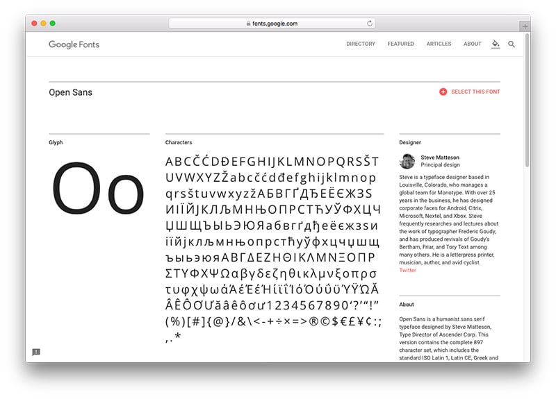
Open Sans contains hundreds of glyphs.
Hosting and Delivering Web Fonts
When you choose to use a web font, it has to be stored somewhere. There are two options for hosting web fonts:
- Self-hosting: Hosting font resources on your web server together with the rest of your website files.
- Third-party hosting: Using a font service like Adobe Typekit, Fonts.com or Google Fonts.
There are advantages and disadvantages that come with each of these options. While using a third-party solution might be simpler to set up, it means you have no control over performance and security, or even if the service goes down. In 2015 when Typekit’s servers crashed, sites the world over were forced to make do with Arial and Georgia.
But if you’re not concerned about outages – Typekit was only down for four hours – speed or delivery, third-party hosting might be your preferred option if you don’t want to deal with self-hosting font resources.
Tips for Optimizing Fonts
Web font optimization is a complex topic and there are many different ways to optimize the delivery of fonts. Exactly how you optimize your fonts will depend on your hosting preferences, your site’s design and server, your technical abilities, and how far you are willing to go to improve the performance of your fonts.
Before getting started optimizing your fonts, it’s a good idea to know exactly how many you’re using. An easy way to do this is to run your website through speed testing tools, like GTmetrix or Pingdom, so you can analyze the resulting waterfall chart and view your HTTP requests. Sometimes, plugins and themes might be using fonts that you’re not aware of.
Here are some steps you can take to optimize the delivery of your fonts.
1. Audit and Monitor Font Use
With browser support for the CSS @font-face rule now widespread, the use of custom webfonts has exploded. According to the HTTP Archive, 67% of web pages now use custom fonts, with websites averaging a median of four font HTTP requests.
The jury’s out on exactly how many fonts is too many, though the general rule of thumb is that three’s a crowd and it’s best to stick with two – one for your headings and one for body copy.
Not only does minimizing the number of webfonts you use help reduce the overall number of HTTP requests, it also ensures a more streamlined and consistent site design. Take LINGsCARS, for instance. It has so many fonts and other ridiculous elements it makes me want to scratch my eyes out. Fortunately, it uses only web safe fonts to make it load faster.
It’s also important to take into account variations, such as italics, bold and other weights. Each font variations add weight to the file size, so try to avoid adding those you’re not planning to use.
2. Subset Font Resources
Unless you provide translations across your site, it’s best to keep character sets to a minimum. This means only delivering characters for the languages you need.
As Google Web Perf Guru Ilya Grigorik explains, many fonts can be subset or even split into multiple Unicode ranges to deliver only the characters needed for a particular page. Using @font-face, you can use the Unicode-range descriptor to specify a list of range values, which can be set out in three different forms:
- Single codepoint (for example, U+416): indicates a single character.
- Interval range (for example, U+400-4ff): indicates the start and end codepoints of a range of characters.
- Wildcard range (for example, U+4??): ? characters indicate any hexadecimal digit.
For example, here’s how you would split the Awesome Font family into Latin and Japanese subsets, each of which the browser would download as-needed by the user:
Grigorik says when defining subsets, it’s important to optimize for font reuse. For instance, don’t download a different by overlapping set of characters on each page. It’s good practice to subset based on a script, such as Latin, Cyrillic, etc.
If the sole purpose of a Google webfont is for displaying your site title, here’s a tip: only download the specific characters used in the title. You can do this by adding &text= followed by the specific letters you wish to download to the end of a Google Fonts URL.
For example, if you want to load the word Blog using Montserrat, you would do so using the following:
This link tells the Google Fonts CDN to deliver only the uppercase letter B and the lowercase letters l, o, and g, while ignoring all other characters.
3. Deliver optimized font formats to each browser
There are four font container formats in use on the web: EOT, TTF, WOFF and WOFF2.
- Embedded Open Type (EOT): Microsoft designed this format, which is now only used by IE browsers.
- True Type Font (TTF): A format that’s been around since the late 1980s that has partial IE support.
- Web Open Font Format (WOFF): A format developed in 2009, which is essentially OpenType or TrueType with compression and additional metadata. It enjoys widespread support but is not available in some older browser.
- Web Open Font Format (WOFF2): An improvement on WOFF that provides, on average, a 30% reduction in file size. Support is still a work in progress for many browsers.
Unfortunately, there isn’t a single format that works in all browsers, which means you need to deliver multiple formats. When deciding exactly which formats to use, it’s helpful to check your Google Analytics to see which browsers and devices are most popular amongst your visitors.
If your visitors are mostly using modern browsers, you could get away with specifying just two formats, like so:
The first format, WOFF2, gives you the advantage of extra compression. It browser don’t support WOFF2, it falls back on WOFF, which also has good compression along with support across the latest versions of all major browsers. However, there’s lack of support for Opera Mini, IE8 and older Android browsers. While this might be a concern, these browsers would automatically default to web safe fonts.
4. Give Precedence to local() in src List
While you’d expect a site visitor to have web safe fonts pre-installed on their computer, it’s impossible to predict whether they already have a particular webfont. Take me, for instance. I have dozens of webfonts installed on my computer, so when I visit websites it doesn’t make sense that I should have to download a webfont I already have.
Another drawback is that a blank space (Flash of Invisible Text, aka FOIT) or unstyled text (Flash of Unstyled Content, aka FOUC), is displayed as the font is loaded into the browser. This is absolutely unnecessary for users who already have the font locally installed on their computer.
The way to get around this is quite simple: use local() to check if a font is already on the user’s system. Listing local(‘Font Name’) first in your src list ensures that HTTP requests aren’t made for fonts that already exist.
5. Put the Font Request Early
By default, @font-face lazy loads fonts. This means font requests are delayed until after your page content is loaded. This is a good thing as far as speed and performance are concerned, and if you appreciate progressive enhancement techniques.
But if the user experience is a priority and you don’t like the jarring experience of FOIT, you might want to override this behavior for particular fonts, such as your title text, for instance.
You can customize font loading and rendering using <link rel=”preload”>, font-display, or the Font Loading API.
<link rel=”preload”> tells the browser that a font is going to be needed soon, but doesn’t say how to use it. Here’s how to use it:
HTML:
CSS:
In general, it’s best to put your @font-face declaration above all <script> tags.
For more on how to use font-display, check out CSS-Tricks’s `font-display` for the Masses.
6. Proper Caching is a Must
Since fonts are static resources that aren’t frequently updated, they can be cached locally in the browser, saving users having to download your fonts again the next time they access your site. This way, the amount of data the user’s browser has to download, as well as the number of HTTP requests, are reduced.
Google’s Web Fundamentals guide recommends making sure your servers provide a long-lived max-age timestamp and a revalidation token to allow for efficient font reuse between different pages on your site. You should also avoid storing fonts using localStorage or IndexedDB since each of these has its own set of performance issues.
Note that browser caching can only be applied to fonts you serve from your own domain or CDN – you don’t have control over the browser caching of fonts served from 3rd parties, like Google Fonts etc.
Conclusion
As I mentioned earlier, webfont optimization is a hugely complex topic. There are so many techniques you could employ to better deliver your fonts, and this article only scratches the surface. So I encourage you to learn more and work out which optimization methods work best for you and your website. By optimizing web fonts, it’s likely you’ll also improve the Cumulative Layout Shift, one of the Core Web Vitals scores.
Here are some additional webfont optimization resources.
- Web Font Optimization – Google Web Fundamentals
- Webfont Options and Speed – varvy.com
- Web Font Optimization – NerdWallet
- Case Study – Analyzing Web Font Performance – KeyCDN
- A Guide on Web Font Optimization in WordPress – Kinsta
How many fonts do you use? Have you considered webfont optimization? Leave a comment below!