
Table of Contents
Last update on
Understanding how to correctly identify the size of your images and how to resize them is fundamental to boost the performance of your website.
A fast and optimized web page always contains images that have been previously resized and compressed.
Not every image you wish to add to your website will always be the exact size it needs to be: most of the time you need to use a photo editor to resize your image files.
Photo editors can also compress your images, but we’ll see this in a separate article dedicated to image compression.
In this article we’re going to dig into the secrets of image resizing: you’ll learn what file size for images is and how to determine the right size of your images.
We’ll be also suggesting a few tools you can use to change the dimensions of your images.
What Does Resizing an Image Really Mean
The dimensions (height and width) of an image are measured in pixels: a pixel is the unit measure to identify the space an image takes up on the screen.
File size, on the other hand, is the amount of storage space your image will occupy: it’s measured in kilobytes (KB) and megabytes (MB), where 1MB = 1000KB.
Dimensions and file size are strictly related: the larger the dimensions of an image, the larger its file size will be.
Images for the web can also be defined by their pixel resolution, which is usually adopted to indicate the quality of an image. This measure is expressed by two numbers, for example, 1024 × 768 (where the first is the number of pixel columns, and the second is the number of pixel rows).
Resizing an image for the web means reducing its width and height, which will also end up reducing its file size.
When the size of an image is reduced, the photo editor of your choice will automatically remove the unnecessary pixel information and change the dimension of the file.
So we can define resizing as dealing with the physical dimensions of an image.
How to Determine the Right Size for an Image?
To get your images ready to be uploaded on the web, you should make sure they have the right height and width for the content area of the page where you’ll place them.
It’s very important to figure out in advance how wide the content area of your web page is: to save resources and page load time, always avoid uploading images wider than that portion of the page.
There are several tools that allow you to assess the right width of your content area. The quickest ones are the following:
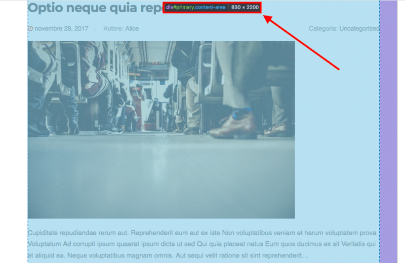
- From the browser (be it Chrome, Firefox or Safari), you can right-click on any page element and choose Inspect Element to open Developers Tools. It will instantaneously indicate the dimensions of the content area of your interest:
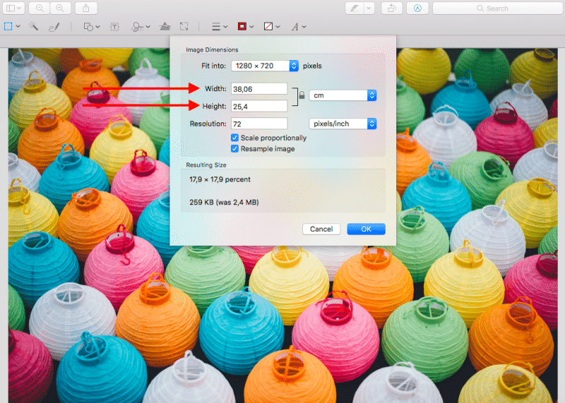
- For Apple users, you can profit from Mac’s built-in capture tool, Grab: you can activate it with Command+Shift+4. When you draft an area on the screen, you will see the pixels of that area.
Which Tool Should You Use to Resize Your Images?
There is a wide variety of software and online tools that can help you resize your images. There’s not really a tool better than others when you need to change the dimensions of a file: the important thing is to locate the resizing feature, add your desired width and let the tool do its job!
Here are a few suggestions about resizing tools you can use:
- Photoshop: the most famous photo editing software
- GIMP: very similar to Photoshop, it’s a free image editor software
- IrfanView: free image editor software for Windows
- High Quality Photo Resizer: free image editor software for Windows
- Preview app: the built-in solution for every version of macOS and OS X
If you prefer online image resizing tools, here are a few you can try:
- Squoosh.app: free online tool by Google
- Picmonkey.com: premium online tool, free trial available
- Fotor.com: freemium, also available as a mobile app
- BeFunky.com: free tool, also available as a mobile app
- Pixlr.com: free, also available as a mobile app
- Picozu.com: free, it also supports SVG image files
Choosing the Right Image Format
Once the dimensions of your image file are resized, it’s time to give them a name!
Choosing the right image format is important to keep your pages light and fast.
Website graphics are often originally built in the SVG format (Scalable Vector Graphics files): they use an XML-based text format that describes the image and gives directions about its display.
Since they rely on text to be described, SVG files can be scaled to different sizes without losing quality: they can be defined as resolution-independent.
Due to this characteristic, web designers prefer to build their graphics in SVG, so they can later resize them to fit different designs in the future.
The three most suitable image formats for the web are:
- .jpg
- .png
- .gif
JPEG
This format is best used for non-flat images, like photographic images. It’s not suitable for vectors or images containing text and it doesn’t support transparencies. JPEG images can be compressed quite easily and their file size is suitable for web pages.
PNG
If, on the other hand, you’re dealing with illustrations or with an export from a vector file, PNG is the most appropriate solution. Unlike JPEGs, PNGs make full use of transparency. Moreover, this format handles hues differently, supporting more homogeneous shading and richer image information. For this reason, it usually generates larger file sizes: its use is suggested only if you need to keep transparency.
GIF
Unlike JPEG, GIFs can only export images containing up to 256 colors. If the original image contains a higher number of colors, the loss of quality will be significant. The GIF format supports transparency and multiple frames, so nowadays it’s mostly used for creating animated GIFs.
Everything You Need to Know About Image Optimization in WordPress
In this article you learned:
- The definitions of image dimensions and file size
- What is image resizing and how to determine the right size for your images
- Which kind of tools you should use to resize your images
- Which file format you should choose for your images
Now that you know everything about reducing file size, it’s time to go ahead and learn other tricks about image optimization:
- How To Compress Your Images?
- Why You Should Use Lazy Loading For Your Images
- Image Optimization With Imagify: The Definitive WordPress Plugin To Optimize Your Images
You should also take a look at the list of the best image optimization plugins for WordPress!