Table of Contents
Last update on
WP Rocket’s Mission Control has been buzzing with activity in preparation for the launch of WP Rocket 3.0 in April. The upcoming release explores a new frontier in user experience with our completely redesigned interface!
Since 2013, WP Rocket has been helping WordPress users set their sites to warp speed. And we have been consistently committed to making the complex task of caching, as easy as possible for our customers. Our vision for how we would like to improve the user experience of WP Rocket is expansive and cannot be implemented in one release. But WP Rocket 3.0 takes the first, bold step toward it in providing a more streamlined and intuitive experience for all Rocketeers.
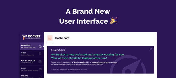
After updating to 3.0, you’re going to be treated to a completely revamped user interface that will make configuring your site a more enjoyable and empowering experience.
What’s coming
We’ve received a lot of feedback from customers about their desire for a better-looking, easier to understand and navigate, settings screen. We had been focused for a long time on the “under the hood” optimization mechanisms themselves, but not focusing on the user experience within the plugin. Meanwhile our sister product Imagify launched with a beautiful interface and we wanted to give customers of WP Rocket an equally enjoyable experience, fitting for a premium plugin.
Our mission is to make configuring the plugin more user-friendly. 3.0 strives to do this by:
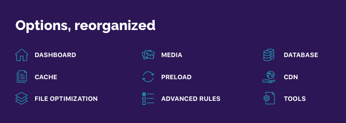
- Reorganizing the settings tabs in a more intuitive way
- Streamlining options and default settings
- Providing more easily accessible educational resources and help
- Addressing the most common questions and misunderstandings directly in the interface
- Creating an add-on system to un-clutter the interface
A new dashboard

The dedicated dashboard provides immediate access to your account information. It’s your personal homebase :).
Clearly defined tabs and options

We’ve reorganized the options and tabs to make them more intuitive and we’ve also made our defaults smarter. We want site optimization to be as easy as possible.
Rocket Add-ons

Some options, like Varnish auto-purge and Cloudflare, aren’t relevant for every user because they relate to 3rd party services, so we didn’t want them adding unnecessary cognitive overload. By moving them into our new Rocket Add-ons, they will be present only when needed. This structure paves the way for the introduction of other 3rd party features which some users may benefit from, without overloading the settings.
Easier access to support materials

On every tab you’ll have easy access to relevant documentation for those features. By integrating our HelpScout support system directly in the interface, you can radio back to Mission Control for help with a couple of clicks 🙂
Planning for the future
The overhaul of the interface builds the foundation for some exciting and innovative features we have planned for the future which will make your experience with WP Rocket even better.
WP Rocket 3.0 is scheduled for blast-off on April 3rd.


