
Table of Contents
Last update on
Are you looking for the best Google Fonts for your next web project?
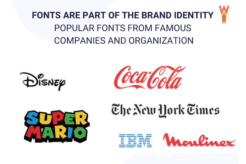
Fonts are a crucial part of the whole brand identity. You need to choose them carefully according to context because it affects your audience’s feelings (and, therefore, the buying decision process). Some famous brands, such as Disney or Coca-Cola, are automatically associated with a font when we mention them.
Google has over a thousand fonts available in its catalog, but we’ve done the heavy lifting for you and selected the 11 most popular ones. You’ll see that there is always a font that can match your needs and your niche!
What Are Google Fonts?
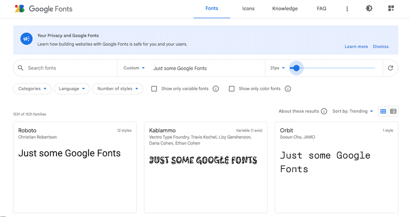
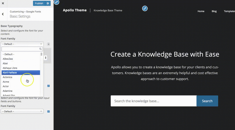
Google Fonts is a robust collection of web fonts you can use for any project online and offline. They are free and open source, so that you can use them commercially for a logo, print, apps, teaching materials, e-books, etc. The value is real: you will not need additional licensing charges. You can find the perfect Google Fonts directly from the directory by using the search box and the different filters available:
Google Fonts usually don’t impact performance much as they are retrieved from Google’s content delivery network (CDN) and will load automatically once uploaded to your site.
How to Choose and Use Google Fonts on WordPress
When choosing the best Google Fonts for websites, you should consider the readability and the look and feel based on the context and industry.
1. Readability & Accessibility
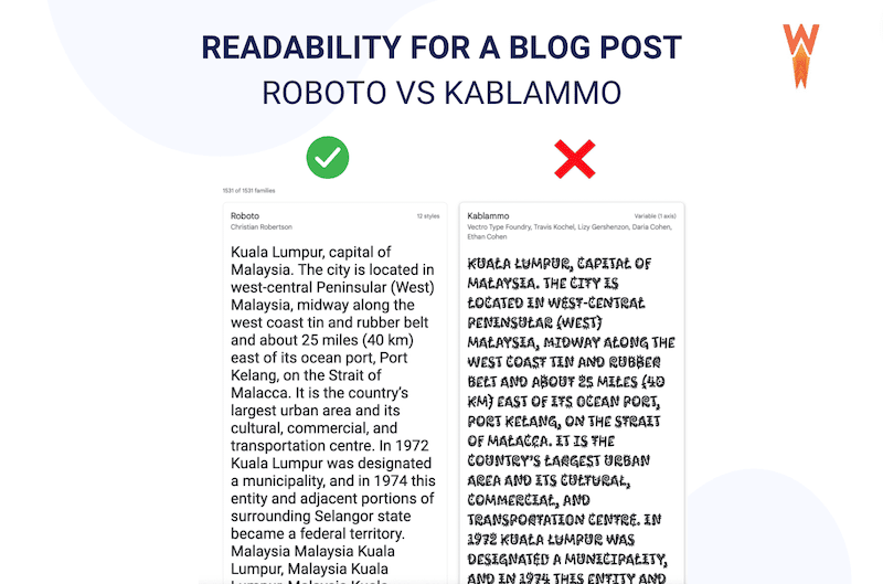
Readability describes how easy and inviting it is for a person to read some text online. Fonts directly affect readability in web design, as you can see in our example below. The article written using the “Roboto” font looks easier to read than the one in the “Kablammo” font.
Accessibility also correlates to font size, colors, and contrasts you will use on your web page. Check the web content accessibility guidelines to make sure that all can read your font.
2. Look-and-feel Based on the Industry
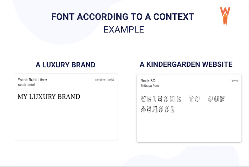
Each font impacts and influences your customers’ emotions when they read something online or in the street. You can’t use the same font for a reggae bar and a lawyer: the design codes are different. Similarly, if you want to create a website for a kindergarten, you should opt for a friendly and easygoing font. But if your client is more of a luxury brand, then the font should express elegance and sophistication.
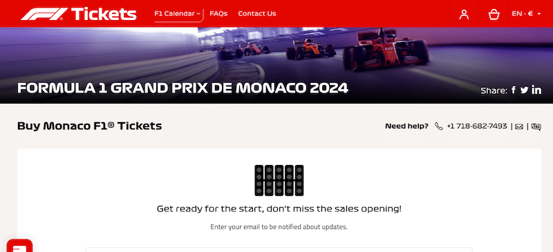
To give you a real-life example, the Formula 1 website chose the perfect font for their ticketing site. They created a “racing” and “automotive” look and feel by choosing the right font.
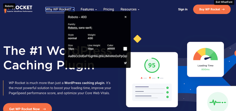
Bonus: How to Identify a Font on a Website
You can install the free Chrome extension “Whatfont” and hover your mouse on the font that you like, it will identify the family font, the weight, the size, and much more.
Best Practices to Use Google Fonts on WordPress
To help you find the best Google Fonts on WordPress and install them on your site, follow our 3 best practices below.
1. Less Is More: Only Use The Fonts You Need
We don’t recommend you use more than 2 or 3 fonts for your brand identity, and also make sure to limit font weights. Regular and bold are the most popular ones, there is no need to have the whole variation from extra-thin to extra-bold from a performance perspective. All the font weights that aren’t being used will slow down the requests from Google’s servers.
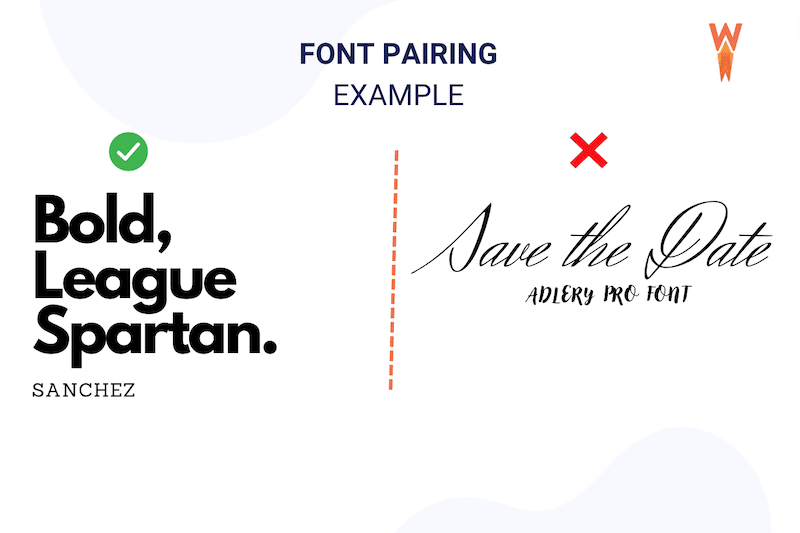
2. Mix and Match: Make Sure The Fonts Match Well Together
When you have chosen the best Google font but want to add another one, make sure that it’s a match.
- Choose different fonts (but not so different). This one is hard to explain, so here’s an image instead:
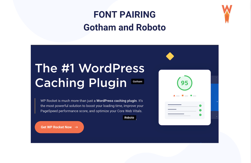
Keep in mind the hierarchy of the information: Use a bold and bigger font for a title and a smaller font for a paragraph. Here’s how WP Rocket communicates visual hierarchy through font pairing:
- When you pair them, a general tip is to combine serif headings with the sans-serif body text. Using two serif fonts together makes your text hard to read. If you want to learn more, Webflow explains the major font combinations you can use in your design work.
3. Installing Google Fonts With a Plugin
Once you have chosen your favorite Google font(s), you can use a typography plugin to use them on your WordPress site.
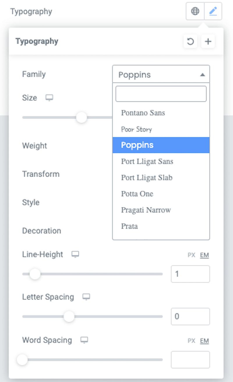
The most popular is the free Google Fonts Typography plugin, unlocking all your WordPress site’s Google fonts. It also comes with a live preview feature which comes in handy when pairing fonts:
Good to know before installing a typography plugin: Popular page builders like Divi or Elementor offer Google Fonts in each element of their respective builders. Most WordPress themes also use Google Fonts in the core to allow you to use fonts from their library.
Now that you know what to look for in a font, let’s see which are the top Google fonts!
The Best and Most Popular Google Fonts
The 11 best and most popular Google Fonts for a WordPress site are the following:
- Roboto
- Open Sans
- Montserrat
- Lato
- Poppins
- Roboto Condensed
- Inter
- Roboto Mono
- Oswald
- Noto Sans
- Raleway
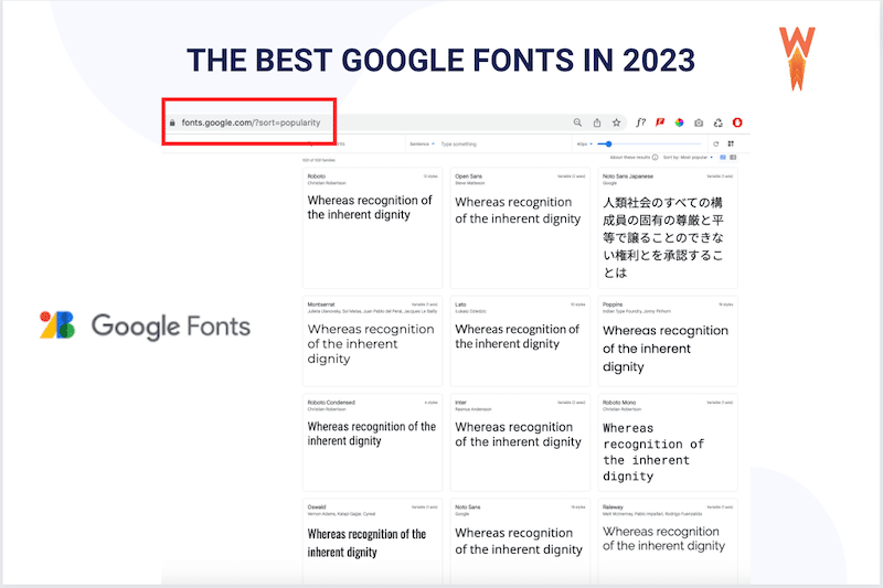
💡Hint: You can find that list directly from the Google Fonts website and sort the fonts by popularity:
Let’s go over the list of the best free Google fonts that are available to use on all your personal and commercial projects (copyright free).
1. Roboto
Roboto has it both geometric but with some friendly open curves.
- Example of websites using it: Roboto is the default font on Android and other Google services such as Google Play, YouTube, Google Maps, and Google Images.
- Type of website or industry using it: Tech, web apps.
2. Open Sans
A clear ultra-readable appearance and versatile font.
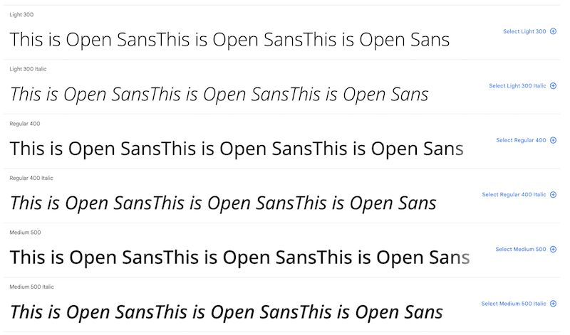
- Example of websites using it: WordPress, Dolce and Gabbana, Ikea
- Type of website or industry using it: Versatile from tech to fashion
3. Montserrat
From Argentina, it was inspired by posters, signs, and painted windows.
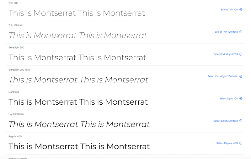
- Example of websites using it: hustlerblueprint.com
- Type of website or industry using it: Elegant and stable, Montserrat is great for creating a simple and clean-looking web design
4. Lato
A sans-serif font family started in the summer of 2010 in Poland. (“Lato” means “Summer” in Polish).
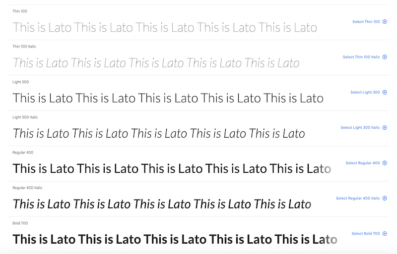
- Example of websites using it: Practical-ui.com
- Type of website or industry using it: Very versatile, it’s a good font for websites because it’s readable and comes with different styles. It is also great for printing and can be used anywhere because of the geometric simplicity with a great large x-height (typefaces that incorporate large x-heights generally do so in an attempt to increase legibility and readability).
5. Poppins
Poppins’ geometric shapes keep the content readable in small format, while its curves look bold when displayed in headers, big screens, or mobile devices.
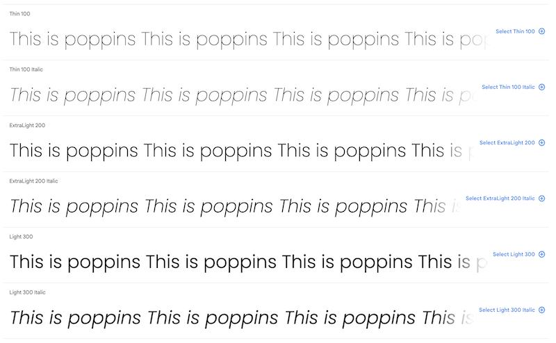
- Example of websites using it: monday.com
- Type of website or industry using it: Perfect for web and UI designs that need style, clarity, and legibility.
6. Roboto Condensed
It is a member of the largest geometric sans-serif typeface family known as Roboto Font. “Condensed” means narrow and taller characters.
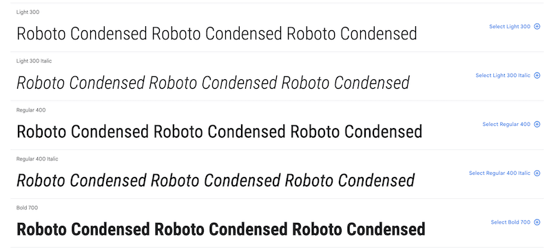
- Example of websites using it: Nintendo Switch
- Type of website or industry using it: The tall characters and the reduced space between them create a visual effect that can allow your website to stand out and be more memorable (perfect for a tagline or main title).
7. Inter
Another variable font family specially designed for computer screens because it features a tall x-height to aid in the readability of mixed-case and lower-case text.
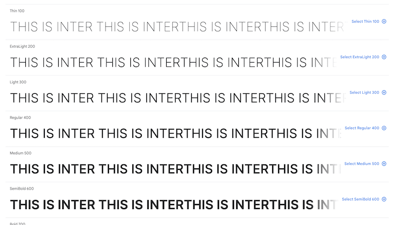
- Example of websites using it: Jetpack
- Type of website or industry using it: Perfect for responsive design as it ensures your content is easily read on smaller devices.
8. Roboto Mono
Roboto Mono is a monospaced addition to the Roboto-type family.
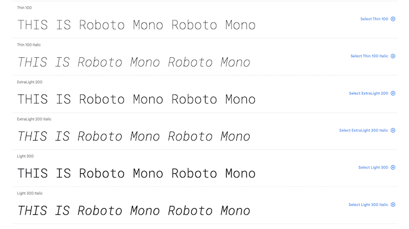
- Example of websites using it: Same font family as Google applications.
- Type of website or industry using it: Fonts are optimized for readability and responsive design. It’s also excellent for programming purposes. It’s a “nerdy” font.
9. Oswald
A redesign of the classic style historically represented by the ‘Alternate Gothic’ sans serif typefaces.
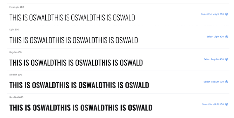
- Example of websites using it: secupress.me
- Type of website or industry using it: Because it is elongated, it always brings contrast to a typography combination and makes it ideal for designing a logo.
10. Noto Sans
This is a clean, unornamented design with a neutral tone best suitable for online reading and one of the best fonts for pairing.
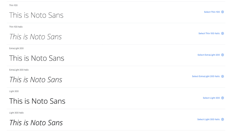
- Example of websites using it: dimano.rs
- Type of website or industry using it: Perfect for product descriptions or short text.
11. Raleway
A thin and elegant font with a thin weight – the famous ‘W’ really makes it stand out.
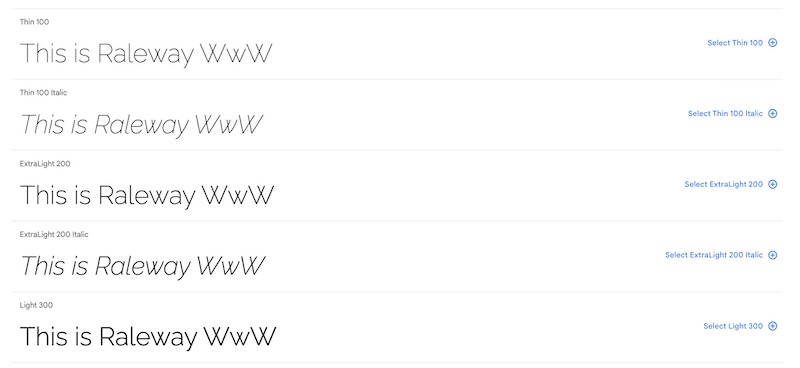
- Example of websites using it: Storespark.co
- Type of website or industry using it: Perfect for headings, subheadings, or even text body with an elegant feeling.
Now that we’ve reviewed the best Google Fonts, let’s see how to optimize them so they don’t slow down your WordPress site.
How to Optimize Google Fonts
The best way to optimize Google Fonts in WordPress is to use a performance plugin.
But before we dive into the optimization techniques, that’s the optimization journey we suggest you follow:
- Understand how Google Fonts are correlated with performance.
- Audit your WordPress site on PageSpeed Insights to see where your website stands regarding fonts and performance.
- Optimize the fonts that need optimization manually or with a performance plugin.
Let’s go over the main steps for a complete font optimization process.
Step 1 – Why Optimizing Google Fonts is Important for Performance
Google Fonts are often large files with slow load times, impacting the perceived performance and the user experience. Your Core Web Vitals can be affected, meaning your ranking could also be impacted. Below, we explain the consequences of unoptimized fonts on performance.
- Slower website – Unoptimized Google Fonts can have a negative impact on your website performance and your page loading speed. It may be less crucial than image optimization, but remember that each request your WordPress site makes means the user is waiting longer to see the page.
- Largest Contentful Paint (LCP) – It calculates when the page’s main contents have finished loading. If your LCP is a string of text, you need to ensure that your font is downloaded and rendered as fast as possible.
- First Contentful Paint (FCP) – It measures the perceived speed of a page because it marks the first point in the page load timeline where the user can see anything. So if a web font has not loaded, browsers typically delay text rendering, resulting in a bad FCP score. On the contrary, having a great FCP reassures the visitors that something is happening on the screen, and they’ll be more likely to wait.
- Content Layout Shift (CLS) – It measures the visual stability of a page. Unoptimized web fonts can negatively impact the CLS score because the text string using the font and the surrounding content can shift while the web font loads.
| 📖 Want to boost your Core Web Vitals and improve your WordPress site performance? Read our dedicated guide, where we give you 16 Tips to boost SEO and improve the Core Web Vitals. |
Now that you know the impact of poorly optimized Google Fonts on performance and SEO, you should run your own audit using Lighthouse.
Step 2 – Google Fonts Diagnosis On PageSpeed Insights
Once you have installed the Google fonts, we recommend you run a performance audit on PageSpeed Insights. In the report, Lighthouse ensures you’re following web font optimization best practices. Generally, if the fonts are not optimized, those five warnings are likely to be triggered:
- Preload key requests
- Preconnect to required origins
- Serve static assets with an efficient cache policy
- All text remains visible during webfont loads
- Eliminate render-blocking resources
The five issues above have a direct impact on page speed, so you may want to fix them as soon as possible to avoid any drop in performance.
Step 3 – Optimize Google Fonts
Once you have selected the best Google Fonts for your web design project, you can optimize them manually or with a plugin or a tool such as:
- WP Rocket – It automatically optimizes Google fonts.
- OMGF – It reduces DNS lookups thanks to caching and reduces the Cumulative Layout Shift score. You can choose to preload or unload fonts that are not used on your website.
- Google Fonts Typography – It allows you to load any Google Fonts to your WordPress site. It also offers some preconnect Resource Hints.
Wrapping Up
You can manually browse more than 1400 fonts, or you can save some precious time and use our guide to select the best Google Fonts for your next project! Remember that your font must be aligned with your brand’s personality: serif fonts are popular with brands that want to portray an elegant and sophisticated image. On the contrary, if you want to convey an image that is more modern and edgy, a sans serif is your go-to.
The golden rule is not to use too many fonts and to optimize them as much as possible. If you serve unoptimized fonts, there will be a dual impact on performance and the user experience because of delayed text rendering and important layout shifts. Keep this rule in mind and choose the best font for your website!